Showing posts with label girls. Show all posts

Wednesday, May 23, 2012

Blonde Beach Bunny


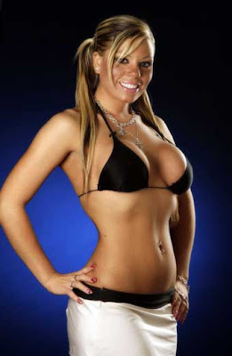
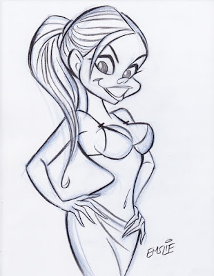
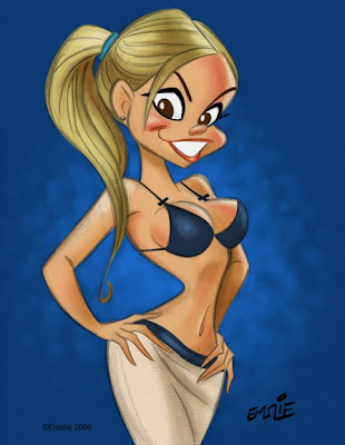
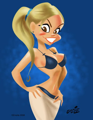
Yes, it's been a long time since I last posted something. Anyway, here's something I've done as a result of playing with Photoshop CS5. Admittedly, I'm not likely to ever be a "digital painter" in the truest sense, as I find that my efforts to paint without benefit of a containing outline just don't seem to look very good. While it's frustrating to try and achieve the fully rendered approach that others do so well, I suspect that I'd never be totally happy with it even if I could do one to my satisfaction. I am a cartoonist who happens to love the power and graphic boldness of a line drawing, so I'm always going to prefer working like that.

It's for this very reason, actually, that I'll always prefer traditional hand drawn animation to CG, as I still believe that you can make a bolder visual statement through outline describing the illusion of solid form than you can with the fully rendered CG approach. While it's true that I'm adding in all the highlights and shadows in my drawing similar to the look of CG, I find that I really need that outline to hold it all together and make it pop. Anyway, I'll continue to experiment with CS5, since it does seem to give a huge improvement in the way the brush tool handles a controlled line compared to what I was achieving with CS3.

Thursday, May 20, 2010

Life Drawing: Charlotte


It's always interesting to draw contrasting body types, and Charlotte is very different from Heather, whom I profiled in my last post. Charlotte has a very sleek, angular body and her poses tend to be equally dynamic and angular, as opposed to the more rhythmic curves in Heather's poses. She must be double jointed as well, as her elbows can bend slightly backwards when her arms are tensed!


Charlotte's also a bit of the goth girl, with several tattoos and a lip piercing. This tends to influence me a lot when I take my more caricatured approach to the longer poses, as I really like to play up her large eyes, high cheekbones and almost "haunted" expression. She's actually a very shy, sweet natured girl, but I like to imagine her as some gothic heroine who would fit right in to a Tim Burton film!


Monday, May 17, 2010

Life Drawing: Heather


This is Heather, one of the life models we've drawn from often over the last few years at Visual Arts Brampton. I've posted a number of my sketches of her previously on this blog. Heather is a trained dancer who brings a lot of that dancing sensibility to her poses, particularly in the quick gestures. Her body type is soft and curvy, lending a rhythmic flow to her gestures, and always with a strong line of action.


I've never been that proficient with longer studies, I'm afraid. Part of this I attribute to not feeling completely in control when using a stick of conté. I often marvel at the sketches pinned up in the display cases at Sheridan, as the Animation students are far better versed on showing solid form through use of conté than I am. Anyway, here are some studies that I am reasonably happy with:


As a lifelong cartoonist, I'm far more comfortable with a pencil in hand, depicting form through outline, varying the line weight with pressure and angle. I also find that I'm happier when I give in to my cartoon sensibilities and caricature the model, as I can capture more inner life and personality that way. Here are some examples of the way I prefer to depict Heather:


Just a reminder to all of my readers who live in the vicinity of Brampton, Ontario, that the open life drawing sessions at Visual Arts Brampton are held every Tuesday evening from 7pm to 9:30pm. Please click on the link listed in the sidebar for more information.

Sunday, April 4, 2010

More Doodles!


Here's a bunch more of my recent newspaper doodles drawn in blank areas of my daily Globe and Mail over a succession of leisurely lunches at my favourite local eateries. The oddly dyslexic Bell Canada ad pictured above seemed to offer up an interesting layout in which to fit a bevy of cute showgirls. It started out with just the one in the lower right, then led to one after another as my pen meandered clockwise around the page.


Uh oh, I think the guy in the above photo may be in trouble now that the gal's cartoon hubby has unexpectedly walked in the door! The family pets apparently never liked the rascal anyhow.

As for the following images, I believe that any product will sell better if the corporation hires cute cartoon gals to hawk its wares:


Aloha!

Tuesday, February 23, 2010

It's Doodle Time!


Usually I reserve this blog to just show my finished art, or maybe something in progress for a tutorial. Perhaps once in awhile though, I might post some of my doodles just for fun. Here are some recent doodles, mostly sketched while having lunch and reading my daily Globe and Mail at a favourite restaurant. After reading all the news I'm interested in, I'll start sketching aimlessly in whatever patches of bare space I can find among the pages of the newspaper.


My favourite subject matter is cartooning the human face, as I love to explore the myriad shapes, sizes, and relative placement of facial features on various head shapes. Admittedly, most of my doodles end up being of cute cartoon girls, as that is a subject I can never tire of drawing! The great thing about doodling on newspaper is that it is so completely inviting and tempting. Unlike doodling on clean white fresh pages in a sketchbook, which can be rather intimidating due to the commitment of the act, sketching on newspaper is just like getting more use out of something that was destined for the recycling bin anyway. Also, there is nothing quite so pleasing as the feel of a ballpoint pen on soft, padded newsprint.


I especially like to doodle because I feel I can draw completely in my own natural style, as loose, spontaneous and free of the constraints I might place on myself when drawing for a paid commission, particularly when the client is expecting something to look a certain way. When one doodles, there is the distinct pleasure of knowing that you are doing it just for yourself, not subject to anybody else's approval nor what they would be willing to pay for it. No, you yourself are the only one to satisfy and, heck, even if you don't like it, you haven't invested much time or effort in creating it. If it's good, maybe you'll file it away for future reference, and if not, it joins the rest of the newspaper in the aforementioned recycling bin.


More cute girls. (Hey, how did that one funny looking guy get in there?)


Often, these cute cartoon girls make an appearance right after I've solved my Sudoku puzzle. Could somebody please check to make sure I put all the numbers in the right place? Thanks...

Saturday, May 23, 2009

Digital Cheesecake!

For a long time now I've been trying to figure out this digital painting stuff with Photoshop and finally I seem to making some headway. I went through pretty much all of the Photoshop brushes, trying them out in various ways to see what I could do with them, but I find most of them rather unsatisfying. However I did stumble upon this one that, after lots of messing with, I found I could get some nice painterly results. I also had been studying the work of fellow caricaturists, Court Jones and Paul Moyse, both of whose abilities I admire greatly, in order to analyze how they're using the medium so well.

So then I decided to experiment and see what I could accomplish with this initial amount of Digital knowledge, as little as it was. I started out sketching this girl right on the screen using a brush I'd created from a tutorial that gives a nice soft pencil look. Then on a separate layer, I jumped in with both feet and started to paint it. I must confess that I got very frustrated along the way, nearly giving up a few times, but I persevered just to see what I could learn from the experience if nothing else. For this first attempt, I do wish I hadn't painted the background so close to the colour of her hair, though I do kind of like the way her hair melds into it at the back.

The more I worked with it, the more it started looking like a cartoonier version of the type of pin-up paintings I've always loved by Gil Elvgren, with a rich, creamy, oil paint feel to it. Since I didn't really know what I was doing most of the time, it took me hours longer to do than it really should have, but this was just a learning experience and hopefully I'll be able to accomplish things more quickly as I get more proficient with it.

For this second attempt I used several vintage 50's pin-up photos as reference, combining elements from each and making stuff up as well. This time, however, I drew her in pencil on paper the way I normally do, then scanned in the sketch. After making it into a transparent layer in Photoshop, I painted in the main areas on a separate layer underneath, first in flat colours, then adding a bit of modeling based on the lighting in the reference photos. Above is the rough sketch with quick colour added. It's actually a fun and satisfying technique in itself, and warrants more exploration sometime.

Once I had a rough colour sketch I was happy with, I merged the two layers together and started into the "oil painting" technique on top. Though I was having an easier time of it since my first attempt, the difficulty with digital painting is knowing when to stop and leave an area alone. I tried to keep the whole thing progressing at the same rate, but it's always so tempting to start embellishing it with details too early in the process.

Seeing the finished artwork, I'm still not sure about some things. In my opinion, there could still be more tonal definition, as I feel that some areas look too soft, especially when compared back to the colour sketch. Doing narrow, smooth lines is not easy in Photoshop, and I therefore have a hard time with detail in the hair, as well as the eyelashes, and any areas where I've used a bit of soft darker outline to help accentuate some of the form. Here's where a good sable watercolour brush still beats the heck out of computer technology, in my opinion. (Yes, I remain a traditionalist at heart!)

Anyway, these are just a couple of initial attempts to learn the digital painting process. I keep on studying the work of artists I like in order to pick up additional skills, but I know it's a long road ahead of me.

Sunday, November 16, 2008

Bits and Pieces...


These are just a couple of recent pics I sketched in pencil, then scanned and coloured up in Photoshop. Both of these young ladies are subjects to be drawn on the National Caricaturist Network forums. I'm not much of a digital painter, I'm afraid, but I do like to add some quick colour to my drawings with the Photoshop program. I was also trying out one of the texture brushes on the backgrounds of these two caricatures. As I am also currently teaching about diversity in face and body design for animated characters, I offer up these sketches as two examples of attractive young women with extremely different features. There is such a wealth of variety to be found when you study what real people actually look like, so there is really no excuse for sticking to the same time-worn template whenever you are trying to come up with a new character design. By taking an honest look at people, you may then observe and analyze the differences in head/face shapes, as well as the relative placement, size and shape of all the individual features.

Something else I wanted to make note of at this time is something that John Kricfalusi had posted recently on his blog, "All Kinds of Stuff". He has written about the cartooning tips in the Famous Artists Cartoon Course which, though it dates back to the 50s, is still as relevant today insofar as showing practical drawing principles. I would particularly like to direct my Sheridan Animation students to these notes, as some of them relate very closely to many of the things I have been specifically talking about in my Character Design course in recent weeks. Here is the direct link to the original source of these pages.

Thursday, October 30, 2008

Have a Happy Hallowe'en!


I thought that Hallowe'en should be properly acknowledged here in The Cartoon Cave with an appropriate caricature. Nothing too scary of course - just slightly sinister mixed in with a healthy dose of sex appeal in the shapely, sassy form of Elvira, Mistress of the Dark. I must admit, Elvira was harder to draw than I thought she'd be. My first sketch showed her face in a direct front view but, after taking a fresh look at it, I wasn't so sure I'd caught her. So I tried a three quarter view to better show off her facial features and inked that up instead. I hope this one is better!

I quite admire Elvira's alter-ego, Cassandra Peterson. She's a smart, attractive and funny lady who has created a very successful franchise out of her Elvira persona. Here is an interview with Cassandra where she explains the origin of her creation:


And here's an Elvira blooper reel that's pretty cute:


I hope you all have a safe and happy Hallowe'en!

Saturday, July 5, 2008

Photoshop Frustration!

I must admit, I'm still pretty leery of digital artwork. Up to this point, all of my artwork generated on the Mac has been of the hybrid sort: drawn and inked traditionally by hand, then scanned in and coloured up with Photoshop. Notice I said "coloured" as opposed to "painted". You see, I don't consider what I've achieved thus far to be digital paintings - at least not in the truest sense.

Here's a recent example which explains why not. This actually just started out as a test to see if I could create something using the Paths function on Photoshop. Frankly, I've never been able to figure out how to use that nefarious Pen tool, with it's Bezier Curves function. Being a right-brained kind of guy, I just couldn't make sense of those weird little handles. However, one of my students this year at Sheridan, Lawrence Lam, was kind enough to give me a basic tutorial on the different aspects of the Pen tool. I hadn't been practicing since then (about March), so it took a lot of messing around with it a couple days ago to figure it all out again. Fact is, it took me several hours to achieve what l did, so I'm going to have to work with this a lot more to get up to speed!


First of all, I needed some subject matter to practice on. Let's see now, what should I draw? Hmmm...hey, how about a CUTE GIRL! Fortunately, I'd been downloading pics of The Toronto Sun's daily "Sunshine Girl" for just such an occasion, so I had quite a collection to draw from. Though these pics are all relatively small, I wasn't in great need of visual clarity, as I am not attempting to achieve a perfect caricatured likeness of a specific girl. Anyway, I liked the sunny look of this cute blonde with her ponytails, plus the pose was appealing, so I went with her.


So here is my pencil sketch, starting out with a rough blue underdrawing, then defined on top with a dark pencil outline. (Are you paying attention, Sheridan students?) Like I said, I'm not trying to get a true likeness of this girl like I would with my celebrity caricatures - I'm just trying to capture her essence and using her pose and facial type as a starting point for what will be a much more cartooned interpretation. You can see how I've pushed the pose more, exaggerating the tilts and angles. For some reason, I have no idea why, I just gave her a single ponytail in the back instead of the two that the model has. Anyway, I only spent less than 20 minutes on the drawing, as it really was just for the purpose of this test with the Paths tool.


So after creating individual Paths for her flesh, hair, skirt, top, lips, eyes, etc. etc., I was finally ready to start adding colour. Initially I just filled each area with flat colours using the Paint Bucket tool, then started some fairly simple rendering in each area. I did want to try to get away from just using the Airbrush tool, so I used a custom brush that I learned how to make from an online tutorial that gave a more textured sort of rendering, similar to pastel. That, plus some softening here and there with the Airbrush seemed to result in a piece that was fairly appealing. I kept my pencil sketch on a transparent layer on top, lowering the opacity of the linework so it didn't overpower the colour. However, here's where I feel rather handicapped by my minimal knowledge of Photoshop and digital painting.


Here is the same artwork with the pencil sketch layer turned off so that just the colour is visible. As you can well see, it doesn't work like this, as it needs the pencil line to pull it all together. Ideally though, I would like to develop my Photoshop skills enough to attempt a real digital painting, using just tonal rendering to create the form, though perhaps using a bit of accent linework to strengthen it here and there. Recently, I've joined the National Caricaturist's Network (NCN), and have been studying the wonderful work of such talented folks as Joe Bluhm, Court Jones and Paul Moyse, just to mention a few. All of these guys are exceptional talents working with both digital and traditional media, but it's their digital work that I'm really trying to learn from. These guys are truly digital "painters" in the very real sense - something that I currently can only aspire to. If anyone can recommend any good sites for simple and clear Photoshop painting tutorials, please feel free to post them here in the comments section. Thanks!

Saturday, June 21, 2008

Diversity and "Fairyations"

There was an interesting comment from Bill Drastal in regards to my last post. He says:

I worked for a web company designing characters and other images and while I can't say what I designed them for, we were defiantly pushed in a direction where all the main characters came out looking like the same, and when we had to design characters of different racial backgrounds the direction was to make them, quote "Normal looking"

Believe me, Bill, I can sympathize with what you say. Unfortunately we live in politically correct times, and there's far too much sensitivity to portraying people of various ethnic backgrounds (other than caucasian, of course) with any degree of caricature. Sure it's a Black character, but it mustn't look too Black. Inexplicably, there seems to be a mindset that says that only caucasians can be caricatured and that the features of other races must be played down or, ironically, made to look more like those of caucasians. Frankly, I don't get it. In fact, I would think that the tendency to make Blacks, Asians and Hispanics all look like blandly designed White people would be more offensive to them.

Back in the early 1970's we had Bill Cosby's "Fat Albert and the Cosby Kids". Though the entertainment merits of the show may be open to debate, the character design was rather commendable. It wasn't brilliant cartooning, but there was at least a very distinct, individual look to each character. Furthermore, this nice variety of shapes and sizes of the characters also helped to visually communicate something of each one's personality. This is something I can't stress enough in my class at Sheridan. Remember, you don't have a lot of time to explain your character to the audience. Ideally, the viewer should have some indication of what your characters are all about from a quick glance. Then you can use your acting and dialogue to further flesh them out as your story unfolds.

Alas, here we are in the politically correct new millennium and Bill Cosby has come back with another animated series, albeit aimed at the preschool set. Still, I really don't think that fact justifies dumbing the art design down to the level found in "Little Bill". As you can see, Little Bill and his whole family are a group of lookalike clones, completely lacking individuality of design as well as being devoid of real expression. I love Bill Cosby as a brilliant anecdotal comedian, but I really do question his taste in regards to the art stylings of "Little Bill".

Little Bill's friends don't fare much better either. They're still pretty much all the same basic design and rather robotic looking in their expressionless poses. I suppose I have to give some credit for varying the body types a bit, but overall they're pretty bland and similar in design. Is this something that today's little tykes really would enjoy? I'm just glad that I grew up on "The Flintstones" and old "Popeye" cartoons in my kindergarten days, before the days of highminded "childrens' programming" came into being.

Not all is bad today, however. Here's a character lineup from "The Proud Family" that shows character designs far more to my liking. I personally think this is one of the finest looking animated shows on TV currently. Yes, the stories are all little morality tales, of course, but it manages to be quite funny and entertaining too, not the least because of the beautifully designed characters. Just looking at this lineup of kids, you get a distinct impression of what each one is like - their personalities are obvious in a glance. Also, the visual designs work well as "silhouettes", that is, if you filled them in as solid black shapes they still would read clearly to the eye as distinct, appealing characters, all different shapes and sizes.

Here's Penny and her family, including her Dad, who's a real opportunistic type. I think he's a great character! Even the backgrounds on this show are pleasing to the eye and unified in design. I really give a lot of credit to all who have created the look of this show. Just compare these funny, colourful characters to their bland and boring counterparts on "Little Bill". I know what I'd be watching if I were still a 5 year old kid...

And now I'm going to look again at the new "Tinker Bell" movie from Disney. Like I said before, I would consider any one of these Fairy designs appealing enough on its own, as there is certainly a visual appeal to the head to body ratio, the flowing, organic shapes, and the colour schemes, as we've come to expect from Disney (though the impact is lessened by the CG animation, in my opinion, compared to the linear characters in classic Disney films.) But the fact that there are five of these tiny girls, all identical in face and form is what I see as a big, big mistake.


In looking at this publicity still from the film, one gets absolutely no impression of who these five fairies are: what their personalities are like, or how they might relate to each other in the story. Cute though they may be, they really communicate absolutely nothing to the viewer in their design. All of their various personalities are going to have to be explained through the dialogue, which is a real waste of the animation medium, I believe.


Not long ago, however, I saw this on Jim Hill's site. These young ladies have been hired by Disney to portray the five Fairies as meet 'n' greet walkaround characters at promotional events and maybe at Disneyland.


Ironically, I find these live young ladies to suggest far more in possible personality than their animated counterparts. We know who Tink is, but how about her friends? If I were to hazard a guess, I'd say that the one on the lower left suggests an outgoing, "Voted most likely to succeed" type of girl. The Black girl looks pensive and serene, maybe a shy type. The girl with the braid might be a goofy and not particularly bright type, reminiscent of Goldie Hawn in her "Laugh-In" days. Finally, the Asian girl looks rather mischievous to me, perhaps given to pulling pranks on the others. Whether these impressions are accurate to what the film's characters are all about is not important - but the fact that these live actresses convey something to me in terms of a perceived personality is what counts. Why am I not able to read the animated characters as such? In cartooning, personalities should be even more obvious because you have the liberty of pushing them more through caricatured designs, expressions and body language. Which leads me to the following sketch:


Just for fun, I thought I'd try redesigning the Fairy characters as caricatures of these actresses, cartooned in a Disney style. I haven't drawn Tink herself though, for obvious copyright reasons aside from the fact we already know what she looks like. Is this what I think the final designs should be? Not necessarily, as I think they could be explored more in various ways and then simplified and refined more for the final models. But I genuinely believe this makes for a better starting point - to try and create distinct individuals that suggest their specific personality type through the visual designs. This is what Disney has historically always been so brilliant at in their classic animated features. Female attractiveness should not all derive from just one template - variety is the key to engaging the viewer's interest! I know there is the art talent at Disney to pull it off - but why are the artists not calling the shots?

Wednesday, June 18, 2008

Generically Speaking...

Katie Rice has just posted a very thoughtful analysis of "generic" versus "specific" female character designs over on her blog. What I like about the way she's written it is that she is not slamming generic design when it has a visual appeal (which does have its place), but rather, showing how designs with a more unique individuality can be more interesting to the viewer. I've long been an admirer of Katie's art, as I feel she's a naturally funny cartoonist who also manages to bring out not only great humour, but also some real humanity in her cartoon sketches. Her girls do not display a cloying cuteness, but instead she taps into the mindset of young adolescent girls, somehow bringing out an endearing goofy side in addition to their cute femininity. She's even got a term for her special brand of drawing girls: "Retarded Cute". One of my favourite posts is this one recalling her high school girlfriends. I find it very charming and funny. By the way, this drawing to the left is one of her many self-caricature sketches. Katie has a goodnatured way of lampooning life, even when drawing herself.

Unfortunately, there is an awful lot of art out there in the world of animation and especially consumer products that is extremely generic and not even aesthetically appealing. Look at these "Bratz" characters for example. In fact, I'm rather loathe to even call them "characters" at all, as that term would imply that there is some personality there. From having looked at much of the art on "Bratz", I can honestly state that there is absolutely no personality to be found in these designs whatsoever. None of the characters are capable of emoting - their faces are frozen in one generic, non-expression. And as you can see, there is no discernible distinction between the girls, save for different clothes and hair colour. Facially they look to me like five identical little clones of Angelina Jolie!

Remarkably, even the folks at Disney are content to add to the generic glut with their "Disney Princesses" line of merchandise. I would like to state for the record that I have always admired and championed the Disney classic animated features, so it pains me to see how these characters are now being handled by Consumer Products. The concept is an awkward one to begin with, actually. If you study the merchandise art out there, you will notice that these princesses, though posed together, will never acknowledge or interact with each other because they are all from separate character "universes". If they're on the cover of a book, the content of the book itself has them portrayed separately in their own stories. But on the cover they are posed as if in some inane Vanity Fair photo shoot, looking out at the viewer, never at each other. So right away the "Disney Princesses" is a concept with inherent problems. Besides, these girls were always more interesting within the context of their own films, surrounded by colourful supporting characters that they could work off of, being part of an appealing ensemble. Taken out of that context they are not particularly interesting.

What I particularly object to is the way they are handled in the art, always highly airbrushed to the point where they lack definition of tonal value. But the worst thing about them in my opinion, is the way their designs have been homogenized, their expressions reduced to vacuous smiles and their features becoming too similar, so that they start looking like all the same character. Though I understand the reason for this, for example the more angular design of Aurora being rounded down to fit in with the other girls, I find the process rather insulting to the great Disney artists who brought those characters to life onscreen.

Likewise, these drawings of Tinker Bell and the new "Disney Fairies" marketing program leave much to be desired. To be fair, any one of these characters I'd consider to be visually appealing in their design as separate entities, but collectively they suffer from the same problem as "Bratz" - all are identical if not for their costumes, hair and, in this case, skin colour. The tragic thing is, it doesn't have to be this way. In fact, I suspect if this were placed completely in the hands of the talented artists that work at Disney, these characters would show more individual distinction in design. I'm convinced it's the executives in Disney's Consumer Products division that have mandated this appalling blandness of design, as these types rarely show good taste when it comes to the art aesthetic.

Coincidentally, this reminds me of a project I worked on back a few years ago for a merchandising concept entitled "Bella May". The title character was an all-American type girl of about 15, and had a group of friends that included the prerequisite girls of different ethnic background. Unfortunately, in the rough concepts that they'd had someone come up with (pictured at left), all five girls looked identical, just like my complaints about "Bratz" and the new "Disney Fairies", despite the fact that one was supposed to be Asian, one Black, and one Italian. Now, I don't have a problem with overtly politically correct concepts so long as each character is treated as a distinct personality. It's when they are homogenized into all practically the same design that it offends my artistic sensibilities. Anyway, the folks putting this program together had been referred to me by a publisher I'd been working for and they knew these characters were in need of a massive overhaul.

Since they'd agreed to my terms that I'd want to redesign them so they all looked more like the nationalities they were supposed to be in addition to trying to capture the personalities better as described in their character bible, I decided to take on the project. The finished pencil art on the left is what I finally arrived at after exploring different ways of portraying each girl based on her character description. However, the initial designs had to start with some sort of reference material so I'd have a better idea of what I was trying to do and that their designs would have some basis in reality, though caricatured into appealing cartoons.

My first step, therefore, was to start compiling reference photos of girls of that age. I recall looking through department store catalogues and sketching various young girls, as well as collecting a bunch of images through Google Images. (The cartoonist's best friend!) The fact is, though, there is an unfortunate trend today in some members of various ethnic groups not wanting to see what they consider to be "stereotyped" depictions of themselves, therefore one is always having to be careful in the way these things are handled. Disney is constantly under fire for this (always unfairly), which makes me think that their lookalike fairies is their way of playing it safe and avoiding controversy. It shouldn't be this way of course - nothing should be sacred where cartooning is concerned, and anybody should be fair game for the art of caricature. However, I do like to make sure that my cartoons have some basis in reality, for the simple reason that I can learn more by studying real human types rather than just trying to make things up from scratch. This makes for richer personalities in my opinion. These rough sketches were made after trying different approaches, maybe combining different physical aspects from several reference photos to come up with a satisfying character type that seemed to suggest the right personality I was looking for.

The people I was working for were very nice and they liked what I'd come up with. They paid me upon delivery but, sadly however, this project never did get off the ground. I think they had underestimated the costs involved in starting up a merchandising venture like this and got cold feet about it. It's too bad "Bella May" got cancelled, as I was hoping to develop these characters further and, hopefully, work on the actual artwork for the various merchandise. Ah well, it was not to be, but at least it was fun to revisit this project in today's blog post.