Frankly, I can't see what all the fuss is about regarding the new Merida makeover...
By the way, for those out of the loop, here's the silly controversy I'm referencing regarding a perceived makeover of Merida from Disney/Pixar's Brave. And here's my take on the subject that I had posted on Facebook that I think is worth reposting here:
I must admit I feel that everybody is getting their knickers in a knot unnecessarily about this supposed makeover of Merida. I suspect it is nothing more than a less than faithful final rendering done by an outside illustrator based on a much better and accurate drawing by the talented Jennifer Gwynne Oliver, not a deliberate, insidious attempt to sex her up at all. Part of the problem is that, in order to fit into "The Disney Princess" merchandising program, Merida (like Rapunzel before her) has to be translated from CG to drawing to be consistent with the others. In so doing, some of the subtleties of the design are lost, notably the complex frizzy hair, as well as the need to define her eyes more graphically with an outline. I think it's fair to say that even the traditionally animated Disney girls have lost some of their likeness as they've been homogenized into a consistent art style for this merchandising program. Aurora in particular has been rounded out more from her original, more graphic design. To be honest, I've never much liked the mentality of "The Disney Princess" program to begin with, as it takes these characters out of context of their respective cartoon universes, as well as away from the unique variety of shapes and sizes of their respective co-stars. It then places them together alongside their similarly shaped sorority in what looks like a Vanity Fair photo shoot, not allowing any of them to acknowledge or interact with each other in any way. Artistically it's a pretty dumb concept, however little girls just love it and, since they're the target market for all the dolls and accessories, I say let it be. Personally I don't give a rat's ass about them being "role models" - that's just a lot of ultraliberal claptrap.
Yes, it's been a long time since I last posted something. Anyway, here's something I've done as a result of playing with Photoshop CS5. Admittedly, I'm not likely to ever be a "digital painter" in the truest sense, as I find that my efforts to paint without benefit of a containing outline just don't seem to look very good. While it's frustrating to try and achieve the fully rendered approach that others do so well, I suspect that I'd never be totally happy with it even if I could do one to my satisfaction. I am a cartoonist who happens to love the power and graphic boldness of a line drawing, so I'm always going to prefer working like that.
It's for this very reason, actually, that I'll always prefer traditional hand drawn animation to CG, as I still believe that you can make a bolder visual statement through outline describing the illusion of solid form than you can with the fully rendered CG approach. While it's true that I'm adding in all the highlights and shadows in my drawing similar to the look of CG, I find that I really need that outline to hold it all together and make it pop. Anyway, I'll continue to experiment with CS5, since it does seem to give a huge improvement in the way the brush tool handles a controlled line compared to what I was achieving with CS3.
I grew up with MAD Magazine during its glory days of the 1970's, so it remains very much a part of what influenced me early on in my artistic yearnings. In fact, I credit MAD Magazine specifically as being the determining factor in my choosing to pursue a career as a print cartoonist over that of an animator after I finished school and had to make a decision on my career path. I still have every issue from about 1971 on up until sometime in the late 80's when I felt it was starting to decline a bit. I would occasionally pick it up in the years since (though not now), as many of my favourite cartoonists were still contributing their talent to it, including the following "Usual Gang of Idiots":
Here's a cover by Mort Drucker. It wasn't too often that Mort illustrated the covers, so it was a real treat whenever he did one, adding some watercolour to his distinctive pen and ink linework. Mostly, Mort drew in the interior pages illustrating the MAD movie satire, presenting a caricatured comic book version of a new movie release. Mort has a huge following even today, and I'm glad to see the very talented Tom Richmond carrying on the movie satires tradition since Mort has gone into semi-retirement.
This is a page from Jack Davis, my personal favourite of all the MAD cartoonists. Back in the 70's Jack Davis's art was everywhere: MAD, Time and TV Guide covers, magazine ads for various companies, even record album jackets. The guy was incredibly prolific and his art just sparkled with fun, personality, and great humour.
Paul Coker, Jr. had a delightful style, and I used to borrow all sorts of tricks from his great pen and ink textures and use them in my own work back then. In addition to MAD, Paul was a popular cartoonist in the greeting cards market, as well as being the main designer that Rankin-Bass employed to create the art stylings of their stop-motion animated puppet holiday TV specials. (And also the hand-drawn Frosty The Snowman!)
All my friends were really into the wacky cartoons of Don Martin back in those days. A pure cartoonist with a distinctive style, Don Martin also had a flair for creating descriptive words that expressed the appropriate sound effect for everything that happened in his strips. Tragically, we lost Don a few years ago.
Antonio Prohias was a Cuban who somehow got out and made his way to America, where he rose to fame creating Spy vs. Spy, a satirical commentary on the absurdity of the longtime Cold War still going on at that time. To be honest, I often found his artwork to be a bit visually busy, and usually it took me more than one read to follow what was going on. (This is one of his clearer examples, which is why I scanned it in to show here.) However, I loved his great thick and thin ink line and bold graphic approach.
Which now brings me to my main reason for posting this stuff today. I just recently saw this promo clip posted on Cartoon Brew, which shows various animated snippets from a new MAD cartoon series coming up on The Cartoon Network:
To be blunt, I am very disheartened by what I see here. While I understand the sad reality of less and less money being put into creating anything for TV these days, especially animated, I don't think everything can be blamed solely on those diminished show budgets. Yes, it's typical of the "symbol" based animation that's employed on pretty much every show these days, with Flash, ToonBoom or similar software. And, yes, I'll admit that I am biased against this highly limited, "cutout" style and make no apologies for that. Yet, I have seen a number of shows that use these programs but still have a very professional graphic design style despite the symbol limitations.
Unfortunately, I can't be that generous in my assessment of what I see in these clips that I have to assume are quite representative of the look of the series itself. Animation aside, everything I see here is just poorly drawn. The characters look like they're drawn at the high school level, with awkward form and hastily traced outline; the layouts show poor composition and naive perspective (as opposed to deliberately skewed perspective like what Maurice Noble used to skillfully do.) It's rank amateurism that cannot be blamed completely on the lack of production dollars. And before I get bombarded with howls of protest from those who animated on the show under tight deadlines, may I point out that the newspaper doodle of imaginary critters in my last post was sketched in no more than 15 to 20 minutes tops over lunch. Yes, if kept simple, decent cartoons can be drawn in a short amount of time. Considering the repeated use of "symbol" animated pieces, there's really no excuse for not taking a bit of time to draw relatively simple cartoons like Spy vs. Spy and Don Martin and get them right from the get go.
In contrast, just take a look at this Spy vs. Spy segment that was animated for the MAD TV series that started in the mid 90's:
Frankly, I'm highly impressed with that series of short animated bits, as they were pretty full animation considering it was for TV. They're expertly drawn with a strong graphic look, retaining the comic's distinctive thick to thin linework. The background layouts are simple but dynamically staged, and the entire production reads clearly with visual appeal. In short, it looks like the work of skilled cartoonists, who, back then were still allowed to actually draw! How much we've lost even since then, going cheaper and cheaper, and having become way too dependent on the computer to do so much of what was done far better by the hand of an artist.
Sorry I haven't been updating more regularly. You folks must be really sick of looking at those two kids in the hair nest by now, so here's something else to peruse. The top doodle is the result of me just trying out a new flexible brush marker I picked up today. One face just led to another until the paper was well covered. I love the thick and thin variation that you can get with those things!
Just some more random head doodles. I really enjoy playing with the underlying design of a face, varying the shape, size, and relative placement of the features, creating contrasting character types.
This one is actually a bunch of heads I sketched from real people while having breakfast at Denny's. This is something I strongly recommend in order to build up a variety of facial types in your sketchbook. I also strongly recommend breakfast at Denny's, but not so often that you clog up your arteries with that country gravy!
Just stream of consciousness at work, letting my pen do whatever the ad seems to inspire it to do.
Watch out, Miss Muffet! Just tuffet out, kiddo!
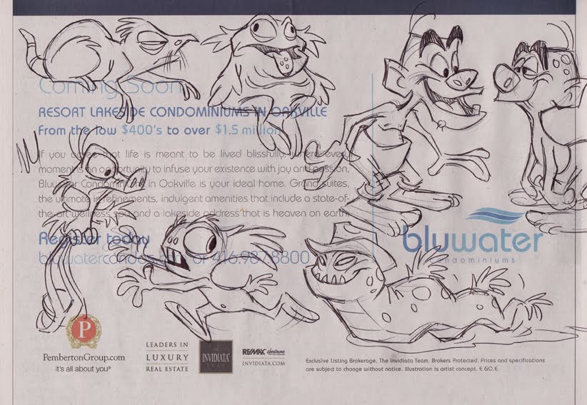
Here's something I rarely ever do - draw imaginary beasties off the cuff like this. I reckon I've always gravitated to cartooning and caricaturing that which really exists, maybe because I like the discipline of using reality as a springboard, rather than just creating life from scratch. Anyway, this is a rare unguarded moment of pure, polyunsaturated whimsy, so enjoy it while it lasts.
I saw this over on Cartoon Brew yesterday and was so impressed with it that I felt compelled to comment on it here. It's just a short promo for the Palm Springs International Short Fest, yet somehow it has excited me more than any animated feature has in recent years. It was created by a studio called MAKE in Minneapolis, and the director/lead animator was Andrew Chesworth. Interestingly, all of the comments over at Cartoon Brew have been enthusiastically positive in their praise of the film - which is an unusual situation at The Brew, where there is generally mixed feelings on most animated clips posted. Anyway, watch it first, then I'll discuss it:
Here's why I like it so much. First of all, it's a spoof of that oh so familiar scene in 40's film noir where the damsel in distress shows up at the office of the hardboiled private detective begging him to take the case. Strangely, film noir has never been done in a full animated feature, the closest thing being the animation/live action hybrid, Who Framed Roger Rabbit, so I think it's a genre that would be ripe for an animated feature. And like this short, I'd want to see that feature animated in glorious, traditional, hand-drawn animation, not CG! Take a look at the overall style of this short - it's so unabashedly a cartoon. The characters are all highly caricatured and stylized: the hero in bold angular outlines and blocky shapes, the femme fatale all in sexy curves. The animated movement is equally cartoony in it's timing. Also, look at how distinct all of the character designs are and how they communicate immediately to the viewer what those characters are all about. The hero is reminiscent of tough guy actors with chiseled features like George C. Scott or Richard Conte. He's not one of those pretty boy metrosexuals that have been dominating animated features for the last 20 years. Neither is the girl generic in any way. Her features are exaggerated to show her sexiness and her deceptive personality - look at that imposing jawline that shows her to be a tough cookie. I also love the highly designed curly hair, as it shows what drawn animation can do so much better than CG, which is a slave to literal form. I hope that my Sheridan students are taking note, as this short film is a great example of what I'm always stressing to see in your Character Design assignments.
As far as I'm concerned, this short is a breath of fresh air, so different from the stagnation of semi-realistic character design that we've been seeing in so many hand-drawn features of the last 15 to 20 years. Interestingly, John Kricfalusi has been taking a stab at the generic male leads that are all looking too similar, culminating in the latest attempt in the upcoming Tangled, with the hero, Flynn Rider. I happen to agree with much of what John says in this regard, as I'm getting damn tired of what I've come to call the "Rock Star" look of all male leads in the latter-day films of Disney, Dreamworks, and a few other studios. Disney artists should check out some classic Hollywood films of the past and start studying real men like Gregory Peck, Gary Cooper, Cary Grant, Gene Kelly, etc. etc, so as to get away from this current trend of designing longhaired metrosexuals. This short film with the film noir detective hopefully will inspire some more satisfying heroes in future animated features. My sincere congratulations to Andrew Chesworth and his talented crew for creating a small gem of animated brilliance!
I make no bones about the fact that I love to draw cute characters. Cartoons that are cute and appealing are what I grew up with, and I still far prefer that over the ugly schlock of today, therefore that is what I gravitate towards in my own cartooning. Here are some more examples of recent doodles that explore that theme.
In the one above, I decided to scribble out several animated poses of the same little guy bouncing his basketball. Though I have never animated per se, I have always enjoyed bringing a character to life through continuity poses and expressions. Of course, this is the essence of what I have done for many years in illustrating children's books for Disney. Ideally I would love to start illustrating books with my own characters, but I'm not sure that children's book publishers even like cartoons anymore. Regrettably, they seem to have forgotten that the most famous kids' illustrator of all time, Dr. Seuss, was in fact a cartoonist.
These were a couple of quick impressions I scribbled of other diners at the restaurant I was at several weeks ago. The old guy reminded me a bit of Ed McMahon and the young girl had similar features to Drew Barrymore. The cat was not actually in the restaurant, but snuck into my doodling just the same.
Okay, I guess these ugly rascals can't be called "cute", but they were fun to draw. After finishing up a Suduko, I started aimlessly doodling a couple of ugly mugs, which then led to a whole series of unsavory mobster types appearing around the edge of the puzzle. I particularly like the psychotic looking fellow in the lower right corner and the wall-eyed rascal in the top middle. The whole exercise was really meant to explore facial features of varying shape, size and relative placement on various head shapes, which is something I stress constantly in my Sheridan College Character Design class.
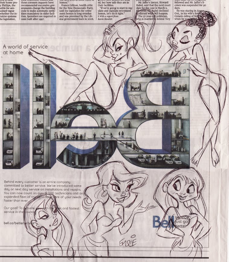
Here's a bunch more of my recent newspaper doodles drawn in blank areas of my daily Globe and Mail over a succession of leisurely lunches at my favourite local eateries. The oddly dyslexic Bell Canada ad pictured above seemed to offer up an interesting layout in which to fit a bevy of cute showgirls. It started out with just the one in the lower right, then led to one after another as my pen meandered clockwise around the page.
Uh oh, I think the guy in the above photo may be in trouble now that the gal's cartoon hubby has unexpectedly walked in the door! The family pets apparently never liked the rascal anyhow.
As for the following images, I believe that any product will sell better if the corporation hires cute cartoon gals to hawk its wares:
Usually I reserve this blog to just show my finished art, or maybe something in progress for a tutorial. Perhaps once in awhile though, I might post some of my doodles just for fun. Here are some recent doodles, mostly sketched while having lunch and reading my daily Globe and Mail at a favourite restaurant. After reading all the news I'm interested in, I'll start sketching aimlessly in whatever patches of bare space I can find among the pages of the newspaper.
My favourite subject matter is cartooning the human face, as I love to explore the myriad shapes, sizes, and relative placement of facial features on various head shapes. Admittedly, most of my doodles end up being of cute cartoon girls, as that is a subject I can never tire of drawing! The great thing about doodling on newspaper is that it is so completely inviting and tempting. Unlike doodling on clean white fresh pages in a sketchbook, which can be rather intimidating due to the commitment of the act, sketching on newspaper is just like getting more use out of something that was destined for the recycling bin anyway. Also, there is nothing quite so pleasing as the feel of a ballpoint pen on soft, padded newsprint.
I especially like to doodle because I feel I can draw completely in my own natural style, as loose, spontaneous and free of the constraints I might place on myself when drawing for a paid commission, particularly when the client is expecting something to look a certain way. When one doodles, there is the distinct pleasure of knowing that you are doing it just for yourself, not subject to anybody else's approval nor what they would be willing to pay for it. No, you yourself are the only one to satisfy and, heck, even if you don't like it, you haven't invested much time or effort in creating it. If it's good, maybe you'll file it away for future reference, and if not, it joins the rest of the newspaper in the aforementioned recycling bin.
More cute girls. (Hey, how did that one funny looking guy get in there?)
Often, these cute cartoon girls make an appearance right after I've solved my Sudoku puzzle. Could somebody please check to make sure I put all the numbers in the right place? Thanks...
Well, only touching briefly on the subject, to be honest.
I've been associated with Visual Arts Brampton for about 7 years or more now, and I can most often be found there on Tuesday evenings for the open workshops in life drawing. Visual Arts Brampton, or VAB for short, is located on the east side of Hurontario immediately north of Steeles in Brampton Ontario, just a short drive away from where I live in adjacent Mississauga. Keith Moreau runs this art studio that offers art lessons and open drawing sessions to the general public, and I'd like to encourage those in the Brampton area to come out and join us for some life sketching on Tuesday evenings, 7:00 pm to 9:30 pm. It's only $10 per session with no obligation to sign up for anything - just drop by when you're of a mind to. I've posted some of my more caricatured approaches to life drawing previously, which may be found here. I think I may soon be posting more samples, as I've got a ton of them stockpiled. Also, here are a couple of caricatures pictured below I drew of aspiring young artists who have joined us in past sessions.
Something else Keith and I have been starting to venture into is doing some test runs at cartooning tips on video. To be honest, they're pretty rough attempts so far, as nothing has been scripted at all and I have a tendency to ramble a bit in my somewhat awkward stammering way of speaking! But we're just trying out things in the hopes of developing it more down the road. Anyway, here is our first attempt at something pretty much on the fly that Keith's son Nick has videotaped and uploaded to YouTube for now. Funnily enough, although I'm quite comfortable standing up in front of a classroom full of students at Sheridan College, I'm pretty damn self-conscious in front of a rolling camera! No Oscars for acting in my future, I'm afraid...
These are just a couple of recent pics I sketched in pencil, then scanned and coloured up in Photoshop. Both of these young ladies are subjects to be drawn on the National Caricaturist Network forums. I'm not much of a digital painter, I'm afraid, but I do like to add some quick colour to my drawings with the Photoshop program. I was also trying out one of the texture brushes on the backgrounds of these two caricatures. As I am also currently teaching about diversity in face and body design for animated characters, I offer up these sketches as two examples of attractive young women with extremely different features. There is such a wealth of variety to be found when you study what real people actually look like, so there is really no excuse for sticking to the same time-worn template whenever you are trying to come up with a new character design. By taking an honest look at people, you may then observe and analyze the differences in head/face shapes, as well as the relative placement, size and shape of all the individual features.
Something else I wanted to make note of at this time is something that John Kricfalusi had posted recently on his blog, "All Kinds of Stuff". He has written about the cartooning tips in the Famous Artists Cartoon Course which, though it dates back to the 50s, is still as relevant today insofar as showing practical drawing principles. I would particularly like to direct my Sheridan Animation students to these notes, as some of them relate very closely to many of the things I have been specifically talking about in my Character Design course in recent weeks. Here is the direct link to the original source of these pages.
Here's a little character I've been playing with for awhile. I've had an idea for a story that's been kicking around in my noggin involving a squirrel and some birds. I'm hoping to develop it into a children's book. Anyway, this is the rough prototype for the rascal. (Actually, I think in several expressions he sort of looks like me!)
I'm posting these sketches as an example of what I am always suggesting to my Sheridan Animation students. That is, before finalizing a character design you should take it out for a "test drive" to see how it's working. A common mistake I've found is that a student will draw one or two views of a character and be instantly sold on it. I maintain that you should never nail down a character design until you've sketched it many times over, trying it out in various animated poses. Many's the time that I've found that a design that looked good to me initially proved to be awkward to move around into different poses. When that happens, always be prepared to make whatever modifications that may be necessary to make it work better.
In these 2 sets of sketches, I've just allowed my stream of consciousness to take over, doodling my squirrel in whatever pose and attitude that happens to flow out of my pencil naturally. None of these sketches are finished in any way and they may not even show him in altogether consistent proportions. In fact, sometimes I find that more ideal proportions may develop quite naturally through the repetition of drawing him out in different poses. Likewise, the facial features may evolve into a more appealing design through trying various moods and expressions, as well as tilts and angles of the head. Even my approach to construction is looser at this stage. To dwell too much on structure right away would be a hindrance to developing him as a little personality.
For me, this is what is most fun about drawing. I love to just do little rough sketches like these to get a performance on paper. Admittedly, I am much happier having made a career being a cartoonist in the print medium. The only way I would want to be involved in animation is if I could draw in this "organic", fully dimensional way that pleases me. I'm not much of a fan of today's flat, graphic styles, I'm afraid.
I've worked as a cartoonist in the print medium for over 30 years, including 10 years as a Character Artist with the Disney Company. For 11 years I taught Character Design in the Animation program at Sheridan College. Currently, I freelance for various clients with my cartoon and caricature illustration.
Though my feet may be physically planted in this 21st century, my mind prefers to take up residence in the 1960's - a time when everything in commercial art and popular entertainment still made sense to me. It was Sinatra's world and I'm still livin' in it. Welcome to The Cartoon Cave...