Have you ever noticed how much teenybopper sensation Justin Bieber looks like that poster child of the checkout aisle tabloids, Bat Boy? This interesting revelation hit me recently when I saw this caricature by John Kricfalusi of the mop-topped little knucklehead. It immediately put me in mind of Bat Boy, who I believe is currently still on his mission of helping the U.S. military hunt down Osama Bin Laden in the caves of Afghanistan. Some quick Google searches turned up photos of both parties that I have combined here to prove my theory:
I swear, they're practically twins, save for the mop-top hairdo. Of course, even that small discrepancy can be easily remedied with the help of Photoshop. So here now is my Frankensteined cobbling together of the two images, resulting in "Bat Beeb":
Pretty cute, huh? Bat Beeb is sure to have all those pre-teen girls swoonin' over him, wishing they could give his big pointy ears a loving tweak. By the way, speaking of the Bieber kid, the overrated little twerp is playing tonight at Toronto's Air Canada Centre. My readers from around here may want to avoid that area of downtown until tomorrow. You have been warned.
I grew up with MAD Magazine during its glory days of the 1970's, so it remains very much a part of what influenced me early on in my artistic yearnings. In fact, I credit MAD Magazine specifically as being the determining factor in my choosing to pursue a career as a print cartoonist over that of an animator after I finished school and had to make a decision on my career path. I still have every issue from about 1971 on up until sometime in the late 80's when I felt it was starting to decline a bit. I would occasionally pick it up in the years since (though not now), as many of my favourite cartoonists were still contributing their talent to it, including the following "Usual Gang of Idiots":
Here's a cover by Mort Drucker. It wasn't too often that Mort illustrated the covers, so it was a real treat whenever he did one, adding some watercolour to his distinctive pen and ink linework. Mostly, Mort drew in the interior pages illustrating the MAD movie satire, presenting a caricatured comic book version of a new movie release. Mort has a huge following even today, and I'm glad to see the very talented Tom Richmond carrying on the movie satires tradition since Mort has gone into semi-retirement.
This is a page from Jack Davis, my personal favourite of all the MAD cartoonists. Back in the 70's Jack Davis's art was everywhere: MAD, Time and TV Guide covers, magazine ads for various companies, even record album jackets. The guy was incredibly prolific and his art just sparkled with fun, personality, and great humour.
Paul Coker, Jr. had a delightful style, and I used to borrow all sorts of tricks from his great pen and ink textures and use them in my own work back then. In addition to MAD, Paul was a popular cartoonist in the greeting cards market, as well as being the main designer that Rankin-Bass employed to create the art stylings of their stop-motion animated puppet holiday TV specials. (And also the hand-drawn Frosty The Snowman!)
All my friends were really into the wacky cartoons of Don Martin back in those days. A pure cartoonist with a distinctive style, Don Martin also had a flair for creating descriptive words that expressed the appropriate sound effect for everything that happened in his strips. Tragically, we lost Don a few years ago.
Antonio Prohias was a Cuban who somehow got out and made his way to America, where he rose to fame creating Spy vs. Spy, a satirical commentary on the absurdity of the longtime Cold War still going on at that time. To be honest, I often found his artwork to be a bit visually busy, and usually it took me more than one read to follow what was going on. (This is one of his clearer examples, which is why I scanned it in to show here.) However, I loved his great thick and thin ink line and bold graphic approach.
Which now brings me to my main reason for posting this stuff today. I just recently saw this promo clip posted on Cartoon Brew, which shows various animated snippets from a new MAD cartoon series coming up on The Cartoon Network:
To be blunt, I am very disheartened by what I see here. While I understand the sad reality of less and less money being put into creating anything for TV these days, especially animated, I don't think everything can be blamed solely on those diminished show budgets. Yes, it's typical of the "symbol" based animation that's employed on pretty much every show these days, with Flash, ToonBoom or similar software. And, yes, I'll admit that I am biased against this highly limited, "cutout" style and make no apologies for that. Yet, I have seen a number of shows that use these programs but still have a very professional graphic design style despite the symbol limitations.
Unfortunately, I can't be that generous in my assessment of what I see in these clips that I have to assume are quite representative of the look of the series itself. Animation aside, everything I see here is just poorly drawn. The characters look like they're drawn at the high school level, with awkward form and hastily traced outline; the layouts show poor composition and naive perspective (as opposed to deliberately skewed perspective like what Maurice Noble used to skillfully do.) It's rank amateurism that cannot be blamed completely on the lack of production dollars. And before I get bombarded with howls of protest from those who animated on the show under tight deadlines, may I point out that the newspaper doodle of imaginary critters in my last post was sketched in no more than 15 to 20 minutes tops over lunch. Yes, if kept simple, decent cartoons can be drawn in a short amount of time. Considering the repeated use of "symbol" animated pieces, there's really no excuse for not taking a bit of time to draw relatively simple cartoons like Spy vs. Spy and Don Martin and get them right from the get go.
In contrast, just take a look at this Spy vs. Spy segment that was animated for the MAD TV series that started in the mid 90's:
Frankly, I'm highly impressed with that series of short animated bits, as they were pretty full animation considering it was for TV. They're expertly drawn with a strong graphic look, retaining the comic's distinctive thick to thin linework. The background layouts are simple but dynamically staged, and the entire production reads clearly with visual appeal. In short, it looks like the work of skilled cartoonists, who, back then were still allowed to actually draw! How much we've lost even since then, going cheaper and cheaper, and having become way too dependent on the computer to do so much of what was done far better by the hand of an artist.
Sorry I haven't been updating more regularly. You folks must be really sick of looking at those two kids in the hair nest by now, so here's something else to peruse. The top doodle is the result of me just trying out a new flexible brush marker I picked up today. One face just led to another until the paper was well covered. I love the thick and thin variation that you can get with those things!
Just some more random head doodles. I really enjoy playing with the underlying design of a face, varying the shape, size, and relative placement of the features, creating contrasting character types.
This one is actually a bunch of heads I sketched from real people while having breakfast at Denny's. This is something I strongly recommend in order to build up a variety of facial types in your sketchbook. I also strongly recommend breakfast at Denny's, but not so often that you clog up your arteries with that country gravy!
Just stream of consciousness at work, letting my pen do whatever the ad seems to inspire it to do.
Watch out, Miss Muffet! Just tuffet out, kiddo!
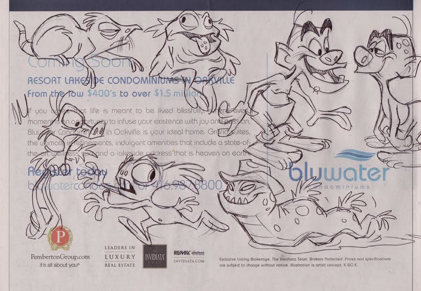
Here's something I rarely ever do - draw imaginary beasties off the cuff like this. I reckon I've always gravitated to cartooning and caricaturing that which really exists, maybe because I like the discipline of using reality as a springboard, rather than just creating life from scratch. Anyway, this is a rare unguarded moment of pure, polyunsaturated whimsy, so enjoy it while it lasts.
I came across this poster image earlier today for the upcoming Disney release, Tangled. Now, having seen both this and the recent theatrical trailer for the film, I have to say that I am not too impressed with what it's shaping up to be. As most of you know, Tangled is the new title for the film formerly known as Rapunzel. Why the silly title change? Well, it seems that the Disney brass are nervous about putting out another animated film with a girl's name as the title out of fear that it will turn off the boys in their targeted demographic. Personally, I think their decision is ill-advised.
When the trailer came out about a month or so ago, I was not very happy with what I saw (and heard). Overall, there seems to be a jokiness to the film - particularly a "cool and hip" sarcastic quality to the dialogue and expressions of the hero, Flynn Rider. Also, the trailer includes an inane pop/rock song playing over the action, which really has me worried about the mindset of this film. Interestingly, in the comments I've read on sites like Cartoon Brew and The Animation Guild blog, several commenters who claim to have worked on the film are doing their utmost to assure us all that the pop/rock song is not in the soundtrack, and that all of the music score is provided by Disney stalwart, Alan Menken. They also claim that the scene where Rapunzel traps Flynn limb by limb in her long golden locks is not actually in the film either, just animated for this "teaser" trailer. Fair enough, I suppose, although I wonder why they would spend all that time and effort to animate something exclusively for the trailer when I'm sure all of the artists are working long hours just to get the film completed on schedule. Doesn't make much sense to me, I'm afraid.
They go on to say that Tangled will be sincere in its storytelling, just as previous Disney fairy tales have been. If what these commenters say is true, then why is Disney's Marketing department so hell-bent on promoting this film as what it is not, instead of what it is? Because judging from both the trailer and this poster, the film seems more cynical than sincere, with all of the hip attitude that many of us have come to loathe in today's "entertainment". I'd like to believe that the film will be more in keeping with its classic hand-drawn predecessors in tone rather than emulating the schlocky Shrek saga. But frankly, I'm not convinced, and I suspect many others aren't either. And that's a real problem that the Studio is going to have to address head on.
I make no claim to know anything about the pecking order at Disney, but I'd assumed that, as head of Disney Animation, John Lasseter was the man in charge, answering only to Disney CEO, Bob Iger. If this is so, then John needs to get tough with Disney's merry Marketeers because, due to their misguided marketing they are undermining the integrity of this film and putting at risk all of the hard work of the animation staff in trying to create something of worth. John should be fighting them tooth and nail, using whatever professional clout he has (and I have to believe that's a formidable amount). And Bob Iger needs to support him on that, and not just go along with Marketing's efforts to promote this like a stupid teen comedy. Honestly, I really wonder about Disney these days.
I've worked as a cartoonist in the print medium for over 30 years, including 10 years as a Character Artist with the Disney Company. For 11 years I taught Character Design in the Animation program at Sheridan College. Currently, I freelance for various clients with my cartoon and caricature illustration.
Though my feet may be physically planted in this 21st century, my mind prefers to take up residence in the 1960's - a time when everything in commercial art and popular entertainment still made sense to me. It was Sinatra's world and I'm still livin' in it. Welcome to The Cartoon Cave...
 I swear, they're practically twins, save for the mop-top hairdo. Of course, even that small discrepancy can be easily remedied with the help of Photoshop. So here now is my Frankensteined cobbling together of the two images, resulting in "Bat Beeb":
 Pretty cute, huh? Bat Beeb is sure to have all those pre-teen girls swoonin' over him, wishing they could give his big pointy ears a loving tweak. By the way, speaking of the Bieber kid, the overrated little twerp is playing tonight at Toronto's Air Canada Centre. My readers from around here may want to avoid that area of downtown until tomorrow. You have been warned.


