Saturday, August 21, 2010

Fun With Photoshop

Have you ever noticed how much teenybopper sensation Justin Bieber looks like that poster child of the checkout aisle tabloids, Bat Boy? This interesting revelation hit me recently when I saw this caricature by John Kricfalusi of the mop-topped little knucklehead. It immediately put me in mind of Bat Boy, who I believe is currently still on his mission of helping the U.S. military hunt down Osama Bin Laden in the caves of Afghanistan. Some quick Google searches turned up photos of both parties that I have combined here to prove my theory:

I swear, they're practically twins, save for the mop-top hairdo. Of course, even that small discrepancy can be easily remedied with the help of Photoshop. So here now is my Frankensteined cobbling together of the two images, resulting in "Bat Beeb":

Pretty cute, huh? Bat Beeb is sure to have all those pre-teen girls swoonin' over him, wishing they could give his big pointy ears a loving tweak. By the way, speaking of the Bieber kid, the overrated little twerp is playing tonight at Toronto's Air Canada Centre. My readers from around here may want to avoid that area of downtown until tomorrow. You have been warned.

Thursday, August 19, 2010

MAD... And Just Plain SAD

I grew up with MAD Magazine during its glory days of the 1970's, so it remains very much a part of what influenced me early on in my artistic yearnings. In fact, I credit MAD Magazine specifically as being the determining factor in my choosing to pursue a career as a print cartoonist over that of an animator after I finished school and had to make a decision on my career path. I still have every issue from about 1971 on up until sometime in the late 80's when I felt it was starting to decline a bit. I would occasionally pick it up in the years since (though not now), as many of my favourite cartoonists were still contributing their talent to it, including the following "Usual Gang of Idiots":

Here's a cover by Mort Drucker. It wasn't too often that Mort illustrated the covers, so it was a real treat whenever he did one, adding some watercolour to his distinctive pen and ink linework. Mostly, Mort drew in the interior pages illustrating the MAD movie satire, presenting a caricatured comic book version of a new movie release. Mort has a huge following even today, and I'm glad to see the very talented Tom Richmond carrying on the movie satires tradition since Mort has gone into semi-retirement.

This is a page from Jack Davis, my personal favourite of all the MAD cartoonists. Back in the 70's Jack Davis's art was everywhere: MAD, Time and TV Guide covers, magazine ads for various companies, even record album jackets. The guy was incredibly prolific and his art just sparkled with fun, personality, and great humour.

Paul Coker, Jr. had a delightful style, and I used to borrow all sorts of tricks from his great pen and ink textures and use them in my own work back then. In addition to MAD, Paul was a popular cartoonist in the greeting cards market, as well as being the main designer that Rankin-Bass employed to create the art stylings of their stop-motion animated puppet holiday TV specials. (And also the hand-drawn Frosty The Snowman!)

All my friends were really into the wacky cartoons of Don Martin back in those days. A pure cartoonist with a distinctive style, Don Martin also had a flair for creating descriptive words that expressed the appropriate sound effect for everything that happened in his strips. Tragically, we lost Don a few years ago.

Antonio Prohias was a Cuban who somehow got out and made his way to America, where he rose to fame creating Spy vs. Spy, a satirical commentary on the absurdity of the longtime Cold War still going on at that time. To be honest, I often found his artwork to be a bit visually busy, and usually it took me more than one read to follow what was going on. (This is one of his clearer examples, which is why I scanned it in to show here.) However, I loved his great thick and thin ink line and bold graphic approach.

Which now brings me to my main reason for posting this stuff today. I just recently saw this promo clip posted on Cartoon Brew, which shows various animated snippets from a new MAD cartoon series coming up on The Cartoon Network:


To be blunt, I am very disheartened by what I see here. While I understand the sad reality of less and less money being put into creating anything for TV these days, especially animated, I don't think everything can be blamed solely on those diminished show budgets. Yes, it's typical of the "symbol" based animation that's employed on pretty much every show these days, with Flash, ToonBoom or similar software. And, yes, I'll admit that I am biased against this highly limited, "cutout" style and make no apologies for that. Yet, I have seen a number of shows that use these programs but still have a very professional graphic design style despite the symbol limitations.

Unfortunately, I can't be that generous in my assessment of what I see in these clips that I have to assume are quite representative of the look of the series itself. Animation aside, everything I see here is just poorly drawn. The characters look like they're drawn at the high school level, with awkward form and hastily traced outline; the layouts show poor composition and naive perspective (as opposed to deliberately skewed perspective like what Maurice Noble used to skillfully do.) It's rank amateurism that cannot be blamed completely on the lack of production dollars. And before I get bombarded with howls of protest from those who animated on the show under tight deadlines, may I point out that the newspaper doodle of imaginary critters in my last post was sketched in no more than 15 to 20 minutes tops over lunch. Yes, if kept simple, decent cartoons can be drawn in a short amount of time. Considering the repeated use of "symbol" animated pieces, there's really no excuse for not taking a bit of time to draw relatively simple cartoons like Spy vs. Spy and Don Martin and get them right from the get go.

In contrast, just take a look at this Spy vs. Spy segment that was animated for the MAD TV series that started in the mid 90's:


Frankly, I'm highly impressed with that series of short animated bits, as they were pretty full animation considering it was for TV. They're expertly drawn with a strong graphic look, retaining the comic's distinctive thick to thin linework. The background layouts are simple but dynamically staged, and the entire production reads clearly with visual appeal. In short, it looks like the work of skilled cartoonists, who, back then were still allowed to actually draw! How much we've lost even since then, going cheaper and cheaper, and having become way too dependent on the computer to do so much of what was done far better by the hand of an artist.

Tuesday, August 17, 2010

Oodles More Doodles

Sorry I haven't been updating more regularly. You folks must be really sick of looking at those two kids in the hair nest by now, so here's something else to peruse. The top doodle is the result of me just trying out a new flexible brush marker I picked up today. One face just led to another until the paper was well covered. I love the thick and thin variation that you can get with those things!

Just some more random head doodles. I really enjoy playing with the underlying design of a face, varying the shape, size, and relative placement of the features, creating contrasting character types.

This one is actually a bunch of heads I sketched from real people while having breakfast at Denny's. This is something I strongly recommend in order to build up a variety of facial types in your sketchbook. I also strongly recommend breakfast at Denny's, but not so often that you clog up your arteries with that country gravy!

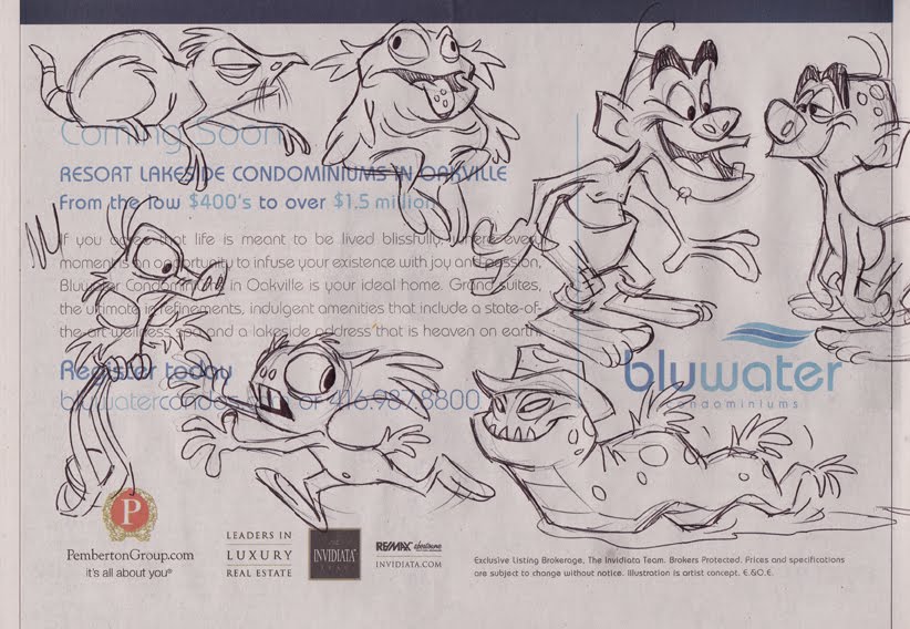
Just stream of consciousness at work, letting my pen do whatever the ad seems to inspire it to do.

Watch out, Miss Muffet! Just tuffet out, kiddo!

Here's something I rarely ever do - draw imaginary beasties off the cuff like this. I reckon I've always gravitated to cartooning and caricaturing that which really exists, maybe because I like the discipline of using reality as a springboard, rather than just creating life from scratch. Anyway, this is a rare unguarded moment of pure, polyunsaturated whimsy, so enjoy it while it lasts.

Sunday, August 1, 2010

Mangled


I came across this poster image earlier today for the upcoming Disney release, Tangled. Now, having seen both this and the recent theatrical trailer for the film, I have to say that I am not too impressed with what it's shaping up to be. As most of you know, Tangled is the new title for the film formerly known as Rapunzel. Why the silly title change? Well, it seems that the Disney brass are nervous about putting out another animated film with a girl's name as the title out of fear that it will turn off the boys in their targeted demographic. Personally, I think their decision is ill-advised.

When the trailer came out about a month or so ago, I was not very happy with what I saw (and heard). Overall, there seems to be a jokiness to the film - particularly a "cool and hip" sarcastic quality to the dialogue and expressions of the hero, Flynn Rider. Also, the trailer includes an inane pop/rock song playing over the action, which really has me worried about the mindset of this film. Interestingly, in the comments I've read on sites like Cartoon Brew and The Animation Guild blog, several commenters who claim to have worked on the film are doing their utmost to assure us all that the pop/rock song is not in the soundtrack, and that all of the music score is provided by Disney stalwart, Alan Menken. They also claim that the scene where Rapunzel traps Flynn limb by limb in her long golden locks is not actually in the film either, just animated for this "teaser" trailer. Fair enough, I suppose, although I wonder why they would spend all that time and effort to animate something exclusively for the trailer when I'm sure all of the artists are working long hours just to get the film completed on schedule. Doesn't make much sense to me, I'm afraid.

They go on to say that Tangled will be sincere in its storytelling, just as previous Disney fairy tales have been. If what these commenters say is true, then why is Disney's Marketing department so hell-bent on promoting this film as what it is not, instead of what it is? Because judging from both the trailer and this poster, the film seems more cynical than sincere, with all of the hip attitude that many of us have come to loathe in today's "entertainment". I'd like to believe that the film will be more in keeping with its classic hand-drawn predecessors in tone rather than emulating the schlocky Shrek saga. But frankly, I'm not convinced, and I suspect many others aren't either. And that's a real problem that the Studio is going to have to address head on.

I make no claim to know anything about the pecking order at Disney, but I'd assumed that, as head of Disney Animation, John Lasseter was the man in charge, answering only to Disney CEO, Bob Iger. If this is so, then John needs to get tough with Disney's merry Marketeers because, due to their misguided marketing they are undermining the integrity of this film and putting at risk all of the hard work of the animation staff in trying to create something of worth. John should be fighting them tooth and nail, using whatever professional clout he has (and I have to believe that's a formidable amount). And Bob Iger needs to support him on that, and not just go along with Marketing's efforts to promote this like a stupid teen comedy. Honestly, I really wonder about Disney these days.

"They just can't get my 'tude right!"

Wednesday, July 28, 2010

The 100 Greatest Looney Tunes


The other day I received a copy of Jerry Beck's new book, The 100 Greatest Looney Tunes Cartoons and was asked by the publisher if I might offer up a review. The book presents a sampling of 100 cartoons that Jerry believes are among the studio's best work, although he himself admits there are so many more that are equally as worthy in various ways. All 100 cartoons are pictured and titled alphabetically in little frame grabs at the beginning of the book for easy reference when searching. As I scanned these 100 titles, I estimated that I'm quite familiar with about 50% of the cartoons, and have seen about another 25% at least once, though am less acquainted with them. But there's certainly a number of cartoons that I don't believe I've ever seen at all. I mention this because I make no claim to know the Looney Tunes library anywhere near as well as Jerry Beck does, therefore I will not attempt to compete with his more informed opinion on the films themselves.

The book is interesting both for what it is and what it is not. Let me address the latter part of that statement first. The book is not an authoritative, in-depth analysis of the cartoons, and those expecting as much may be disappointed. If that is what you seek, then you'd be far better off reading Leonard Maltin's Of Mice and Magic or Mike Barrier's Hollywood Cartoons, both of which go into great detail on select notable cartoons from all of the studios of that Golden Era, Warners included. If you want to limit your reading to just the Looney Tunes cartoons, I'd also recommend Steve Schneider's That's All Folks! and Joe Adamson's Fifty Years and Only One Grey Hare (Bugs' films only). But this new book by Jerry Beck is really not attempting to be such an authoritative tome as any of those titles.

This book is more like a book version of a sampler record album. I used to buy a number of such records (and later, CDs) back when I was trying to gain more knowledge of both the jazz and classical music worlds. These albums offered up a sampling of various jazz musicians or classical composers' works that served as a good primer for the newbie listener. Once introduced to various artists through the popular selections of their work, you could then go forth and explore in greater depth that which appealed to you by purchasing complete albums of their music. For a novice cartoon buff, I believe that this book of Jerry's would serve a similar role as a simple and colourful introduction to these brilliant cartoons.

But that's not to say that its appeal should be limited to the novice, by any means. I believe the ideal use for this book is as a companion guide in conjunction with the six volumes of Looney Tunes Golden Collection DVD boxed sets that are currently available to the cartoon buff (which of course, Jerry Beck was also instrumental in bringing to us). As one who has all six sets but admittedly has only watched a few discs and individual titles scattered throughout the whole series, this book makes me want to search out some of these cartoons I've never seen before, most of which are included among the six volumes. Each entry in Jerry's book contains a few stills from the particular cartoon, which is enough to whet one's appetite to seek out individual titles to watch.

As I said, the book is not meant to be an in-depth look at the 100 Looney Tunes cartoons that it profiles. Each title receives just a double page spread consisting of a few stills, a short synopsis, and a brief commentary provided by Jerry or one of his 30 associates within the animation community, including Mike Barrier, Eric Goldberg, John Canemaker, to mention a few. (Even my friend and Sheridan colleague, Mark Mayerson is featured). If I have one criticism, I'd have suggested dispensing with the synopsis, as much of the cartoon plot is repeated in the commentary. It would have been better to have allowed a bit more room for personal thoughts on each title instead.

As I perused all of the titles that Jerry has judged to be among the top 100, I must admit that all of my favourites were included, such as The Rabbit of Seville, One Froggy Evening, High Diving Hare and the rest of the usual suspects. I was also glad to see the inclusion of such unique cartoons as The Three Little Bops and the giddily disturbing Chow Hound. I might question the inclusion of Page Miss Glory, which, aside from the interesting art deco approach, is a cartoon that I suspect is an acquired taste for most viewers. Likewise, I would definitely not consider Hollywood Steps Out to be even a good cartoon, let alone a great one, as all it has going for it is the caricatured movie stars of the time, many of whom would not be recognized today. That novelty aside, the cartoon is poorly scripted and largely unfunny. While the Roadrunner cartoons only rate a couple of entries, and rightfully so, I am perplexed as to why there are no titles featuring Pépe Le Pew and just one with Foghorn Leghorn, as several of the Foghorns in particular are brilliant.

Still, taken as a whole, I'd have to say that Jerry Beck has done an admirable job of distilling the entire library of Warners' shorts into this collection of just 100 titles. The 100 Greatest Looney Tunes Cartoons is available for just $24.95 U.S. and, while a bit more than the four bits to see Fearless Freep, is certainly a bargain at that price. A fun and nostalgic read, if not an overly informative one.

Saturday, July 17, 2010

Ricci Martin


A few weeks ago I put up a few pics taken on my vacation in Las Vegas with my Mom. We saw three shows while we were there, but only one of them I quite liked, the other two I found a bit disappointing. These were smaller shows, not featuring the big name headliners. Although in my opinion, Vegas headliners sure aren't what they used to be, as I really had no great inclination to see any of the name performers who are currently playing there. I sure do wish I'd seen Vegas back in the day when Frank, Dean, Sammy and all of their contemporaries held court. I reckon I was born too late.

Ironically, though, just several days after returning home from vacation, Mom and I went to see an entertainer at Mississauga's Stage West dinner theatre that would be a terrific choice to see headlining a show in Vegas. Ricci Martin is the son of Dean Martin, and for a few years now he has been doing a really lovely tribute to his famous Dad on stage, singing many of Dean's big hits accompanied by a small band. Don't misunderstand, though, as he's not attempting to impersonate his Dad in any way, like you see in those Rat Pack tribute shows. Ricci is blessed with a fine singing voice that is uniquely his own, and so his interpretations of Dean's songs are not trying to compete with his memory.

This was the third time that Ricci had performed here, and so I've also gotten to know Tony Busseri of ARB Productions who is the fellow who has brought in not only Ricci Martin, but other terrific performers I've gotten to see like Bobby Rydell and the legendary Al Martino. Thanks to the generosity of Tony and his business partner Stan, I was able to go backstage after the show to present Ricci with the caricature I did last year of his Dad. I know Ricci was quite thrilled with the gift and was kind enough to pose with me for a photo. We were able to chat for awhile about Dean, Frank and that Golden Age of entertainment that I love so well. I really hope Ricci will come back to perform for us again here in Mississauga, and I heartily recommend his show if he plays in your area too!

Thursday, July 1, 2010

Happy Birthday, Genevieve Bujold!


Today is the birthday of Genevieve Bujold, one of Canada's most celebrated actresses from Montreal, Quebec. Genevieve first gained great acclaim portraying Anne Boleyn in the 1969 film, Anne of the Thousand Days, opposite Richard Burton as King Henry VIII. I drew this caricature for the ISCA forum where members draw the celebrity of the day as determined by their birthday. As it happens, July 1st is also Canada Day (AKA Victoria Day), so it seemed rather appropriate to acknowledge our national holiday with this pic of lovely, dark eyed Genevieve.

Happy Canada Day!

Saturday, June 26, 2010

Viva Las Vegas!

Back in early June, my Mom and I went out to Las Vegas for a week's vacation. Mom's a veteran of Vegas, having been out there nearly a dozen times over the last 20 years. This was my first visit there, however, and I had a heck of a good time! Here's just a few of the more than 400 photos I took. (No, I won't bore you with them all.)

We explored all of the big hotels. Many of them are themed both in exteriors and interiors, in a style reminiscent of Disney's theme parks. I particularly liked The Paris Hotel, as well as Caesars Palace:


We stayed at The Flamingo Hotel, where I made lots of new friends!:


We took a side trip out to Arizona one day to see a great big hole in the ground:


Of course, we had to stop in at Madame Tussaud's to visit with some old friends too. Here I am swingin' with my pallies, Frank, Dean and Sammy:


I hung out with Shirley Maclaine for a bit:


It was great to see one of my favourite gals. Marilyn was of course looking spectacular!:


I swapped card tricks with a magician, providing my own souvenir deck that was kindly presented to me by the friendly folks who line Las Vegas Blvd:


In fact, I used my collector cards to help Hef choose some new girlfriends:


I was even able to spare a few of them for Elvis, who gratefully responded, "Thank yuh, thank yuh veruh much!"


I ran into a few contemporary stars too. Here I am chatting up Angelina, trying to convince her to ditch whatsisname so we can duck out for a night on the town:


Since that didn't end well, I decided instead to give Buffy a hickey:


Finally, Mom and I did our best to help out President Obama with his busy schedule.
"Hello, what's that again? You say you're the Prime Minister of Canada, Stephen Hooper? I'm sorry, but President Obama isn't in right now..."

Monday, June 21, 2010

Happy Birthday, Al Hirschfeld!


If Al Hirschfeld, the celebrated caricaturist were still around today, he would have been hitting his 107th birthday. As it is, however, the old boy passed away back in January 2003, just a few months shy of turning 100! Still, he had an amazing career drawing for many venues over his many decades, and was primarily associated with creating linear depictions of the Broadway shows for his regular stint with The New York Times.

Oddly, though, my first introduction to Hirschfeld's art was through one of the full colour covers he'd illustrated for TV Guide, which depicted the popular variety series, The Sonny and Cher Show, of which I was a big fan in my early teen years. I was entranced with the illustration, as it showed me a very different approach to caricature than what I had been then enjoying in MAD Magazine by the likes of Mort Drucker and Jack Davis. Whereas the two MAD artists drew more of what I call "distorted portrait" caricatures, exaggerating the features, yet still maintaining a sense of anatomical structure ( albeit Davis doing it looser and more cartoony than Drucker), Al Hirschfeld had a more stylistic and playful approach, abstracting the form into simple shapes and flowing lines. I cut out and saved that TV Guide cover and still have it today, as shown here.

I was a pretty bold little guy back then, and I was determined to get a fan letter to Al Hirschfeld, so I wrote to him care of TV Guide, being oblivious at the time to his more famous career illustrating for the Arts section of The New York Times. Well, the good folks at TV Guide actually forwarded my letter to Al, and it wasn't too long before I received a very nice response back from him. I ended up corresponding with him several more times over the next few years and I'll post several of these letters here for all to enjoy:


Some years later I ended up going to New York to freelance for Disney's Character Merchandise art department, the tale of which I'll save for another post. Prior to going there, I was determined to look up Al Hirschfeld when I was in town, and I took down one of my books of his art in the hopes of getting it autographed. After working in the Disney office the first week, I decided to try getting in touch with Al early on the weekend. Sure enough, he was listed in the NYC phone directory, so I gave him a call. Much to my excitement, he answered the phone and, when I explained that I used to correspond with him a few years earlier, he remembered me and told me I should come down to visit him that afternoon in his home studio!

I can still recall my excitement and nervous apprehension as I boarded the transit bus that would let me off within an easy walk of the old brownstone that he lived in. Once there, I rang the bell and was met at the door by Al's sweet wife, Dolly. She said Al was expecting me and that I could just make my way up the two flights of stairs to where he was working in his studio on his latest piece for The NY Times. One thing I recall was all of the framed originals that lined the stairway, including that painted cover featuring Sonny and Cher. So, as excited as I was to get upstairs to meet Al, I was also trying to take in all of the glorious original art I was passing on the way up!

When I got to the top of the stairs, I remember they ended facing into his studio, and there silhouetted by the light of a picture window, sitting in his antique barber's chair at his antique drafting table, was the great man himself, Al Hirschfeld! Though Al tended to have a somewhat stern, no nonsense appearance, he was actually a very warm and generous man, and I think he took a certain delight in showing off a lot of his original art to this young fan. I remember him showing me the piece he was currently working on (a Broadway show featuring Ellen Burstyn, as I recall) and I was struck by the size that he worked at. It seems to me that the illustration board was about 24 x 36, and Al showed me how he built up the thick and thin lines through multiple strokes of the tiny Gillott Crow Quill pen nibs he favoured. He said that the nibs were relatively fragile, and that he might go though nearly a dozen on such a large illustration. Of course, he always finished up a drawing by hiding a few NINA's throughout, as that was the name of his only daughter whose birth he'd celebrated with that novelty, and had continued it on ever since.


He then took a break from what he was working on and proceeded to pull out a bunch of his recent originals from a big steel flat file cabinet. One thing I remember well was when he showed me his annual piece for The NY Times where he would depict notable personalities from different fields, such as movies, literature, science, dance, etc. in a beautifully composed montage of figures. I had a chuckle when he started pointing to the actors depicted, saying "That's whatsisname from that movie, whatchamacallit...", as I suspect that his inability to recall their names was mostly due to his not being particularly impressed with that generation of film stars. After all, I had remembered him stating in one of his books that he always favoured movie stars that were larger than life personalities like W.C Fields and Zero Mostel, and that he found contemporary actors too ordinary and mundane with their more realistic acting styles.

After a while, Dolly called up to Al to let him know it was tea time, a ritual she had retained from her native Germany and that Al was happy to share with her. They insisted I join them for tea and cake and I remember just thinking what a lovely couple they were and how gracious they were to me. Unfortunately, the visit had to end soon after, as Al had to get back to finishing his drawing before sunset, as he always preferred to work by natural daylight rather than incandescent bulbs. Al happily signed my book and he and Dolly bid me adieu.

That afternoon spent with Al and Dolly Hirschfeld will always remain one of the happiest memories of my artistic career. Obviously, Al Hirschfeld's own stylistic approach has heavily influenced my own - I don't deny it. Still, I've tried to learn what I could through studying and analyzing his work, yet applying the approach of forming a "visual impression" of the subject, then abstracting the physical design and inner personality in my own way as much as I can. But he will always be my artistic mentor, his spirit and playfulness of line always helping to guide me in my own work. The caricature that heads up this post was one I drew of him sometime after having visited him. I sent him the original as a thank you gift, and asked if he could send me back the copy with his autograph. As you can see, he also added a NINA in the hair!

Please check out more of Hirschfeld's great caricatures at the website of his official representative, The Margo Feiden Galleries.

Sunday, June 20, 2010

Finally, Something I Like!


I saw this over on Cartoon Brew yesterday and was so impressed with it that I felt compelled to comment on it here. It's just a short promo for the Palm Springs International Short Fest, yet somehow it has excited me more than any animated feature has in recent years. It was created by a studio called MAKE in Minneapolis, and the director/lead animator was Andrew Chesworth. Interestingly, all of the comments over at Cartoon Brew have been enthusiastically positive in their praise of the film - which is an unusual situation at The Brew, where there is generally mixed feelings on most animated clips posted. Anyway, watch it first, then I'll discuss it:


Here's why I like it so much. First of all, it's a spoof of that oh so familiar scene in 40's film noir where the damsel in distress shows up at the office of the hardboiled private detective begging him to take the case. Strangely, film noir has never been done in a full animated feature, the closest thing being the animation/live action hybrid, Who Framed Roger Rabbit, so I think it's a genre that would be ripe for an animated feature. And like this short, I'd want to see that feature animated in glorious, traditional, hand-drawn animation, not CG! Take a look at the overall style of this short - it's so unabashedly a cartoon. The characters are all highly caricatured and stylized: the hero in bold angular outlines and blocky shapes, the femme fatale all in sexy curves. The animated movement is equally cartoony in it's timing. Also, look at how distinct all of the character designs are and how they communicate immediately to the viewer what those characters are all about. The hero is reminiscent of tough guy actors with chiseled features like George C. Scott or Richard Conte. He's not one of those pretty boy metrosexuals that have been dominating animated features for the last 20 years. Neither is the girl generic in any way. Her features are exaggerated to show her sexiness and her deceptive personality - look at that imposing jawline that shows her to be a tough cookie. I also love the highly designed curly hair, as it shows what drawn animation can do so much better than CG, which is a slave to literal form. I hope that my Sheridan students are taking note, as this short film is a great example of what I'm always stressing to see in your Character Design assignments.

As far as I'm concerned, this short is a breath of fresh air, so different from the stagnation of semi-realistic character design that we've been seeing in so many hand-drawn features of the last 15 to 20 years. Interestingly, John Kricfalusi has been taking a stab at the generic male leads that are all looking too similar, culminating in the latest attempt in the upcoming Tangled, with the hero, Flynn Rider. I happen to agree with much of what John says in this regard, as I'm getting damn tired of what I've come to call the "Rock Star" look of all male leads in the latter-day films of Disney, Dreamworks, and a few other studios. Disney artists should check out some classic Hollywood films of the past and start studying real men like Gregory Peck, Gary Cooper, Cary Grant, Gene Kelly, etc. etc, so as to get away from this current trend of designing longhaired metrosexuals. This short film with the film noir detective hopefully will inspire some more satisfying heroes in future animated features. My sincere congratulations to Andrew Chesworth and his talented crew for creating a small gem of animated brilliance!