Photoshop Frustration!
I must admit, I'm still pretty leery of digital artwork. Up to this point, all of my artwork generated on the Mac has been of the hybrid sort: drawn and inked traditionally by hand, then scanned in and coloured up with Photoshop. Notice I said "coloured" as opposed to "painted". You see, I don't consider what I've achieved thus far to be digital paintings - at least not in the truest sense.
Here's a recent example which explains why not. This actually just started out as a test to see if I could create something using the Paths function on Photoshop. Frankly, I've never been able to figure out how to use that nefarious Pen tool, with it's Bezier Curves function. Being a right-brained kind of guy, I just couldn't make sense of those weird little handles. However, one of my students this year at Sheridan, Lawrence Lam, was kind enough to give me a basic tutorial on the different aspects of the Pen tool. I hadn't been practicing since then (about March), so it took a lot of messing around with it a couple days ago to figure it all out again. Fact is, it took me several hours to achieve what l did, so I'm going to have to work with this a lot more to get up to speed! 
First of all, I needed some subject matter to practice on. Let's see now, what should I draw? Hmmm...hey, how about a CUTE GIRL! Fortunately, I'd been downloading pics of The Toronto Sun's daily "Sunshine Girl" for just such an occasion, so I had quite a collection to draw from. Though these pics are all relatively small, I wasn't in great need of visual clarity, as I am not attempting to achieve a perfect caricatured likeness of a specific girl. Anyway, I liked the sunny look of this cute blonde with her ponytails, plus the pose was appealing, so I went with her.
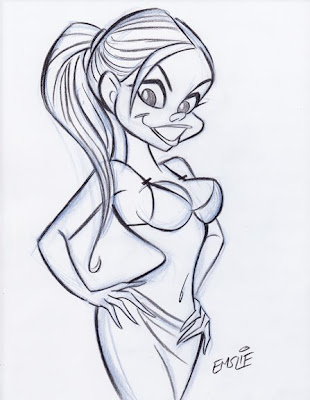
So here is my pencil sketch, starting out with a rough blue underdrawing, then defined on top with a dark pencil outline. (Are you paying attention, Sheridan students?) Like I said, I'm not trying to get a true likeness of this girl like I would with my celebrity caricatures - I'm just trying to capture her essence and using her pose and facial type as a starting point for what will be a much more cartooned interpretation. You can see how I've pushed the pose more, exaggerating the tilts and angles. For some reason, I have no idea why, I just gave her a single ponytail in the back instead of the two that the model has. Anyway, I only spent less than 20 minutes on the drawing, as it really was just for the purpose of this test with the Paths tool.
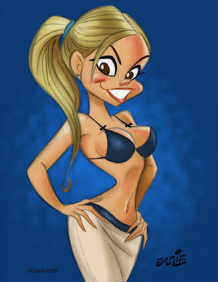
So after creating individual Paths for her flesh, hair, skirt, top, lips, eyes, etc. etc., I was finally ready to start adding colour. Initially I just filled each area with flat colours using the Paint Bucket tool, then started some fairly simple rendering in each area. I did want to try to get away from just using the Airbrush tool, so I used a custom brush that I learned how to make from an online tutorial that gave a more textured sort of rendering, similar to pastel. That, plus some softening here and there with the Airbrush seemed to result in a piece that was fairly appealing. I kept my pencil sketch on a transparent layer on top, lowering the opacity of the linework so it didn't overpower the colour. However, here's where I feel rather handicapped by my minimal knowledge of Photoshop and digital painting.
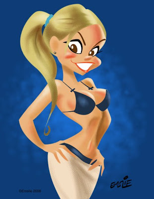
Here is the same artwork with the pencil sketch layer turned off so that just the colour is visible. As you can well see, it doesn't work like this, as it needs the pencil line to pull it all together. Ideally though, I would like to develop my Photoshop skills enough to attempt a real digital painting, using just tonal rendering to create the form, though perhaps using a bit of accent linework to strengthen it here and there. Recently, I've joined the National Caricaturist's Network (NCN), and have been studying the wonderful work of such talented folks as Joe Bluhm, Court Jones and Paul Moyse, just to mention a few. All of these guys are exceptional talents working with both digital and traditional media, but it's their digital work that I'm really trying to learn from. These guys are truly digital "painters" in the very real sense - something that I currently can only aspire to. If anyone can recommend any good sites for simple and clear Photoshop painting tutorials, please feel free to post them here in the comments section. Thanks!
23 comments:
Pete that looks great! You will master the digital painting in no time at all! I still need to master the pencil....hehehe! Keep posting your progress as you go along!
Looks amazing, Pete! Have you tried playing around with a Wacom tablet or Cintiq? I use Painter and find it to do a rather nice job mimicking natural media...
As for great Photoshop tutorial sites, I'd recommend psdtuts.com -it's possibly the BEST Photoshop tutorial site around - well organized and step-by-step tutorials with accompanying images.
Hi Pete,
Like you, my primary background as an artist is/was from the linear, drawing side of things. As time has progressed, I've move more and more into the digital painting realm and have struggled with exactly the same issues you are. I am still on the journey to being what I would call being a painter as opposed to a draftsman. I'm not certain that my advice is useful or correct, but I'll share it with you for what it's worth. Some might be obvious, don't take umbrage if it sounds like I'm talking down.
1. The big difference I've noticed is that drawing is largely about containing and defining form with line (duh), whereas painting defines form continuously. Drawing tends to make us think about edges and ignore the empty space (except as a design element). Painting on the other hand is more about using shapes of varying color to describe how light is being reflected off a form. The difference here is one of the primary "tools" you use to describe form (shapes vs line).
2. A line drawing is a great and often essential way to begin a painting, but at a certain point you might want to jettison it if you are after a painterly effect (as opposed to a colored drawing). As I've progressed in painting, I've found that my initial drawing has become simpler and simpler as I find I do 99% of my drawing "in the paint" now and the foundation drawing is mainly for gesture and composition. Once I have the basic forms blocked in and some basic modeling of the form in, I generally toss the drawing layer. I do this mainly because the lines often obscure the edges of the paint and give you a false sense of the quality of the modeling you've done in color as well as cover up sloppy edges.
3. After ditching the drawing, I focus on refining the forms, sharpening some edges and softening others ( that's a whole lesson in itself). I find this part of the process the most time consuming and often am really worried at the beginning of it because the image looks awful. But take heart and push on. Somehow after a period of fussing, it begins to come together. The main thing is to continue to reinforce the design and form with how light and shadow play across the forms.
One of the most useful and insightful blogs I've found on the theory and practice of painting has been James Gurney's blog: Gurney Journey. The man is a born teacher and takes on topic after after topic from the basic to the profound.
As another aside, I only use the paths tool in Illustrator. It's great for pure vector work where you want that graphic, sharp, snappy quality, but in my opinion questionable in value for making painterly images. Just block in with a brush -it's all going to get mushed around in the end anyway, no need for the super precise line of a vector.
Hey Pete,
You should check out a painting program called Art Rage. It's free to try and only $25 to buy ($39.95 if you want a cd rom version shipped). If you're looking to simulate the look of traditional media, it's fantastic. Also, it's brilliantly designed for ease-of-use. I've been playing around with it and I've been making paintings that look like those early Hanna-Barbera backgrounds. You can make stencils / friskets and color them in with chalk or crayon and it will look like sponging due to the paper texture (which you can customize). Basically it's like a simplified version of Painter. But because it's simplified, I think it's actually better. I can go on and on about how great it is, but then I'll sound like I work for them and you'll think this is spam :)
Here's the url:
http://ambientdesign.com/artrage.html
Hey Pete,
It looks great!
I think it would be a shame to throw away your sense of line completely... as you say, it holds together a drawing like the one you posted...
Personally I would have changed the actual color of the line rather than crank down the opacity of the line itself... mainly so that it will let you have more control over the look of the line...
Easiest way to do that is to select your line layer in Photoshop, click on the first of four buttons right above your layers (they are labelled "Lock:") - the button you want is a checkerboard. This is the lock transparency button. It allows you to only paint on something that is not transparent... so in this case, you can use the brush tool to alter the color of your line in the specific areas that you want the line color to change.. and your brush strokes will only show up on the line. Hopefully I haven't confused you, haha.
That's my photoshop cheese tip of the day.
P.S. is there any particular reason why you are coloring in the flat tones with the pen tool as opposed to using a lasso tool? I find the latter to be much quicker if all you're doing is filling in flats.. especially if you're keeping the line on top of it... and it doesn't require and bezier-curve style brain-bending...
Alan - This really did start out as just a test to see if I could create Paths using the Pen tool. I've tried to use that ornery beast ever since first having an earlier version of Photoshop (as well as Illustrator back then) when I first entered the computer world in 1997. Up until now, I was unable to achieve anything because I couldn't wrap my mind around the way the Pen tool functioned - it was a complete mystery to me.
You're absolutely right - this illustration didn't require Paths in the first place, but like I say, it started out specifically to test my ability at tracing a more complex series of shapes. Once I'd accomplished that, I decided to add colour and make it real pretty! By the way, I was already aware of the transparency lock function in order to just change line colour, but in this case I just wanted to subdue the whole outline quickly. Yeah, it would likely look better painting the various areas of outline in colours that better reflect the areas they contain.
Marc - Yes, I'm very much attuned to the power of the line, and I'm hoping to force myself to try thinking more in terms of painting the form in light, shadow, warm and cool colours, etc. I'm better using real paint, though, as this digital stuff is a rough thing for me to learn, I'm sorry to admit.
Hi Pete,
I am learning PS painting too. As a long-time NCN member, joining and networking with some very generous talents will help you alot! Hope you can make it to our convention in November, they are mind-boggling events that change/enhance one's artistic life!
*smacks forehead*
OHHHH so that's what you meant doing by underdrawings!!
Ha Ha Ha,
Just kidding,
Very cool stuff Mr. Emslie. especially the part of the downloading of SUN girls...I'll have to get on that mailing list, pronto!
Wow!
Between you Pete, Alan's suggestions and Katie's latest inking tips, I've just gotten a major boost in my learning curve.
I think when I move to LA in December, I'm going to take you all out to dinner.... on ME!
Thanks a million, Pete!
- trevor.
Andrew - Yep, I want to see those rough blue lines under there, mister. Hey, I haven't seen you at life drawing in Brampton lately....slacker!
Trevor - I appreciate the offer of dinner, but getting to LA from little ol' Mississauga, Ontario could take me awhile. Feel free to go ahead and order before I arrive, though... :)
I'll send you some take out then, Pete!
I also think the outline-less version is very appealing.
- trevor.
you work is great!!!!
congratulations
Lawrence is a pretty helpful guy, and he's pretty keen on these computer things too!
This painting looks pretty good, Pete! It looks more like paint than your earlier Photoshop pieces have (not to say that you're earlier pieces weren't good). Your drawing of the girl is actually 100% more appealing than the actual fake-tanned over-make-upped original. haha
Your lines are really nice, especially when coloured like that! I can't wait to see more of your paintings (and girl drawings!).
oh man, I miss your class Pete! I love your drawings no matter what, but i think with practise the photoshop will come..there is so much you can do with that program its crazy, and once you get comfortable with it, you can customize your own brushes...which is very handy :)
Hey Rachel!
Actually, I had just started to learn how to make some custom brushes from reading a tutorial by the brilliant caricaturist, Court Jones. He digitally paints in a more opaque manner looking uncannily like a real oil painting when finished. Unfortunately, my Photoshop is currently crashing repeatedly, as it turns out that I need to purchase more RAM and maybe an additional hard drive to meet its insatiable demands for more space. I wish I were as comfortable with computer art as all of you clever students!
hi pete!
just a little tip for photoshop painting : if you set the basic round, hard edged brush to something in the range of 8-18% flow, it behaves a little like acrylic paint. make sure the opacity is 100% otherwise you get watercolours ( sortof ). this is basically how i taught myself to paint with acrylics!
Really nice cartoons! I don't know photoshop enough to recommend anything - I've only tried their inbuilt tutorial. Sorry!
Geez, that photo of the girl looks like it was in photoshop. I thought you liked the natural look, Pete? Nice job with the drawings though.
This looks great Pete! The fact that this is your first "digital painting" is testament to the fact that the skills transfer over smoothly as long as you learn the tools.
Court taught me an awful lot as well. He's got great tutorials buried in the forums at the NCN (I used to be a member). But you've probably found those by now. Looking forward to seeing more paintings!
Oooooh, awesome work as usual, Pete. Photoshop can be a fickle mistress...
Pete, you might laugh at me about this, but I saw this post a while ago now and couldn't think of the right thing to say. Well, I shot out of bed right now like somebody pulled the ability to sleep right out from underneath me. Let me theorize for a little bit, here -
I believe what you're encountering here is a design flaw. If your characters weren't so round and 'geared for animation' you would have established some distinct planes on your figure. You can use those to create hard edge shadows to go along with all your soft ones. What you've got there right now is a lineart that is used to summarize information that won't directly translate into colour.
Anyway, looking forward to you proving me wrong. Love to see what other work you do digitally.
I don't think you needed the reference.. Its a bonus to the readers though. haha
WOW.....I absolutely Love this drawing! You have the most VISUALLY PLEASING style I've ever seen! Boy, Am I glad I bookmarked your blog.
Post a Comment