A Disney Halloween!
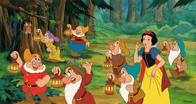
In celebration of Halloween, I thought I'd post a couple of illustrations that I drew and painted about 3 years ago as part of a Disney Halloween book published by Random House, entitled "Don't Go Bump in the Night!" The book offered a series of safety tips to kids by utilizing various characters from both Disney and Pixar films to illustrate them in a fun way. This book can still be ordered here on Amazon.  In this painting of Snow White and the Seven Dwarfs, the point was to show kids how important it is to carry a flashlight in order to see your way in the dark. The characters were drawn on paper and inked traditionally with brush on a transparent sheet of mylar. The linework was then scanned in and coloured with Photoshop (including the outlines) on a layer that was created on top of the background painting that had also been scanned in beforehand. (Click on all images to see them larger.)
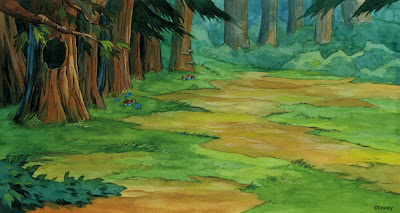
 Here is the background art on its own. I try to paint each background in a style that matches the film itself. In this case, I was trying for a more delicate watercolour look, although I was actually using dilute layers of gouache to achieve the effect.
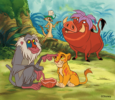
 In this painting of The Lion King, the tip was regarding the recommended use of makeup instead of facemasks that might hinder one's eyesight. This was just a single page illustration, as opposed to the 2-page spread of Snow White above.
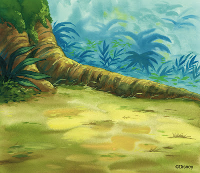
 Again I was trying to match the background style of the film itself, this time using the gouache more full-strength as it was used in the actual film production. By the way, this hybrid approach of traditionally painted backgrounds combined with characters that are traditionally drawn and inked, yet coloured up in Photoshop, is about as much as I would want to involve the computer in my artwork. I do not personally care for the look of digitally painted backgrounds and I also prefer the tactility of real paint on a cold-pressed illustration board. For me, it is all about the aesthetic.
Unfortunately, I can't take credit for the cover of the book, as it was illustrated later by one of Disney's in-house artists, I believe. From what I recall, the design concept for the cover had not been finalized when I had first been sent the project.
9 comments:
awesome work Pete!
i love your inks! I'm trying to learn how to brush ink and it's very hard to get a smooth line and control them. i wanted to ask you if you could give us some advice about it. for example how to properly grab the brush, do you only use one brush or do you have different sizes for details? is it best to go fast or slow? i tend to loose control at the end of the line or in the curves. if i'm inventing something it might end up nice but when tracing it's a disaster! any thing that you can think of will help me a lot!! thanks!!
Hello Julian,
I might actually try to post a lesson on brush inking sometime. It is a tricky thing to master and I'm still figuring it out after 30 years! The approach I have taken on these Disney character illustrations is using a very fine brush, Winsor and Newton, series 7, #00. The reason for this is that I desire a line that looks more like a fine pen line with a very subtle thick to thin variation. When I do my celebrity caricatures, I like to go real bold in the variation of thickness, so I use a series 7, #2. For some reason, coloured outlines tend to look crummy with a really thick, bold approach, yet black outlines look great.
Beautiful paintings!
thank a lot Pete!! i will look forward to that post!!
Hey,
I saw those illustrations before, you have done an amazing job. To tell you the truth I found the book at Sears at Oakville Place, the mall down the street from the college. When I saw it , I thought, "Wow !! this person did such a cool job , but why does it look so familar" ...I turn the book and there was your name, lol. Again really wonderfully illustrations.
Wauw! Like it.
Awesome ink.
Hey Pete,
Terrific work, as always.
BTW, once you have a scan of the inking, how do you paint (color) the characters in Photoshop? The process you use would be interesting. Hope you'll share...
Lovely, background paintings, Pete! Cool that you used traditional gouache to achieve these watercolory looks.
Nice work on spreading a good message, Mr. Emslie. The backgroudns are beautiful.
I had two questions, though: did you do any illustrations of the Pixar movies?
And, second of all, in your experience with Disney books, did you ever work on anything involving Disney's "Tarzan"?
I ask out of curiosity, of course.
-J.
Post a Comment