Wednesday, May 26, 2010
Here's To Jessica Borutski!
This is my caricature of Jessica Borutski, a supremely talented young cartoonist whose work I have admired for several years now. Coincidentally, Jessica resides in Ottawa, Ontario, which also happens to be my old hometown. I first discovered Jessica's work on a cute animated film she created called I Like Pandas. In fact, I have shown samples of Jessica's art in my class on Character Design as examples of great visual appeal, like this one:
Recently however, poor Jessica has found herself caught in the crossfire amid the latest controversy over at Cartoon Brew, this time regarding this image from a new incarnation of the Looney Tunes characters set to debut on TV. Predictably, there were numerous claims that it was "bad design" or "terrible drawing", etc. by all of the usual suspects. Animation fans are a cranky and critical lot to be sure, and I include myself in that description by the way, yet in this case I believe a distinction has to be made. So I'm going to offer up some thoughts from my perspective on the situation.
First of all, even before it came out in the comments, I was pretty certain that I recognized these new designs of Bugs and Daffy as being by Jessica, as the image of Bugs put me in mind of her own cartoons of rabbits and other toothy creatures. Sure enough, it turns out that Jessica was the freelance designer selected by the powers-that-be at Cartoon Network to redesign the classic Looney Tunes characters to meet more contemporary sensibilities. Thus, she has given them a more angular design over all, obviously dictated by her client to be more in keeping with that less rounded, more graphic style that is so prevalent in today's TV cartoons. This approach is also due to the practicality of how these characters are now animated with computer software such as Flash or, in this case I believe, ToonBoom. Instead of full hand drawn animation like that in the classic cartoons, shortcuts are now employed today with characters being created as essentially "cutouts" with replaceable parts to create the animated movement. As I've stated before, I'm personally not an admirer of this approach, yet I'll admit that I have seen some better work created lately through ToonBoom which seems to be a hybrid of both "cutout" (or "symbol") style combined with more traditional inbetweening as is desirable for a somewhat more fluid end result. I'm assuming that this is the approach that is being taken on these new TV cartoons.
Regarding these new designs by Jessica, I'm admittedly of two minds about them. If these designs were of brand new characters with no previous history in cartoons, I believe that these images would be embraced by the majority of animation fans and recognized for how appealing they are in terms of graphic design and feeling of inner life and personality. The problem of course is that these are the Looney Tunes characters, with a long illustrious past in fully animated theatrical shorts that are beloved by all of us who have grown up with them through the many decades since their creation. Most of us would rather that they not be messed with, even though it has to be acknowledged that these characters have all evolved through various permutations before achieving that look from the 1950's that many recognize as the "official" versions. As for this latest artistic makeover to their design, it wouldn't matter who was responsible for it, nor how talented they may be, as longtime Looney Tunes fans are dead set against any changes. And yes, I must include myself in that camp too. Here is a news item that appeared on CBC today that sums up the situation quite well. (Click on the link on the right side of the page to watch the video). Of course, it doesn't help that the reporter starts out by describing the original cartoons as "so 1950's".
So Jessica Borutski just happened to get caught in the critical crossfire, being the one who was commissioned to involve herself and her formidable talent in this no-win situation. Personally, my feeling is this: If it was inevitable that these characters were to be revised to some extent for this new TV show, then I would rather that a terrific cartoonist like Jessica be the one to do it, as the results could have been disastrous in less capable hands, as the ill-fated Loonatics cartoon from several years ago proved. As it is, the new designs are appealing enough on their own merit, and may even succeed in acting as a stepping stone to introduce a new generation of kids to the classic theatrical shorts, many of which are available today on DVD in those great boxed sets that many of us have added to our home video library.
One last point I'd like to make. I wish that the same people who selected Jessica Borutski to redesign Bugs and Friends would now hire her to create original new properties wholly of her own design. For example, here is a very charming series concept that was created and pitched by Jessica and her colleague Chris Dainty called The Constellations. I continue to be amazed by the huge visual appeal of Jessica's work, yet I am frustrated by the entertainment industry's aversion to take a chance on anything new. As an instructor in the Sheridan Animation program, I see so much great talent pass through our doors that will likely never be given the opportunity to reach its full potential. Young, enthusiastic talents like Jessica should be encouraged to create work like this. Enjoy!
Thursday, May 20, 2010
Life Drawing: Charlotte
It's always interesting to draw contrasting body types, and Charlotte is very different from Heather, whom I profiled in my last post. Charlotte has a very sleek, angular body and her poses tend to be equally dynamic and angular, as opposed to the more rhythmic curves in Heather's poses. She must be double jointed as well, as her elbows can bend slightly backwards when her arms are tensed!
Charlotte's also a bit of the goth girl, with several tattoos and a lip piercing. This tends to influence me a lot when I take my more caricatured approach to the longer poses, as I really like to play up her large eyes, high cheekbones and almost "haunted" expression. She's actually a very shy, sweet natured girl, but I like to imagine her as some gothic heroine who would fit right in to a Tim Burton film!
Monday, May 17, 2010
Life Drawing: Heather
This is Heather, one of the life models we've drawn from often over the last few years at Visual Arts Brampton. I've posted a number of my sketches of her previously on this blog. Heather is a trained dancer who brings a lot of that dancing sensibility to her poses, particularly in the quick gestures. Her body type is soft and curvy, lending a rhythmic flow to her gestures, and always with a strong line of action.
I've never been that proficient with longer studies, I'm afraid. Part of this I attribute to not feeling completely in control when using a stick of conté. I often marvel at the sketches pinned up in the display cases at Sheridan, as the Animation students are far better versed on showing solid form through use of conté than I am. Anyway, here are some studies that I am reasonably happy with:
As a lifelong cartoonist, I'm far more comfortable with a pencil in hand, depicting form through outline, varying the line weight with pressure and angle. I also find that I'm happier when I give in to my cartoon sensibilities and caricature the model, as I can capture more inner life and personality that way. Here are some examples of the way I prefer to depict Heather:
Just a reminder to all of my readers who live in the vicinity of Brampton, Ontario, that the open life drawing sessions at Visual Arts Brampton are held every Tuesday evening from 7pm to 9:30pm. Please click on the link listed in the sidebar for more information.
Saturday, May 15, 2010
Happy Birthday, Trini Lopez!
As should be quite apparent here by now, The Cartoon Cave is mostly about nostalgia: my personal recollections of a better era of entertainment. Back in the 1960s, Trini Lopez was one of the entertainers that helped define that era for me. Although my Dad was the one who usually had the records spinning on the family hi-fi, once in awhile my Mom would take control of it and play some of her favourites. I guess she may have liked the latin sound, as she liked to play Trini Lopez and also Herb Alpert and the Tijuana Brass. Anyway, I grew up enjoying that sound too, and I've since acquired those old LPs that I wouldn't let her toss out a few years ago. Mom's happy with CDs and doesn't share my sentimental value of dusty old records!
Trini Lopez had a fun, joyous sound to his music. Sometimes it was uptempo like his rendition of "If I Had a Hammer" or "Lemon Tree". But he could also sing slower tender ballads as well. He recorded on the Reprise Records label created by Frank Sinatra in the 60s. In addition to his singing career, Trini did a bit of acting here and there, including an appearance as himself performing onstage at a nightclub in the Sinatra film, Marriage on the Rocks.
Anyway, over on the ISCA (International Society of Caricature Artists), they're continuing with a forum celebrating a different notable personality's birthday each day. I wish I could keep up with it more regularly than I do, but I decided to do one of Trini, since the mention of his name conjured up such warm feelings of nostalgia of my childhood years. I sketched his face from an old episode of the cop show, Adam-12, in which he had guest-starred. Then I looked at a video posted on YouTube to see him in concert mode to draw his shirt and jacket.
While perusing YouTube, I also came across this neat clip where Trini Lopez appears in a duet with one of my favourite girl singers, warm and lovely Vikki Carr (who I am determined to draw some time for my blog!) I hope this brings back some happy memories for you readers out there of my generation!
Sheridan College Open House 2010 (Part 3)
Wednesday, May 12, 2010
Sheridan College Open House 2010 (Part 2)
Sunday, May 9, 2010
Gordon Brown For PM!!
Yeah, I know that the Brits have already been to the polls to vote, but it turns out there's still no clear winner. Conservative David Cameron may have had the most votes, but not enough to make a clean sweep of it, so sitting PM Gordon Brown still has a chance at keeping his job. Well I say good on Gordo! If it was up to me, I think the Brits should keep him in power. Despite this dour Scot looking like the human equivalent of Eeyore the donkey, I think Gordon Brown is an intelligent and articulate guy who has well proven himself. But more importantly, Gordon Brown has a face that is a gift to all caricaturists!!
I mean, just look at this line-up of the three candidates. David Cameron and his Liberal Democrat opponent, Nick Clegg, are both a couple of blandly handsome young fellows who are virtually indistinguishable from each other! What self-respecting cartoonist would want to draw either one of their generic mugs?
Gordon Brown stands out like a sore thumb next to these two "Ken dolls". And a sore thumb of a face is far more interesting, in my opinion. Look - the bags under his eyes even have bags of their own! (Damn, how'd I miss that in my caricature?)
I mean, really?! Cameron, Clegg? Clegg, Cameron? Your guess is as good as mine!!
Tuesday, May 4, 2010
Happy Birthday, Audrey Hepburn!
I believe that Audrey Hepburn and Marilyn Monroe may be the two most iconic figures who have represented female beauty in the movies. But, while Marilyn was blonde, voluptuous and an image of pure sexuality, Audrey was the more fragile, doe-eyed waif who really captured our hearts. Certainly Audrey Hepburn has always been my favourite actress, and much of her appeal is in that pixieish figure with the big dark eyes. Tragically, Audrey left us in 1993 at the relatively early age of 64, after being diagnosed with stomach cancer. She'd largely retired from films after Robin and Marian in 1976, devoting her last few years to helping the children of the world through her association with UNICEF. Audrey was truly a beautiful woman, through and through - a genuine class act.
Interestingly, Audrey only made about 30 films, and probably not more than 20 of those would be well known to her fans, starting with her Oscar winning role in Roman Holiday in 1953. I've seen all of her major films but two: War and Peace and The Unforgiven, although I do own them on DVD just waiting to be watched. I'd be hard pressed to name my absolute favourite, but My Fair Lady, Funny Face and Charade would be right up there. But then there's so many others that I love too!
One of my earliest movie memories is of seeing My Fair Lady at the drive-in with my parents, though I'm guessing it may have been in a reissue several years after it first debuted in 1964. I've seen it dozens of times since, as I consider it the perfect musical film, despite the fact that poor Audrey didn't get to do her own singing as the cockney flower girl, Eliza Doolittle. She was able to show off all of her talents in Funny Face a few years earlier, though, singing and dancing alongside Fred Astaire. The sequence in the Parisian café, where Audrey, in a black leotard and hair up in a ponytail, does a modern jazz number is just a stunner. She'd had training as a ballerina in her youth and it's really a shame that she wasn't given more opportunities on film to display her incredible dancing ability. As for her singing, though not as notable as her dancing, I still find her voice to be warm and lovely when she sings the wistful and poignant "Moon River" in Breakfast at Tiffany's. Composer Henry Mancini figured out what a comfortable vocal range was for Audrey, and wrote "Moon River" tailored specifically to her admittedly limited range. Frankly, I find it hard not to get misty-eyed when I hear her singing it as she strums her guitar in her Manhattan apartment window. It's a very beautiful sequence.
For my caricature of Audrey Hepburn, I had first started doing some sketches of her (including the one above) from Paris When It Sizzles, in which she costars with William Holden. Though I love her 1960's stylish looks in that film, I must admit that I find the film itself to be one of her weakest. Therefore, I decided to switch my attention to her role in Charade, where she costarred for the only time with the wonderful Cary Grant. This was a team-up on screen that was just meant to be, with the two stars obviously enjoying working with each other immensely. For me, that was Hollywood royalty at its best, and the film itself just sparkles with wit and sophistication.
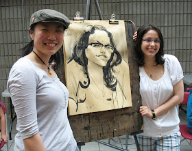
Interestingly, just recently I heard a couple of my Sheridan animation students discussing Charade before class started, as it turns out they're both big Audrey Hepburn fans themselves. And so I would like to dedicate this post to students, Justin Hartley (a fellow classic film buff, pictured in my recent Sheridan caricatures post) and Nicole Kozak, who coincidentally resembles Audrey Hepburn with her big dark eyes, as you can see in this caricature of her at right!
So, now let's end off this tribute to lovely Audrey with the aforementioned scene of her singing "Moon River" from Breakfast at Tiffany's. Enjoy!