Showing posts with label tutorial. Show all posts

Tuesday, April 5, 2022

Happy Birthday, Jim Garner!


 I kept it simple for this year's tribute to my favourite actor, Jim Garner, just drawing one more caricature of him as Jim Rockford from TV's The Rockford Files. However, I thought I'd also give you all some insight as to how I go about creating one of my celebrity caricatures. As I've noted in past articles, I don't rely on just still photos to draw my subjects, preferring instead to study and sketch them from video so as to get more of a sense of their overall design and inner life and personality. But additionally I will go back and pause on a few freeze frames in order to study the structure and surface details in greater depth. Lately I've also been using my digital camera to grab a few reference pics directly from my TV screen. Here are some samples I took to develop this new caricature of Jim.

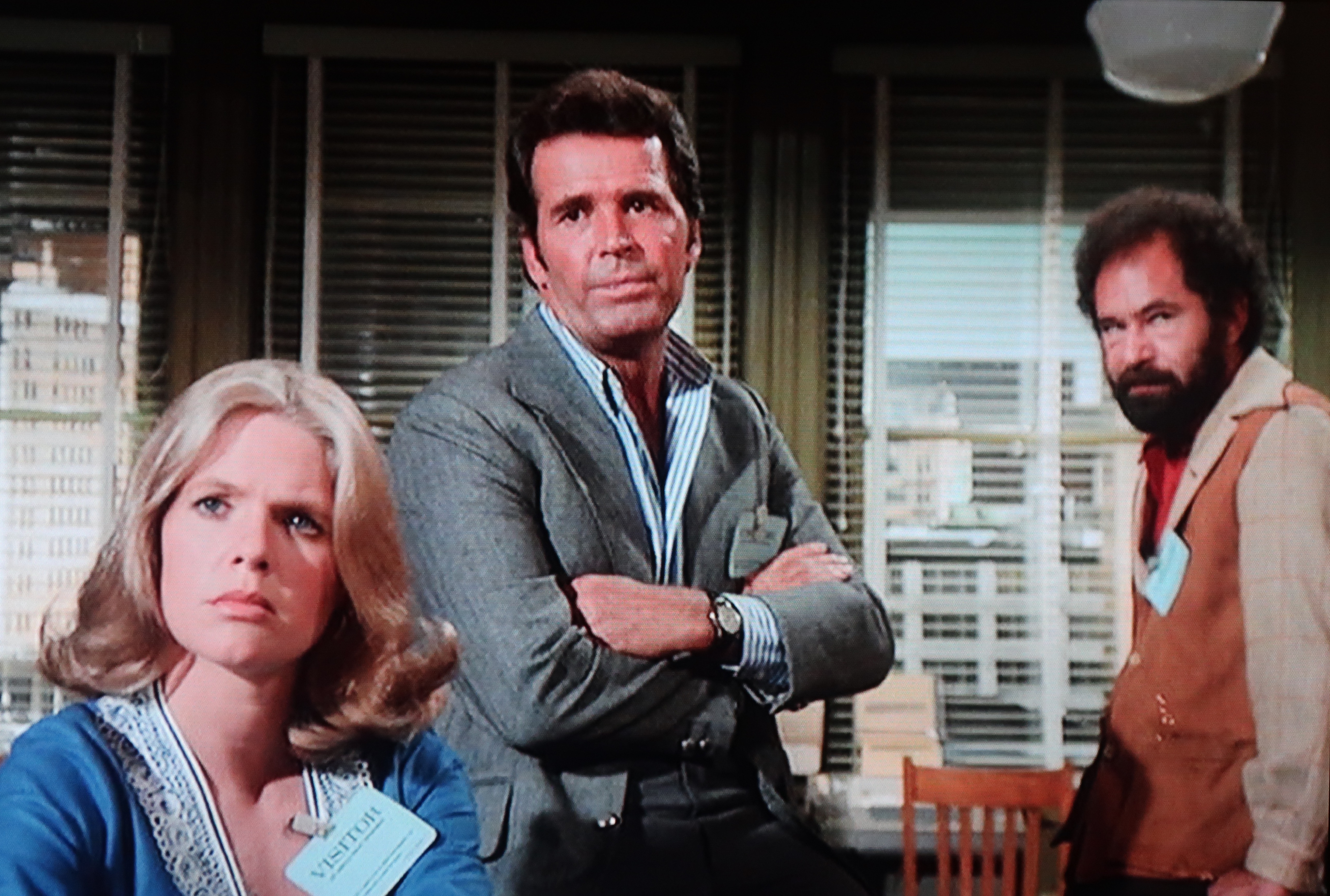
This first pic gave me the overall pose I wanted of Rockford with his familiar crossed arms looking very casual:


I rather liked this expression, where Rockford is looking a little concerned as to whether they've got a solid case against the guy he suspects is a hired killer who's attempted to kill his client:


I took this shot specifically for the mouth position showing both sets of teeth and tongue as he's speaking. Also the head angle is closer to the one I'm looking to draw:


Another pic that captures some of the overall expression I'm looking to depict in my drawing:


Like I mentioned before, I am also watching the video in action as I first gesture out my sketch, as that's the only way I can get a real feel for the personality and inner life of my subject. You can also see from my rough sketch how I start by gesturing and blocking in very loosely with a light blue pencil, then defining the forms with a soft black pencil while always thinking of it as "sculpting" the form as opposed to just drawing outlines. That illusion of solid structure remains an integral part of the process for me. Sometimes I find I have to do a few sketches, cobbling together elements from several in order to arrive at the final sketch, but this time I was able to get it all done in one shot:


Finally I use a lightbox to lightly trace the image in pencil onto a sheet of Bristol board, then tweak it a bit until I have the refined pencil art that is then ready for the fun part - the inking with my brush!


Once the line art is inked up, I scan that into my computer to colour it up with Photoshop resulting in the final full colour caricature of Jim Garner that heads up this post. Although I did decide to consult other photos through Google Image Search to select the colours of his shirt and blazer, as I've always preferred those 70's earth tones that Rockford wore rather than the grey outfit he's wearing in my reference photos above.

Monday, January 7, 2013

Anthropomorphism in Animation

In the 1946 Disney animated feature, Make Mine Music, there was a rather delightful sequence called Johnny Fedora and Alice Bluebonnet. It was a terrific example of anthropomorphism - giving human traits and personality to that which is not human. Usually we think of anthropomorphism as it relates to cartoon animals who wear clothes, talk, and walk upright on their two hind legs. But there are plenty of samples of objects that are also brought to life with human traits, like the enchanted clock, candlestick and tea pot in Beauty and the Beast, or the brooms that overwhelm poor Mickey Mouse in The Sorcerer's Apprentice.

But getting back to the film I cited above, here are some stills from Johnny Fedora and Alice Bluebonnet that show what it is that I love about their design and treatment in the animation.


In the stills above, you can see how the two hats really lend themselves to being cast as human "types". Alice has a bow on the back, just as a girl might have a big bow tying up the back of her hair. The rest of the ribbon hangs down gracefully and can be utilized as girlish arms as demonstrated. Also, the lace around her brim suggests a frilly collar on a dress. Johnny is certainly a lot simpler in design, but the eyes exist where there would be the shadowed indentations on a fedora, and the opening of the hat acts as his mouth. The hatband even suggests a mustache, I suppose.


What I particularly enjoy though about Johnny's design is the use of a visual "cheat" - an element that goes deliberately against the rules of 3 dimensional structure (like Mickey's always round ears, for example). In Johnny's case the cheat is in the way his face actually encompasses two separate planes of the hat: the eyes are on the front, while the mouth is on the underside of the brim. Because a drawing is a 2 dimensional representation of 3D form, the artists can easily get away with this optical illusion of the two planes working as one when the hat is tilted up, as in the two stills above. Also, note how Johnny is able to exhibit emotion in the way the brim is pushed and pulled to achieve different mouth shapes, with the eyes reacting accordingly. This is the magic of traditional, hand drawn animation, and one of the reasons I will always vastly prefer it to CG animation, which so often is trying to mimic the literalness of live-action film. Additionally, so long as Hollywood continues to pursue creating these CG films in 3D, such visual"cheats" cannot possibly work as effectively.

This brings me to a subject that is bound to rub some people the wrong way, but I believe the criticism is warranted. Because of the trend in current animated features to try to emulate live-action cinematography, I feel that we're losing the very definition of what it means to be an animated film. My own interest in animation as a young kid was that it was the illusion of a drawing seemingly springing to life upon the screen. That was truly magical to me, and was certainly one of the factors contributing to my love of drawing and hopes to one day becoming a cartoonist. For me, it was always "The Animated Cartoon" - take "Cartoon" out of the equation and I really wasn't that interested. Sure, I liked some stop-motion animation back then, but it was always drawn cartoon animation that intrigued me.

So hopefully you can understand why I might not be particularly impressed with the latest short that Pixar is working on called The Blue Umbrella, which seems like a watered down (so to speak) variation on the classic Disney segment cited above. I came across this teaser clip on Cartoon Brew today and I must say it just leaves me cold. For a start, though it's technically CG animation, it might as well be live-action footage from the way it looks. The animated faces appear merely pasted on, rather than being physically integrated into the umbrellas themselves, and these objects only twist and turn a bit, not exhibiting any of the whimsical "Squash and Stretch" we associate with classic drawn animated performance. In short, this film clip holds about as much charm for me as a typical TV commercial for Kool-Aid, which it sadly puts me in mind of. For the record, I remain equally unimpressed with Pixar's two Cars features, as they also come across as live-action films with some animated elements pasted on top, again exhibiting no exaggeration of form and movement of the various car characters, thus not taking proper advantage of the animation medium.


By the way, I've heard that this short film may be the work of the satellite studio that Pixar set up in Vancouver. If so, it is likely that some of the folks involved in the animation may be former students of mine at Sheridan. Please understand that my criticism is not targeted toward those involved in bringing the film to fruition. My issue with the film is in the concept and art direction that was decided upon by the powers-that-be. Animation that tries this hard to look like its live-action film cousin just isn't really "animation" in the true sense of the word, not in my book anyway. Sorry, but this stuff needs to be said.

Monday, November 28, 2011

Character Face Types


This post is primarily for the benefit of the students currently in my Character Design class in the Sheridan College BAA Animation programme. An ongoing assignment that they've been working on throughout this fall semester involves drawing a number of people from life or from video (but NOT from still photos!), as a way of building up a reference library of "Character Types", that ideally they should then refer back to when trying to create new characters for animation or other assignments. I'm a great believer in creating a character design that communicates something about the character to the viewer through the visual appearance alone, even before they start to move or speak in the animation. Just as the Casting Director in a live-action film tries to cast an actor who looks credible for the role, so too does a Character Designer strive to "cast" the right sort of type for an animated character, giving much consideration to how the physical aspects of the design will suggest a certain personality type that the viewer will recognize.

I've written about this before, and there are more thoughts and visual samples to be found in these previous posts:
Sketching Character Reference
More Character Types
Variety Is The Key!
Working Out The Likeness

Before you even start to sketch a subject, you should be taking some time to properly observe and analyze their head and face type. Ask yourself the following questions when trying to form a strong visual impression of the subject:

1) What is the basic head shape? Is it long or short? Round, blocky, or triangular? Wider at the top, middle or bottom?

2) Is the facial plane straight up and down, convex or concave, or angled forward or back?

3) What is the relative placement of the facial features within that head shape? Are they mostly in the lower area with a high forehead? Are they converging toward the middle or stretched vertically along the facial plane?

4) Where are the features relative to each other? Are the eyes wide apart or close-set? Is the bottom of the nose not far from the eyes or pushed down closer to the mouth?

5) What is the relative size of the features to each other? Large or small eyes? Long or short nose? Wide or narrow mouth?

6) And finally, what are the specific shapes of the features? Are the eyes angled up or down, narrow slits or wide with much white space around the pupil? Is the nose "Pug", "Ski-slope", or "Roman"? Thick or thin lips, etc. etc. etc.....?


Study the Character Type samples I have posted here and try to analyze them using these and other questions to determine what makes the head shape and features distinct and unique!

Thursday, April 7, 2011

Happy Birthday, James Garner!


Every year on this date I like to celebrate the birthday of my favourite actor, James Garner. Although I don't have a new caricature in full colour to put up this time, I do have this article I wrote for the "Exagerrated Features" magazine, the quarterly publication for all subscribing members of the ISCA. In it, I describe my own personal working method in creating one of my celebrity caricatures, and I use James Garner as the subject for this tutorial. The series of rough sketches at the top of this post I had done especially for the article, and they demonstrate how I sometimes will help familiarize myself with the subject before developing the final piece of art. I don't always take this step, but I do recommend it as a way of warming up and finding the "design" of the head and face, particularly when you may be struggling to get the likeness. I hope this tutorial will be of benefit to those of you who also enjoy drawing caricatures of celebrities:


Now that you've read all that, you may now relax and enjoy this clip from The Rockford Files to see Jim Garner's expressions for real:

Friday, October 22, 2010

More Character Types


Here are a bunch more sketches drawn from video, like the ones I showcased on my Oct. 4th entry. The ones pictured above are all of guests who have appeared on the Charlie Rose interview show seen on PBS. The show's website features numerous archived clips that are just great to sketch from, since the interviews allow you to study the subject in medium close-up, moving just enough that you can get a good feel for the design of the face and body, as well as their personality. I deliberately have drawn guests who I am not familiar with, as the point of the exercise is to take an honest approach to seeing the "design" of a face, in the size, shape and relative placement of the facial features on various head shapes, without getting hung up on whether or not a good likeness has been achieved. These sketches can then later be used as a starting point in developing "Character Types" for your cartoons and animation designs.

Here are direct links to all of the clips I used, so you can see how I interpreted the video reference:
Alison Gopnik
Klaus Schwab
Yang Lan
Jack Ma
Annie Cohen-Solal
Tung Chee-Hwa


The montage above is just of various people I have sketched recently from TV, so unfortunately I can't link to any clips for you. But I post them in the hope that it will encourage some of my readers to try this method of sketching people from video reference while taking a more caricatured approach. Specifically, I offer these up as examples to my Sheridan students as being representative of what I will be looking for in your ongoing assignment that I'll be assessing at the end of the fall semester.

Monday, October 4, 2010

Sketching Character Reference

I put this post together to tie in with what I'll be starting to cover in my Character Design classes at Sheridan College this week. The topic is "Character Types", and these are a few samples I just sketched yesterday to illustrate what I'll be stressing in this subject. I'm a firm believer that an animated or illustrated character should aspire to be distinct as an individual - the visual design suggesting a certain personality through the physical face and body type. The character designer on an animated film should serve the same role as a casting director on a live-action production. Just as a casting director tries to cast an actor or actress who has a believable "look" for a particular role, so should the character designer be trying to create a character that visually suggests the personality to be portrayed in the film.

There is a tendency for the novice to simply design a character off the top of his head, without considering what physical aspects and personality traits seem to work well in combination together to communicate a clear visual statement to the audience. My view is that, before an artist can have any knowledgeable output, one must first have some informed input. Therefore, I strongly recommend sketching people in the world around you, either from life or, as is my preference, from studying various character types on video in order to build up a library from which to draw upon when designing a specific character. I prefer the latter way of working, as video provides a way of studying the subject in a completely controlled manner, allowing one to study the subject at one's leisure. It helps to see the subject in motion, which makes it easier to see the physical "design" of the face and body type in order to then exaggerate and abstract it. Additionally, seeing the subject in motion and displaying physical nuances through body language, expressions, vocal mannerisms, etc. makes the resulting sketches far more successful in capturing personality and inner life than one would likely achieve by working from a still photo image.

Anyway, here are some samples sketched from YouTube that hopefully will illustrate what I'm saying more clearly. It should be noted, however, that the goal of the sketches is not to come up with a perfect likeness of the subject, but rather to make an honest attempt at seeing a unique design in the face and body type and using that as a springboard for abstraction and caricature:


Here are the links to the YouTube videos I sketched these from:
Character #1 Character #2
Character #3 Character #4


Here are the links to these videos:
Character #1 Character #2
Character #3 Character #4

Ironically, the "tough guy" character I've sketched from the YouTube clip is an imagined personality suggested by the physical type, as the fellow in the video really comes across as a very friendly and gentle sort. But in animation and cartooning, perception can carry more weight than being literal to the subject. Remember, you're trying to put forward a visual impression that your audience will understand at a quick glance. When required, more subtlety can be developed though story and animated characterization as your film progresses.

Tuesday, April 13, 2010

Some Cute (And Not So Cute) Doodles!


I make no bones about the fact that I love to draw cute characters. Cartoons that are cute and appealing are what I grew up with, and I still far prefer that over the ugly schlock of today, therefore that is what I gravitate towards in my own cartooning. Here are some more examples of recent doodles that explore that theme.


In the one above, I decided to scribble out several animated poses of the same little guy bouncing his basketball. Though I have never animated per se, I have always enjoyed bringing a character to life through continuity poses and expressions. Of course, this is the essence of what I have done for many years in illustrating children's books for Disney. Ideally I would love to start illustrating books with my own characters, but I'm not sure that children's book publishers even like cartoons anymore. Regrettably, they seem to have forgotten that the most famous kids' illustrator of all time, Dr. Seuss, was in fact a cartoonist.


These were a couple of quick impressions I scribbled of other diners at the restaurant I was at several weeks ago. The old guy reminded me a bit of Ed McMahon and the young girl had similar features to Drew Barrymore. The cat was not actually in the restaurant, but snuck into my doodling just the same.


Okay, I guess these ugly rascals can't be called "cute", but they were fun to draw. After finishing up a Suduko, I started aimlessly doodling a couple of ugly mugs, which then led to a whole series of unsavory mobster types appearing around the edge of the puzzle. I particularly like the psychotic looking fellow in the lower right corner and the wall-eyed rascal in the top middle. The whole exercise was really meant to explore facial features of varying shape, size and relative placement on various head shapes, which is something I stress constantly in my Sheridan College Character Design class.

Sunday, February 7, 2010

Drawing Cartoon Eyes

I came across this film still from Disney's The Princess and the Frog by way of John Kricfalusi's blog. John has been pointing out (quite correctly in my opinion) how badly designed and drawn the TV shows from the 80's were. Furthermore, he contends that those bland and soulless 80's character designs live on to this day, not only on TV but also in feature film animation. Though I might be rather more charitable towards Disney's features of the last 20 years, I can't say that John is off target in this criticism either, especially when I see an example like the following that he includes:


John's correct in his assertion that some of Disney's male and female leads are bland and generic in design. I too feel like Prince Naveen in The Princess and the Frog is highly derivative of Prince Eric and Aladdin who came before him. Ideally, I'd like to have seen Naveen designed more ethnically exotic in his actual features, rather than just his flesh colour, perhaps more like the young Omar Sharif, for example. However, despite this criticism, I will defend the actual drawing and animation of Naveen as being highly competent. He is solidly drawn, if uninspired in design.

I'm afraid, however, that I cannot say the same for the three young ladies looking so adoringly at Naveen in this particular scene (undoubtedly drawn by a different animator than the one handling Naveen). I'm sorry to say that I find the drawing of these three very amateurish - more the kind of drawing I'd equate with the aforementioned 80's TV animation. I recall thinking the same thing when I saw the village sequence that opened Beauty and the Beast. There were a lot of village folk very poorly drawn and animated in that film, though all of the principal characters were handled so well. I think things got better in subsequent films, however, and I was glad to see it. But, by virtue of The Princess and the Frog being Disney's first traditionally animated feature in six years, it looks like they're saddled with some newbie animators, likely by way of TV animation, who just aren't up to speed yet with their drawing.


As it happens, I've just lectured about the design and function in drawing eyes as part of my Character Design class at Sheridan this past week, so I'd like to offer my thoughts on that subject in regard to this particular still from the Disney film, as well as this suggested revision in some of the drawing. First of all, I find the construction lacking in the drawings of these three girls, especially when compared to the better drawn Naveen. I think the head construction on all three could be tightened up a bit, and the 2nd girl could do with a more substantial nose structure too. Mostly, though, it's the construction and direction of the eyes on all three that bothers me the most. Girl #1 has eyes that are spreading out too large and show no feeling of being spherical eyeballs behind the surrounding flesh, due to the pupils being drawn without regard to the rounded surface they exist on. Girl #2 at least has elliptical pupils, suggesting a turning of form, yet they are not even close to being directed towards Naveen's eyes in order to meet his gaze. I haven't drawn Girl #3, but her pupils, drawn as perfect circles, also show no indication of turning on a rounded surface and she appears to be looking at something offscreen beyond Naveen's left ear.

I must admit, poorly drawn and unfocused eyes are a big pet peeve of mine, as it it takes so little extra effort to draw them well. Here are a couple of notes from the lecture I give on cartoon eyes:


Monday, January 18, 2010

How To Draw Cartoons!

Well, only touching briefly on the subject, to be honest.

I've been associated with Visual Arts Brampton for about 7 years or more now, and I can most often be found there on Tuesday evenings for the open workshops in life drawing. Visual Arts Brampton, or VAB for short, is located on the east side of Hurontario immediately north of Steeles in Brampton Ontario, just a short drive away from where I live in adjacent Mississauga. Keith Moreau runs this art studio that offers art lessons and open drawing sessions to the general public, and I'd like to encourage those in the Brampton area to come out and join us for some life sketching on Tuesday evenings, 7:00 pm to 9:30 pm. It's only $10 per session with no obligation to sign up for anything - just drop by when you're of a mind to. I've posted some of my more caricatured approaches to life drawing previously, which may be found here. I think I may soon be posting more samples, as I've got a ton of them stockpiled. Also, here are a couple of caricatures pictured below I drew of aspiring young artists who have joined us in past sessions.


Something else Keith and I have been starting to venture into is doing some test runs at cartooning tips on video. To be honest, they're pretty rough attempts so far, as nothing has been scripted at all and I have a tendency to ramble a bit in my somewhat awkward stammering way of speaking! But we're just trying out things in the hopes of developing it more down the road. Anyway, here is our first attempt at something pretty much on the fly that Keith's son Nick has videotaped and uploaded to YouTube for now. Funnily enough, although I'm quite comfortable standing up in front of a classroom full of students at Sheridan College, I'm pretty damn self-conscious in front of a rolling camera! No Oscars for acting in my future, I'm afraid...


Saturday, May 23, 2009

Digital Cheesecake!

For a long time now I've been trying to figure out this digital painting stuff with Photoshop and finally I seem to making some headway. I went through pretty much all of the Photoshop brushes, trying them out in various ways to see what I could do with them, but I find most of them rather unsatisfying. However I did stumble upon this one that, after lots of messing with, I found I could get some nice painterly results. I also had been studying the work of fellow caricaturists, Court Jones and Paul Moyse, both of whose abilities I admire greatly, in order to analyze how they're using the medium so well.

So then I decided to experiment and see what I could accomplish with this initial amount of Digital knowledge, as little as it was. I started out sketching this girl right on the screen using a brush I'd created from a tutorial that gives a nice soft pencil look. Then on a separate layer, I jumped in with both feet and started to paint it. I must confess that I got very frustrated along the way, nearly giving up a few times, but I persevered just to see what I could learn from the experience if nothing else. For this first attempt, I do wish I hadn't painted the background so close to the colour of her hair, though I do kind of like the way her hair melds into it at the back.

The more I worked with it, the more it started looking like a cartoonier version of the type of pin-up paintings I've always loved by Gil Elvgren, with a rich, creamy, oil paint feel to it. Since I didn't really know what I was doing most of the time, it took me hours longer to do than it really should have, but this was just a learning experience and hopefully I'll be able to accomplish things more quickly as I get more proficient with it.

For this second attempt I used several vintage 50's pin-up photos as reference, combining elements from each and making stuff up as well. This time, however, I drew her in pencil on paper the way I normally do, then scanned in the sketch. After making it into a transparent layer in Photoshop, I painted in the main areas on a separate layer underneath, first in flat colours, then adding a bit of modeling based on the lighting in the reference photos. Above is the rough sketch with quick colour added. It's actually a fun and satisfying technique in itself, and warrants more exploration sometime.

Once I had a rough colour sketch I was happy with, I merged the two layers together and started into the "oil painting" technique on top. Though I was having an easier time of it since my first attempt, the difficulty with digital painting is knowing when to stop and leave an area alone. I tried to keep the whole thing progressing at the same rate, but it's always so tempting to start embellishing it with details too early in the process.

Seeing the finished artwork, I'm still not sure about some things. In my opinion, there could still be more tonal definition, as I feel that some areas look too soft, especially when compared back to the colour sketch. Doing narrow, smooth lines is not easy in Photoshop, and I therefore have a hard time with detail in the hair, as well as the eyelashes, and any areas where I've used a bit of soft darker outline to help accentuate some of the form. Here's where a good sable watercolour brush still beats the heck out of computer technology, in my opinion. (Yes, I remain a traditionalist at heart!)

Anyway, these are just a couple of initial attempts to learn the digital painting process. I keep on studying the work of artists I like in order to pick up additional skills, but I know it's a long road ahead of me.

Thursday, January 29, 2009

Anthropomorphism

John Kricfalusi has just posted an interesting piece on the use of dog-nosed faces on otherwise very human cartoon characters. This is a phenomenon mostly found in Disney's "Uncle Scrooge" and Donald Duck" comics illustrated by Carl Barks, although it's been seen in animation as well, like Nelvana's "Rock and Rule", for example. I agree with John that this type of character is rather off-putting, as it is neither distinctly human nor typical of the "Funny Animal" type of cartoons so prevalent in animation and comics. Though the Carl Barks dog-nosed characters are rather benign, this trend also begat the "Furry" movement, which usually also seems to have a sexual bent to it in the art of its many practitioners.

At this very point in time, I am coincidentally covering the topic of "Anthropomorphism" in my Character Design course at Sheridan College, so I'd like to take this opportunity to address the distinction between "Funny Animals" and "Furries". Some time ago, I'd posted this piece on "Four Degrees of Anthropomorphism" that covers most of the main approaches to creating animals with human traits and personalities in various animated shorts and features. By breaking it down into these four common approaches, I hope to teach my students how to create a set of rules to apply to the way they handle animal characters in their film stories, so that there's a certain logic and plausibility that is maintained in what they're trying to communicate to their audience. And from a purely visual standpoint, I'm also trying to impress upon them where to draw the line between an anthropomorphic animal that possesses human traits, before crossing that line and instead ending up with a "Furry", being essentially an animal's head stuck on top of a fur covered human body.

Ideally, an anthropomorphic animal should maintain something of the actual animal's physique, even when walking around on two legs and wearing clothes. If you look at this still from Disney's "Robin Hood", you will note that Robin himself is still very much a fox on two legs, and that if placed back down on all fours without his costume, he would be very much at home in a film like "Lady and the Tramp" as a caricature of a real fox but with a human personality. Same thing with Little John the bear. When done really well, an anthropomorphic animal character should be initially visualized as a "Human Type", then translating those human physical traits and reinterpreting them in the animal design. I discussed this topic here.

For those of you familiar with "The Country Bear Jamboree" at Walt Disney World, the Disney artists were very successful in creating a cast of bear characters that looked like caricatures of the type of performers one would see on the stage at Nashville's "Grand Ol' Opry". Here is a picture of "Big Al", as an example of what I'm talking about. The facial design and physical body type are very much based on the character's human equivalent, yet never losing sight of the physical design of the actual animal either. For many students, this seems to be rather confusing and a challenge to pull off, while for others it seems to be a very natural, intuitive process.

For the uninitiated, just so you have a clear idea of the distinction between what I'm describing here and the aforementioned, dreaded "Furries", here is a link to some Google images of the latter. As you can see, they are more mutant than animal. As a general rule of thumb: If it is embarrassing to look at your animal character when he or she is naked, chances are you've drawn a "Furry"!!

Just to solidify the distinction, here is a clip from Disney's "Bedknobs and Broomsticks" that shows how to successfully translate animals into two-legged anthropomorphic characters while still maintaining the animal's physique. I really love this clip, as all of the gags are based on the traits of the actual animals, yet every one of them also conjures up a "Human Type" equivalent as well. Wouldn't you agree that the big ugly rhino puts one in mind of some thuggish, skinhead footballer? Of course, the sleek and agile cheetah is more of the David Beckham type.


Saturday, November 29, 2008

Hitchcock's "Vertigo"


This month on the National Caricaturist Network forums, the subject for the drawing contest is "Hitchcock Films", as decided upon by last month's "B.B. King" contest winner, Vin Altamore. I was overjoyed at this choice of subject, as it gives a lot of scope as to whom we may draw based on whatever Hitchcock film we choose to portray. I really love the films of Alfred Hitchcock, and I had several favourites to choose between, including two starring Cary Grant: "North by Northwest" and "To Catch a Thief". However, my all time favourite is 1958's "Vertigo", starring Jimmy Stewart and Kim Novak and, believe it or not, I'd never really drawn a finished caricature of Jimmy Stewart before, though I recall having done some rough sketches of him many years ago. I had, however, drawn a caricature of the alluring Kim Novak from the other film in which they had co-starred together, "Bell, Book and Candle", which you may view here.

There were actually a lot of creative decisions that went into preparing this image, long before the drawing was finalized. In watching the film again, I wanted to pick out one scene that would seem iconic, and the pivotal scene at the old California mission was just perfect in summing up the movie for me, more so than anything in San Francisco itself, where the bulk of the movie takes place. As you can see by the rough thumbnail sketch pictured at left, I wanted to combine several shots from that scene into one single image that would tell more of what was going on, so in addition to the desperate embrace that Jimmy Stewart has on Kim Novak, I wanted her eyes to be focused on the top of the foreboding bell tower. So I included a forced, 3-point perspective shot (not entirely successful) of the mission to create the suspense, and took it further by using the spinning vortex from the Saul Bass title animation as the backdrop, with the bell itself focused in the centre. Lastly, I had struggled with getting Kim Novak's caricature in this 3/4 view, as I wanted to show her hair at the back in the "Carlotta" bun, indicative of the subplot of her believing she's possessed by the spirit of the mad Spanish woman, Carlotta.

Though I've certainly seen "Vertigo" a number of times, it's amazing how it can continue to engage me with repeated viewings. When you see the film for the first time, there is the shock of the mystery being revealed in the last act, which of course you can never relive a second time. However, even when you know what is going on, it's such a pleasure to watch the characters' faces, as you are aware of what they know and what they don't know at any given time. While Jimmy Stewart was wonderful in anything he did, this may be Kim Novak's finest hour, as she was not always given such great roles to work with in her somewhat spotty career. (I personally liked her a lot co-starring with Frank Sinatra in "Pal Joey", but the critics were not as impressed, I'm afraid.)

I'm including here the trailer for "Vertigo", which will hopefully give the uninitiated a compelling reason to seek this film out. Bernard Herrmann's memorable and haunting score, which plays over this trailer, is just one of many reasons to see it. Also, in the second YouTube clip, some very clever fan of the film has taken it upon himself to revisit all of the major locations in San Francisco where "Vertigo" was filmed, as well as faithfully recreating some atmospheric shots like the pan across the inside of the arched doorways of the old California mission. One interesting note of trivia is that the infamous bell tower had actually been created for "Vertigo" as a matte painting, as the mission's own bell tower had burned down many years prior. That's why you're not going to see any such bell tower in the scenes shot by this film fan. I really encourage all of my readers to watch "Vertigo" if they've never seen it before, as it really is one of Hitchcock's finest works.


Sunday, September 28, 2008

Working Out The Likeness

A comment by Denise Letter on my previous post:
"Hello Peter, good drawings! Could you put some of the photos of these people up to compare and learn?"

A very good idea, Denise! First of all though, I must give the following disclaimer:

The fact is, working from still photos is not my preferred method for drawing caricatures. When I draw caricatures of celebrities I never use photos if I can avoid it, as I much prefer to sketch them from watching video. By seeing my subject in motion, I find that I get a better feel for their simple visual design without getting bogged down with extraneous details. Also, I am equally as interested in capturing their distinctive personality in addition to their physical likeness and this too is more easily achieved by seeing my subject in action. For me, video is my favourite medium to work from, even better than real life, as it is totally controllable in my ability to play over or pause on a single frame for studying something in depth. When I work from still photos, I must admit I can't guarantee a great likeness of the subject, as the best I can hope for is that the interpretation results in something fairly close to the reference photos provided. So, having said that, I now present for you the way I work when limited to still photo reference alone.

When I sketch my fellow NCN members, the resulting caricature is very much dependent on what sort of photo reference that member has provided. To be perfectly blunt, there are some members who I am unlikely to even attempt to draw because they have only posted a single photo to work from. I never draw from a single image, as it too limiting in its visual information. So the members I like to draw are the ones who have provided a variety of pics, showing different angles and some variation in natural expression. (I say "natural" because I don't like made up funny expressions, like tongues poking out, crossed eyes, etc.)

My first step is to download as many of the pics as I think may be helpful to draw from by placing them in a file folder. At this point I then open them all up on my computer desktop and just look at them for awhile, glancing from one pose to another in order to try and see the underlying "design" of the face. So now I'll use these three examples to attempt to explain my thought process in working out the caricatured likeness.

This "Wolverine" lookalike is Adam Pate. As I study the selection of photos Adam has provided, I first try to see the overall shape of his head and face. Adam has a very wide, blocky jaw structure and a sturdy neck. His head shape seems to taper in narrower at the top. I keep everything loose at this stage of my drawing, as I may need to go back and fine tune things as my drawing progresses. Next it's onto the facial features themselves.

The facial features should be analyzed in three different ways: 1) Their relative spacing and placement on the facial plane, 2) their relative size to each other, and 3) their distinctive shape.

My visual impression of Adam's face is that his features are close set along the vertical centre line of his face with plenty of open space for the wide jaw and chin. Size-wise, he seems to have a large nose, small eyes and narrow mouth in its relaxed state. When I study the shapes, his eyes are slanted up and narrow with small light coloured irises. His nose flares out at the bottom with prominent nostrils. The mouth is always the most flexible feature, so I based its shape specifically on his expression in the 4th photo. I like the way his eyebrows arch upward in some expressions, so I portrayed them that way. In fact, Adam's face is very much based on a series of angular, alternating 'V' shapes. Sometimes I like to mentally compare a subject's face to a famous celebrity I've drawn before, and in Adam's case I thought there were some similarities to Kevin Kline and also, strangely enough, the young Peter Ustinov!

My next subject is Ken Coogan, or "Coogy" as he goes by professionally. Coogy's got a long narrow head shape that is swept back in a convex facial plane as can be clearly determined from the profile in the 5th photo. Because of this, my impression is that his features are stretched along this vertical space with a small chin that is close set to a long thin neck. His longish nose keeps the eyes and mouth separated some distance from each other. His eyes are squinty and heavy-lidded when he smiles and he has prominent lips. The shapes of his eyes and mouth are based on more curving 'U' shapes that head in opposite directions from each other. There is a droopiness to his features. Again, like in Adam's face, I chose to portray Coogy's raised eyebrows that I see in some of his expressions. As I drew Coogy, I couldn't help but think that he has similar features to that of comedian Garry Shandling.

Finally we come to Angie Jordan. Some aspiring caricaturists are somewhat unsure of how to approach drawing the face of an attractive woman, yet one should not shy away from the challenge. Overall, Angie strikes me as having a very angular head and features, which are in great contrast to the softer, curvier features that are seen on Alison Gelbman at the top right corner of my previous montage. In determining Angie's head shape, I am more inclined to draw her in a 3/4 view so that I can play up her high cheekbones and angular jutting chin. Her nose also juts out from the facial plane, so I see the overall design of her face as being made up of "arrows" thrusting forward and slightly downward at a 45 degree angle, with bridge of nose, mouth and jawline all parallel to each other. I like the expressiveness of her eyes in the 3rd photo, so I play up that wide-eyed look, giving her a lot of white space around her irises. Her mouth stretches wide back to her cheeks when she smiles, with all of her flesh taut to the bone. With females, it's also fun to study how the hairstyle works with the design and framing of the face. Angie's hair is long and straight with an interesting tuft in front that hangs down towards her eyes.

Again, I must confess that I have no idea how much these caricatures may or may not capture the subjects, as I have never met my NCN colleagues in person to have formed a visual impression of them. If I had good video reference of these folks to sketch from, I would likely end up with somewhat different results. By the way, my Sheridan students will recall that I distinctly have instructed them to draw people for their sketchbook assignment either from life or from video, and NOT from still photos. Until you have experienced drawing people in a caricatured fashion from life, you will not be able to draw them from still photos with the necessary skill set required to make informed artistic choices. Believe me, even I feel hindered when drawing from photos and would far rather draw my NCN friends from real life in order to get a more accurate feel for what they're all about.

Saturday, September 27, 2008

Variety Is The Key!


Back in the spring, I decided to join the National Caricaturist Network (NCN) in order to meet some of my talented colleagues online and hopefully raise my own profile out there in cyberspace. It's certainly been a fun and rewarding experience, and I'm glad to be getting to know such a great bunch of artists through the member forums. (Unfortunately, you have to be a member to read them, otherwise I'd direct you all there. Sorry!)

Anyway, one of my favourite areas in the forums is "The Firing Squad", where members can post a selection of photos of themselves as fodder for the rest of us to sketch from. It's quite fascinating to see the myriad of variations that result, with each artist interpreting the subject in their own individual way. At this point I have sketched over 50 of my colleagues and posted them in the forum, as it's a lot of fun and keeps me in practice with what I love to do. Here is just a random sampling of some of my fellow NCNers - I'll post some more over the next little while.

Fact is, I really enjoy drawing what people really look like. By that I mean, not just drawing the same generic, cookie-cutter face and body design over and over again, but instead really observing the individual "design" of each person's face and then trying to exaggerate and simplify it into something appealing, while hopefully capturing the essence of their personality as well. I thought it might be a good time to post a montage of these faces on my blog, as I am currently going to be teaching my Sheridan animation students all about "Character Types". In other words, designing a character that somehow communicates to your audience what he or she is all about through the face and body type, essentially doing the same thing in cartoon that a casting director is concerned with when selecting the most appropriate actor to fill a role in a live-action film.

During this first semester at Sheridan, my students are also required to keep an ongoing sketchbook of drawings of actual people they see, but caricaturing the features and bodies as if they were studies for potential animated film characters. I am of the strong belief that by studying what individuals look like, this will hopefully result in them producing character designs that are richer in personality as well as more visually interesting in their variety of shapes and sizes. By posting my own caricatured drawings of these NCN members, I'm hoping this will give my students a clearer understanding of what I am looking for and why. In upcoming posts I will discuss more of the thought process that goes into doing these.

Monday, August 25, 2008

Gouache Meets Photoshop

In my previous post I showed some sample illustrations from a couple of Disney books that were painted completely in the traditional method of paint on illustration board. However, just so you don't get the idea that I am totally against using Photoshop, here are some samples that employ a hybrid method that I like to use.


This illustration is from a book published a few years ago by Random House, entitled "Beauties in Bloom", which featured two spring themed stories, one featuring "Snow White" and the other, "Cinderella". This was the first in a series of seasonal books put out as part of the "Disney Princesses" program. Though I'm admittedly not keen on the packaging of the characters under the "Disney Princesses" banner, I do enjoy illustrating the classic characters in original new tales, rather than just retelling the film stories.


After my final pencil layouts of the pages have been approved by Disney, I then separate the elements of characters and backgrounds. I transfer the background drawing onto a sheet of illustration board using graphite paper and a photocopy of my drawing that I can trace over with a sharp hard pencil. Once the background image is on the board, I start out painting in the large areas such as sky and grass using dilute washes of gouache on the surface which has already been pre-moistened with water brushed on evenly with a large flat brush. Once the larger expanses are in, I can start building up the details of bushes, trees, and surface texture on the ground.

In the case of "Snow White", since the film's backgrounds were rendered in watercolour, I am using the gouache more dilute in order to approximate the look of real transparent watercolour. It's a bit of a cheat, but then I'm pretty sure that even the Disney artists used some opaque gouache in areas that needed lighter highlights over dark areas. Frankly, I've never been good at handling real watercolour, so I prefer to use gouache because I'm more comfortable with it. Once all of the backgrounds have been painted, then comes the rather tedious task of scanning them into Photoshop, usually in two or three sections because of the limited area on the scanner plate. I then have to reassemble them into single Photoshop files, which is often tricky due to some areas having scanned a bit darker or lighter than others, and therefore needing some adjustment.


With the backgrounds out of the way, I can then get to the characters. Working from my clean pencil layouts, I place a sheet of matte finish mylar film on top of each one and, using a very fine #00 watercolour brush, carefully ink each set of characters as delicately as I can in order to approximate the way they used to hand ink the old animation cels using a crowquill pen and ink. When these are all completed, I then scan in each sheet of character art, again sometimes having to reassemble any large character groupings that were too big to scan in one piece. (Fortunately, that doesn't happen often.)

At this point, each page of character line art has to be converted into a transparent layer in Photoshop. This is so that I can then colour the characters by "painting" on a second transparent layer below, thus resulting in an image that really does approximate an animation cel with solid flat colours beneath the clean ink lines. What's nice about this method too, is that I can very easily go over separate areas on the line layer to change the colours of the line to something that relates better to the area of colour they contain. This is also the way they used to ink the cels in the early Disney feature films. Usually I keep this part pretty basic; just brown lines to surround warm colours and dark blue lines for blues and greens. I do a bit of tonal modeling on the areas of colour, but I keep that real basic too, otherwise the characters start looking too much like plastic.

Once both backgrounds and character layers are in the computer, it is then a very easy and fun process of assembling them together for the final picture files. The benefit of working this way as well, is that if either Disney or the publisher require any changes to be made, it is not much problem to slightly shift or adjust the size or colour value of a character, without having to worry about the background. Finally, the real benefit for me is just sending the client a couple of CDs containing all of the page setups, instead of sending a bulky stack of original illustration boards by Fedex, which can be quite costly, as well as nerve racking, hoping they arrive safely.

Because I really enjoy trying to match the background painting style of the original film, here are a couple more examples of my Disney book work which show some variety in approach:


This is a scene from "Happy new Year, Pooh!", that I did as one of a series of "Winnie-The-Pooh" books for Reader's Digest. It was a book of the month type of thing, where each title related to something in each month of the year. I did three books in the series. I quite like working with the Pooh characters, as well as doing the looser pen, ink and watercolour backgrounds that the film employed to adhere more to the original Shepard book illustrations. These backgrounds are more like coloured drawings than true paintings, and therefore are easier for me.


Still, that doesn't mean I shy away from more painterly approaches, as I had fun trying to mimic the style of background artist, Eyvind Earle, in "Sleeping Beauty". Eyvind would paint in large, opaque, flat areas of colour, then build up the surface detail in multiple layers with his gouache. My paintings are a lot more basic than his, though, as he would create incredible textures and ornate design work in his film backgrounds. In June of 2007, I got to see the exhibit of original Disney animation art that was on show in Montreal (having first debuted in Paris). It was a real pleasure to be able to get up so close to some original Eyvind Earle backgrounds and analyze his approach in the brush work and order in which he would paint all of the elements. His gnarled, old tree trunks were incredible to behold. My simplistic "forgeries" pale in comparison, I'm afraid, but it sure is fun trying to paint in his style!

Saturday, July 5, 2008

Photoshop Frustration!

I must admit, I'm still pretty leery of digital artwork. Up to this point, all of my artwork generated on the Mac has been of the hybrid sort: drawn and inked traditionally by hand, then scanned in and coloured up with Photoshop. Notice I said "coloured" as opposed to "painted". You see, I don't consider what I've achieved thus far to be digital paintings - at least not in the truest sense.

Here's a recent example which explains why not. This actually just started out as a test to see if I could create something using the Paths function on Photoshop. Frankly, I've never been able to figure out how to use that nefarious Pen tool, with it's Bezier Curves function. Being a right-brained kind of guy, I just couldn't make sense of those weird little handles. However, one of my students this year at Sheridan, Lawrence Lam, was kind enough to give me a basic tutorial on the different aspects of the Pen tool. I hadn't been practicing since then (about March), so it took a lot of messing around with it a couple days ago to figure it all out again. Fact is, it took me several hours to achieve what l did, so I'm going to have to work with this a lot more to get up to speed!


First of all, I needed some subject matter to practice on. Let's see now, what should I draw? Hmmm...hey, how about a CUTE GIRL! Fortunately, I'd been downloading pics of The Toronto Sun's daily "Sunshine Girl" for just such an occasion, so I had quite a collection to draw from. Though these pics are all relatively small, I wasn't in great need of visual clarity, as I am not attempting to achieve a perfect caricatured likeness of a specific girl. Anyway, I liked the sunny look of this cute blonde with her ponytails, plus the pose was appealing, so I went with her.


So here is my pencil sketch, starting out with a rough blue underdrawing, then defined on top with a dark pencil outline. (Are you paying attention, Sheridan students?) Like I said, I'm not trying to get a true likeness of this girl like I would with my celebrity caricatures - I'm just trying to capture her essence and using her pose and facial type as a starting point for what will be a much more cartooned interpretation. You can see how I've pushed the pose more, exaggerating the tilts and angles. For some reason, I have no idea why, I just gave her a single ponytail in the back instead of the two that the model has. Anyway, I only spent less than 20 minutes on the drawing, as it really was just for the purpose of this test with the Paths tool.


So after creating individual Paths for her flesh, hair, skirt, top, lips, eyes, etc. etc., I was finally ready to start adding colour. Initially I just filled each area with flat colours using the Paint Bucket tool, then started some fairly simple rendering in each area. I did want to try to get away from just using the Airbrush tool, so I used a custom brush that I learned how to make from an online tutorial that gave a more textured sort of rendering, similar to pastel. That, plus some softening here and there with the Airbrush seemed to result in a piece that was fairly appealing. I kept my pencil sketch on a transparent layer on top, lowering the opacity of the linework so it didn't overpower the colour. However, here's where I feel rather handicapped by my minimal knowledge of Photoshop and digital painting.


Here is the same artwork with the pencil sketch layer turned off so that just the colour is visible. As you can well see, it doesn't work like this, as it needs the pencil line to pull it all together. Ideally though, I would like to develop my Photoshop skills enough to attempt a real digital painting, using just tonal rendering to create the form, though perhaps using a bit of accent linework to strengthen it here and there. Recently, I've joined the National Caricaturist's Network (NCN), and have been studying the wonderful work of such talented folks as Joe Bluhm, Court Jones and Paul Moyse, just to mention a few. All of these guys are exceptional talents working with both digital and traditional media, but it's their digital work that I'm really trying to learn from. These guys are truly digital "painters" in the very real sense - something that I currently can only aspire to. If anyone can recommend any good sites for simple and clear Photoshop painting tutorials, please feel free to post them here in the comments section. Thanks!