Wednesday, August 27, 2008

Maher-velous Bill!

Since I was recently ranting about the inanities of political correctness, I think my caricature of this guy would seem to fit in with my feelings on this topic:


I did this sketch last Sunday night while watching a repeat of "Larry King - Live" that had run earlier in the week. I personally find Larry a little tiresome most of the time, but I'll always tune in if the always interesting Bill Maher is the guest, as it also seems to bring out the best in Larry too. I just love Bill's candid, blunt responses on every issue. Besides that, I think it's great that he doesn't toe any party line and, while mostly liberal, he will also occasionally stand up for conservative types when he's impressed with their integrity. He's a big fan of Republican hopeful, Ron Paul, for example. I think Bill Maher is one of the most refreshingly honest guys I've ever heard, and it's because he really doesn't give a damn what people think of him or his opinions.

I used to watch Bill Maher's "Politically Incorrect" show pretty much every night back when it was on, and just loved the way he could gather such diverse guests from various fields and different points on the political spectrum. Sometimes you'd get surprising results from throwing all these seemingly unrelated personalities together. I particularly recall Florence Henderson bonding with Marilyn Manson, no less! Oftentimes a little known starlet might show that she was just as politically astute as the most seasoned veteran politician. And Bill Maher kept the whole thing lively with his provocative questions putting his guests on the spot. Unfortunately, we don't get HBO here in Canada unless one has a satellite dish, so I haven't seen his current show, "Real Time". But from watching clips on YouTube, it looks like it's as good as his former show used to be, though a little more formal in presentation. Here's a clip from this week's "Larry King - Live", the same show that I drew this caricature from:

Monday, August 25, 2008

Gouache Meets Photoshop

In my previous post I showed some sample illustrations from a couple of Disney books that were painted completely in the traditional method of paint on illustration board. However, just so you don't get the idea that I am totally against using Photoshop, here are some samples that employ a hybrid method that I like to use.


This illustration is from a book published a few years ago by Random House, entitled "Beauties in Bloom", which featured two spring themed stories, one featuring "Snow White" and the other, "Cinderella". This was the first in a series of seasonal books put out as part of the "Disney Princesses" program. Though I'm admittedly not keen on the packaging of the characters under the "Disney Princesses" banner, I do enjoy illustrating the classic characters in original new tales, rather than just retelling the film stories.


After my final pencil layouts of the pages have been approved by Disney, I then separate the elements of characters and backgrounds. I transfer the background drawing onto a sheet of illustration board using graphite paper and a photocopy of my drawing that I can trace over with a sharp hard pencil. Once the background image is on the board, I start out painting in the large areas such as sky and grass using dilute washes of gouache on the surface which has already been pre-moistened with water brushed on evenly with a large flat brush. Once the larger expanses are in, I can start building up the details of bushes, trees, and surface texture on the ground.

In the case of "Snow White", since the film's backgrounds were rendered in watercolour, I am using the gouache more dilute in order to approximate the look of real transparent watercolour. It's a bit of a cheat, but then I'm pretty sure that even the Disney artists used some opaque gouache in areas that needed lighter highlights over dark areas. Frankly, I've never been good at handling real watercolour, so I prefer to use gouache because I'm more comfortable with it. Once all of the backgrounds have been painted, then comes the rather tedious task of scanning them into Photoshop, usually in two or three sections because of the limited area on the scanner plate. I then have to reassemble them into single Photoshop files, which is often tricky due to some areas having scanned a bit darker or lighter than others, and therefore needing some adjustment.


With the backgrounds out of the way, I can then get to the characters. Working from my clean pencil layouts, I place a sheet of matte finish mylar film on top of each one and, using a very fine #00 watercolour brush, carefully ink each set of characters as delicately as I can in order to approximate the way they used to hand ink the old animation cels using a crowquill pen and ink. When these are all completed, I then scan in each sheet of character art, again sometimes having to reassemble any large character groupings that were too big to scan in one piece. (Fortunately, that doesn't happen often.)

At this point, each page of character line art has to be converted into a transparent layer in Photoshop. This is so that I can then colour the characters by "painting" on a second transparent layer below, thus resulting in an image that really does approximate an animation cel with solid flat colours beneath the clean ink lines. What's nice about this method too, is that I can very easily go over separate areas on the line layer to change the colours of the line to something that relates better to the area of colour they contain. This is also the way they used to ink the cels in the early Disney feature films. Usually I keep this part pretty basic; just brown lines to surround warm colours and dark blue lines for blues and greens. I do a bit of tonal modeling on the areas of colour, but I keep that real basic too, otherwise the characters start looking too much like plastic.

Once both backgrounds and character layers are in the computer, it is then a very easy and fun process of assembling them together for the final picture files. The benefit of working this way as well, is that if either Disney or the publisher require any changes to be made, it is not much problem to slightly shift or adjust the size or colour value of a character, without having to worry about the background. Finally, the real benefit for me is just sending the client a couple of CDs containing all of the page setups, instead of sending a bulky stack of original illustration boards by Fedex, which can be quite costly, as well as nerve racking, hoping they arrive safely.

Because I really enjoy trying to match the background painting style of the original film, here are a couple more examples of my Disney book work which show some variety in approach:


This is a scene from "Happy new Year, Pooh!", that I did as one of a series of "Winnie-The-Pooh" books for Reader's Digest. It was a book of the month type of thing, where each title related to something in each month of the year. I did three books in the series. I quite like working with the Pooh characters, as well as doing the looser pen, ink and watercolour backgrounds that the film employed to adhere more to the original Shepard book illustrations. These backgrounds are more like coloured drawings than true paintings, and therefore are easier for me.


Still, that doesn't mean I shy away from more painterly approaches, as I had fun trying to mimic the style of background artist, Eyvind Earle, in "Sleeping Beauty". Eyvind would paint in large, opaque, flat areas of colour, then build up the surface detail in multiple layers with his gouache. My paintings are a lot more basic than his, though, as he would create incredible textures and ornate design work in his film backgrounds. In June of 2007, I got to see the exhibit of original Disney animation art that was on show in Montreal (having first debuted in Paris). It was a real pleasure to be able to get up so close to some original Eyvind Earle backgrounds and analyze his approach in the brush work and order in which he would paint all of the elements. His gnarled, old tree trunks were incredible to behold. My simplistic "forgeries" pale in comparison, I'm afraid, but it sure is fun trying to paint in his style!

Monday, August 18, 2008

In Praise of Real Paint!

Since I've been extolling the virtues of using real paint on illustration board, I thought this might be a good opportunity to show some samples of the art I've done for various Disney books over the years. These are all painted with gouache, an opaque form of watercolours.


As I've often mentioned in previous posts, "The Jungle Book" remains my alltime favourite of the Disney animated features. Therefore, it was a real treat to illustrate this book for Random House, which was just a simple retelling of the story targeted to beginning readers. It was one of a series of books under the umbrella title of "My First Disney Story". I drew and painted four of these books and did the pencilling for a fifth that was painted by another illustrator. I am quite comfortable using gouache, and endeavor to paint the backgrounds fairly close to what they look like in the original films.

Painting the characters in these illustrations is a bit tricky, and I always start by masking them out with frisket so as to keep the characters untouched as I paint the background behind them. That way, the characters are still just my pencil lines on clean white areas of board when I go to paint them in. As you can see, I keep the tonal rendering on the characters to a minimum, so they don't start looking all shiny like plastic. (I don't like the Disney video box art for that very reason.) I find that just a bit of dry brush shading on one side gives them the clean, crisp look that I prefer.


These samples from the "Bambi" book I illustrated for that same series unfortunately never saw the light of day. This particular book was sadly never published, as Random House execs were keeping a close watch on sales of the other books and weren't sure how well "Bambi" would do. Though I was still paid well for my work, it was a real disappointment not to see this one in print, as I had really enjoyed doing these paintings. In addition to these two titles, I also illustrated two others in the series on "The Lion King" and "Snow White", as well as having pencilled the illustrations for a "Dumbo" book.

This was at a time when Disney Consumer Products was still greenlighting lots of fun projects, utilizing characters from many of their classic films. Sadly, the mindset there is far different now, with book product limited pretty much to just the "Disney Princesses" franchise and "Winnie-the-Pooh". The only other films that still get some book tie-in seem to be the Pixar titles. Frankly, I miss the days when Disney was still celebrating their classics of the past, as these were the characters that I was happiest to work with. I wish that the folks at Consumer Products would realize just how big an audience still exists for those classic animated films. Additionally, it would be nice if Mickey and the gang would start to be used again properly, instead of relegated to just that preschool "Mickey's Clubhouse" with its unfortunate computer generated animation...

Sunday, August 17, 2008

That's a Good Question!

I was going to answer this question from the clever cartoonist known as Bitter Animator in the comments section where he asked it, but then I thought it might be lost there. I consider it a very fair question that deserves a proper (if longwinded) response:

"Mr.E, do you have to switch? I mean, it's not like you're not getting great results with your brush and ink. I guess it depends on working situations but, hey, if it ain't broke..."

Bitter - You know, it's funny you should ask that because I just had a similar conversation the other day with my buddy and fellow instructor, Johnny. I was telling him of my computer woes and frustration with accomplishing anything decent with Photoshop brushes, when he asked me the following: "Even if you were able to get satisfying results with the tools all operating to your liking, would you give up traditional media in favour of now working digitally?"

After thinking it over for a moment, I replied, "No, actually I wouldn't." Here are my reasons why not. First of all, even if I was able to create the "perfect brush", suitable for digital inking and painting, it would still require constantly resizing and tweaking the settings of opacity, flow, etc. As it is, I can so easily get the line I want through the simple adjusting of pressure and angle on my sable brush. Also, wielding a real brush on a real sheet of illustration board, I can swivel the board to any comfortable angle in order to more easily pull a nice controlled ink line. I can't do that with the Wacom tablet, and would therefore require an expensive Cintiq to have that ease of mobility. As it is right now, I feel very constrained using the stylus and tablet.

Also, the fact is I just love the intuitive feel of working with real media. There is something very satisfying about choosing the preferred surface on which to work, and feeling the tooth of that surface as I apply the brush with ink or paint. Likewise, there is the intuitive feel of knowing just how much to dilute the paint or not, depending on the desired effect, and then knowing instinctively just how much I can rework the paint on the board before it dries. Even aside from the tactile nature of real media, there is that appeal to the sense of smell, too. Fact is, I just love the smell of ink as I work. I've known that smell since starting to ink back when I was about 12 years old, and I'd miss it if I only inked digitally.

Finally, there's the very basic reason that, when creating art digitally, there will never be such a thing as an original piece of art. Anything tangible to hold in your hands or frame on the wall will always have to be a printout. Frankly I love to look at my original artwork, where I can study it and remember how I achieved a certain effect by observing and analyzing the brush work.

So why do I want to be able to learn how to ink and paint digitally? Perhaps somewhat as a matter of satisfying my artistic ego, knowing that I can keep pace with the computer age. Mostly, though, I think it's out of a fear that if I can't produce work digitally, that I become less marketable, as I'm finding that some clients now insist on having digital art. I once talked to an art rep who told me that he won't even look at anything inked traditionally anymore, as he wants everything in a vector line for reproduction at any size. So there I can't even win with Photoshop, as I'd need to learn that wretched Illustrator program with the insidious bezier curves/ pen tool.

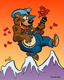
Personally, I find the digital trend highly disturbing and would rather continue to coast along with my traditional skills honed over a lifetime of working this way. At most, I would rather utilize the computer only in a hybrid fashion, combining my hand inked drawings with the ease of adding flat areas of colour with Photoshop. A little bit of rendering is okay, though I prefer not to overdo the adding of shadows and highlights, lest the image start to look more like plastic than flesh and cloth. This image of the bear is pretty much the way I've used Photoshop in the past, and I will probably continue to use it simply as a colouring tool in most of my artwork, although I would still like to see what I could accomplish if I can ever get a handle on this digital painting stuff.

Monday, August 11, 2008

Political Correctness Gone Amuck!

I thought this article in today's Globe and Mail was really interesting, so I'm reprinting it here. As I've long held a reputation myself for being like that kid who knows a naked emperor when he sees one, I know firsthand what it's like to be roundly condemned for speaking truthful but unpopular views. I think Ms. Cohen is right on the money with her assessment of these times we live in:

LAURA ROSEN COHEN
From Monday's Globe and Mail
August 11, 2008 at 3:38 AM EDT
So, did you hear the one about the guy who pushed the envelope while thinking out of the box, and kept a whole lot of agenda items on his radar until he got rid of the low-lying fruit?

You did? Were we at the same meeting? Probably not. But you could have easily heard the same generic tunes at any number of meetings throughout the country. An actual, productive exchange of ideas in many business forums has been gradually usurped by a steady diet of mind-numbing jargon. Who among us has not been at a meeting where legions of employees around the table try to stifle their giggles as increasingly trite and outrageous gibberish reaches our ears and insults our brains. But is this just a work annoyance or does the use of jargon have any implications outside the workplace?

The trend away from honest conversation in the workplace has its roots in a more generalized climate of politically correct discourse. At first glance, it appears to be a relatively benign practice. However, this phenomenon should be viewed in the larger context of words and expressions being continually evaluated and re-evaluated for their potential to offend groups and individuals.

People are so terrified of potentially offending others that language becomes a mockery of itself. While we might joke that someone is follicularly challenged instead of "bald," or vertically challenged instead of "short," these types of expressions move us further away from the facts and into conversations and relationships that are based on a discourse reminiscent of walking on eggshells for fear of offending others. That is not to suggest that one must be honest to the point of being hurtful, but surely there is some need to develop a workplace and political discourse that is both respectful and truthful.

A culture of fear has permeated political conversation in Canada as well. Though freedom of expression is enshrined in Canada's Charter of Rights and Freedoms, on an individual level, one is increasingly aware that political or religious positions that deviate from the unofficially sanctioned politically correct party line makes for ideologically dangerous living.

How did this happen? Can the average Canadian take back freedom of expression without fear of career or social retribution and shunning? Is it possible to nurture a more genuine political and social discourse or will we be forever doomed to repeat regurgitated pleasantries and clichés and obfuscate facts in order not to offend?

In order to reclaim honest conversation, baby steps must be taken.

Truly enlightened employers, managers and employees alike can make efforts to move away from jargon and back to a lexicon of clarity. A general caveat is that by the time "street" slang is used by middle-aged parents ("gee son, that's phat"), much to the chagrin of their teenaged children, it's clearly no longer cool. Similarly, by the time business jargon moves from the web to the boardroom, you can be sure it's just as dead and useless.

In the broader scheme of things, individuals can encourage their elected officials to repeal Section 13.1 of the Canadian Human Rights Act, that labels it a "discriminatory practice" to communicate messages that are "likely to expose a person or persons to hatred or contempt." In real life this amounts to speech that is "likely" to offend someone at some point. We need to collectively buck up, stop whining and allow the appropriate bodies to intervene only when speech becomes a threat of physical violence or incitement (call the cops) or libellous (call your lawyer).

In the meantime, the next time someone tells you to get your ducks in a row, going forward, how to inform the discussion, or what struck them most about what-ever, take a deep breath, take a bold step forward and politely demand clarity. You could be pleasantly surprised at the result.

Laura Rosen Cohen is a Toronto-based writer

Saturday, August 9, 2008

Computer Problems

I've been going through computer hell recently. The 20" iMac that I'd had for only two years was having a power problem, causing it to shut itself down completely after I'd only put it into Sleep mode. It would be okay if I went to use it within a half hour or so of putting it to sleep, but an hour or more and it would shut down. I must have called Apple tech support at least a half dozen times, each time with someone walking me through some test to try and pinpoint the problem and hopefully resolve it. No luck, I'm afraid, so then it was time to take it in for service.

At the Apple Store they figured it was the power unit and replaced it, assuring me the next day that they had tested it out and it seemed fine. But once I'd hooked it back up at home, it started doing the same damn thing again. When I took it back and they reassessed it, they determined it had a faulty motherboard and would be very difficult or impossible to repair. As it was still covered by the warranty, they told me the only option they had was to give me a brand new computer. In fact, they'd already begun transferring my data over, assuming I'd be receptive to the offer.

Now getting a new iMac in exchange sounds great, right? I thought so too, until I got it hooked up and running at home. I noticed that the screen looked a little unusual, sort of more contrast in the desktop wallpaper image I had on there. Also, I noticed that text at the top of a webpage seemed bolder than it did when it scrolled toward the bottom of the screen. However, it was only when I opened up one of my art files to work on that I realized just how much of a problem there was. As I was working, I noticed that when I altered my head position up or down by only a couple inches, that the tonal value of the image would vary lighter to darker. Standing up and looking down at the screen from a sharp angle made the display image appear washed out, whereas looking up from below made everything very dark, in fact causing almost a negative effect at the extreme angle with black areas turning light against midtones. Very strange indeed!

I thought a search on Google might provide some insight into the problem. Boy, did it ever! I soon discovered that Mac fans were in an uproar about what apparently were inferior quality displays that had been outfitted on all of the latest 20" models. In fact, a class action lawsuit has been launched against Apple for making claims on their website that would seem to differ from what the reality is with these new models. Anyway, I took back the computer the next day and complained that, had I known the screen was vastly inferior to what I'd given up, I would never have agreed to the exchange in the first place. To be fair, the Apple employees were quite understanding and accommodating, and the manager agreed to upgrade me to the 24" model which still had the superior technology in the display. Yes, I did have to pay a little extra to upgrade, but the manager met me halfway, knocking off half the price difference. So, currently I have a 24" iMac that has a beautiful screen and everything seems to be operating as it should.

Knock wood...

Tuesday, July 29, 2008

"Maria" Problem Solved!

For the record, I have to state that I am not a fan of so-called "reality shows" on TV. I've especially avoided the various "American Idol" type talent shows, mostly because I can't abide contemporary pop music. However, a recent addition to the reality show genre did intrigue me enough to tune in earlier this summer. CBC started showing "How Do You Solve A Problem Like Maria?"- a talent search for the leading role in a big stage revival of "The Sound of Music" to be produced by Andrew Lloyd Webber, no less, here in Toronto. It's based on a previous talent search that successfully aired in Britain on the BBC some time ago.

Being a Baby Boomer myself, I grew up in the tail end of the Hollywood musical era, when film adaptations of hit stage shows were still big box office. So, yes, I saw "The Sound of Music" when it originally played in movie theatres back in 1965. I believe I saw it again in a rerelease a few years later, which is when I probably understood better what it was all about. Around that same time I also saw "My Fair Lady", which still ranks first on my list of favourite musicals. Anyway, I thought it might be fun to see what type of talent would be on display in this CBC search, so I tuned in from the first show. By the time they'd pared down a possible 20 to the 10 young ladies who would compete on the weekly show, I was hooked. It has been a real delight to see all these wonderful girls sing their hearts out each week, hoping to make it through to the following week.

Of course, that's also the problem with the series, for in order for one girl to win, nine must lose. And so it went that I'd enjoy the hour long Sunday night show, watching the ladies perform, and then cringe a bit at the end of the half hour Monday show, where two girls would have to do a sing-off based on the lowest number of votes cast, resulting in one being eliminated by the judges. There is something inherently cruel about the process, which is why I still don't much care for the whole reality show concept. Even though some of the girls may not have had the right stuff, I did not like to see any of them hurt, as they were all quite adorable.

I'll admit I had my favourite, but once they'd whittled it down to three final contenders by last week, I was convinced that any one of the three would have been ideal in the role. These three girls pictured above are the final contenders, Jayme Armstrong, Janna Polzin and Elicia MacKenzie.


So here I'll reveal Janna Polzin as my favourite choice for the role. I liked her right from the start, as there was a very professional air about her. Not only blessed with a beautiful singing voice, but Janna seemed to have an instinctive flair for the performance in delivering her song material through strong expressions and body language. I also found out along the way that Janna just happened to be a graduate of the Musical Theatre program at Sheridan College, at the same campus where I teach in Animation. In fact, in researching her, I realized I'd actually seen two productions at Sheridan that she'd appeared in, though she was only in the chorus so I couldn't recall her. I'm a big fan of Sheridan's program, and try to show my support by seeing the shows whenever I can. I know a couple of the girls who would have been Janna's classmates, and I'm also friends with Sarah Cornell, a grad from a few years ago who went on to star in the Toronto run of "The Producers", of which I wrote about in a previous post. Yeah, I'll admit I'm a sucker for pretty gals who can sing and dance - they're my feminine ideal!

Janna did in fact make it into the final round this weekend, and she'd been considered the front runner for awhile, I believe. But it was not to be, for last night the winner was announced and it was.....


....Elicia MacKenzie!

Fact is, though she may not have been my pick, I still think that Elicia richly deserves the role. She too has been blessed with a wonderful voice and seemed the most adaptable to whatever type of song they chose for her to sing. Whereas Janna seemed the more seasoned professional, Elicia is still that diamond in the rough, though I've no doubt she will rise to the challenge and be ready for the stage this fall. She is certainly a fresh faced, wide eyed beauty, and very much the image of the Cinderella who has well earned her "happily ever after". I think Elicia was more surprised than anyone when it was her name that was read from the envelope and her victorious performance at the show's finale of the title song from "The Sound of Music" was just magical. I wish Elicia much success and look forward to seeing her on stage as Maria!

Here are video clips of both Janna and Elicia, courtesy of YouTube:


Saturday, July 5, 2008

Photoshop Frustration!

I must admit, I'm still pretty leery of digital artwork. Up to this point, all of my artwork generated on the Mac has been of the hybrid sort: drawn and inked traditionally by hand, then scanned in and coloured up with Photoshop. Notice I said "coloured" as opposed to "painted". You see, I don't consider what I've achieved thus far to be digital paintings - at least not in the truest sense.

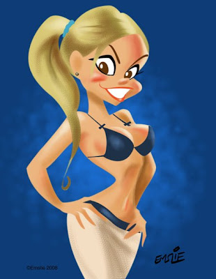
Here's a recent example which explains why not. This actually just started out as a test to see if I could create something using the Paths function on Photoshop. Frankly, I've never been able to figure out how to use that nefarious Pen tool, with it's Bezier Curves function. Being a right-brained kind of guy, I just couldn't make sense of those weird little handles. However, one of my students this year at Sheridan, Lawrence Lam, was kind enough to give me a basic tutorial on the different aspects of the Pen tool. I hadn't been practicing since then (about March), so it took a lot of messing around with it a couple days ago to figure it all out again. Fact is, it took me several hours to achieve what l did, so I'm going to have to work with this a lot more to get up to speed!


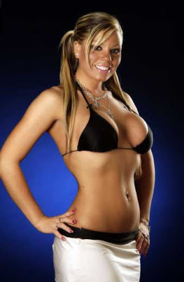
First of all, I needed some subject matter to practice on. Let's see now, what should I draw? Hmmm...hey, how about a CUTE GIRL! Fortunately, I'd been downloading pics of The Toronto Sun's daily "Sunshine Girl" for just such an occasion, so I had quite a collection to draw from. Though these pics are all relatively small, I wasn't in great need of visual clarity, as I am not attempting to achieve a perfect caricatured likeness of a specific girl. Anyway, I liked the sunny look of this cute blonde with her ponytails, plus the pose was appealing, so I went with her.


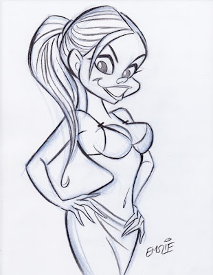
So here is my pencil sketch, starting out with a rough blue underdrawing, then defined on top with a dark pencil outline. (Are you paying attention, Sheridan students?) Like I said, I'm not trying to get a true likeness of this girl like I would with my celebrity caricatures - I'm just trying to capture her essence and using her pose and facial type as a starting point for what will be a much more cartooned interpretation. You can see how I've pushed the pose more, exaggerating the tilts and angles. For some reason, I have no idea why, I just gave her a single ponytail in the back instead of the two that the model has. Anyway, I only spent less than 20 minutes on the drawing, as it really was just for the purpose of this test with the Paths tool.


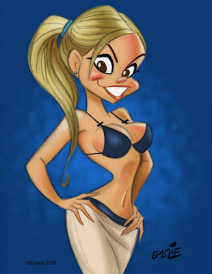
So after creating individual Paths for her flesh, hair, skirt, top, lips, eyes, etc. etc., I was finally ready to start adding colour. Initially I just filled each area with flat colours using the Paint Bucket tool, then started some fairly simple rendering in each area. I did want to try to get away from just using the Airbrush tool, so I used a custom brush that I learned how to make from an online tutorial that gave a more textured sort of rendering, similar to pastel. That, plus some softening here and there with the Airbrush seemed to result in a piece that was fairly appealing. I kept my pencil sketch on a transparent layer on top, lowering the opacity of the linework so it didn't overpower the colour. However, here's where I feel rather handicapped by my minimal knowledge of Photoshop and digital painting.


Here is the same artwork with the pencil sketch layer turned off so that just the colour is visible. As you can well see, it doesn't work like this, as it needs the pencil line to pull it all together. Ideally though, I would like to develop my Photoshop skills enough to attempt a real digital painting, using just tonal rendering to create the form, though perhaps using a bit of accent linework to strengthen it here and there. Recently, I've joined the National Caricaturist's Network (NCN), and have been studying the wonderful work of such talented folks as Joe Bluhm, Court Jones and Paul Moyse, just to mention a few. All of these guys are exceptional talents working with both digital and traditional media, but it's their digital work that I'm really trying to learn from. These guys are truly digital "painters" in the very real sense - something that I currently can only aspire to. If anyone can recommend any good sites for simple and clear Photoshop painting tutorials, please feel free to post them here in the comments section. Thanks!

Monday, June 23, 2008

So Long, George...


Sad to hear that George Carlin passed away today. I can't say I was a huge fan, being more of a Bob Newhart man myself, but I certainly liked his odd, cerebral musings throughout his many televised appearances . Seems to me, I first became aware of him on shows like "Flip Wilson" at the beginning of the 70's. He'd already made a name for himself on TV appearing on "The Ed Sullivan Show", and on these early TV guest spots he had to keep his act clean. A few years later, my friends and I chortled over his bluer material that could be found on his comedy albums, but I must admit, I preferred his odd takes on various subjects more than his infamous "Seven Things You Can't Say on TV". I'm hardly a prude, but shock value humour just gets tedious I think. I don't really follow contemporary comics for that reason.

I'd almost forgotten about this caricature I'd done of George Carlin, as it must date back to around 1979 or so. I recall the circumstances were that he was appearing in concert in my hometown of Ottawa. My friend, Bryan Stoller, also about 19 or 20 at the time, somehow had finagled a chance to interview George for something or other, being quite the enterprising type, and he asked me if I could draw a caricature that he could present to him. I agreed, provided he get a second one I inked up autographed for me. So, though I can't claim to have met George Carlin personally, I did get a signed caricature as a keepsake. Looking back at the art itself, it sure is an unpolished piece. I think my inking has improved a lot in the many years since.

So long, George - I hope you were able to take all your stuff with you...

(PS: I dedicate this post to George Carlin fan, Trevor)

Saturday, June 21, 2008

Diversity and "Fairyations"

There was an interesting comment from Bill Drastal in regards to my last post. He says:

I worked for a web company designing characters and other images and while I can't say what I designed them for, we were defiantly pushed in a direction where all the main characters came out looking like the same, and when we had to design characters of different racial backgrounds the direction was to make them, quote "Normal looking"

Believe me, Bill, I can sympathize with what you say. Unfortunately we live in politically correct times, and there's far too much sensitivity to portraying people of various ethnic backgrounds (other than caucasian, of course) with any degree of caricature. Sure it's a Black character, but it mustn't look too Black. Inexplicably, there seems to be a mindset that says that only caucasians can be caricatured and that the features of other races must be played down or, ironically, made to look more like those of caucasians. Frankly, I don't get it. In fact, I would think that the tendency to make Blacks, Asians and Hispanics all look like blandly designed White people would be more offensive to them.

Back in the early 1970's we had Bill Cosby's "Fat Albert and the Cosby Kids". Though the entertainment merits of the show may be open to debate, the character design was rather commendable. It wasn't brilliant cartooning, but there was at least a very distinct, individual look to each character. Furthermore, this nice variety of shapes and sizes of the characters also helped to visually communicate something of each one's personality. This is something I can't stress enough in my class at Sheridan. Remember, you don't have a lot of time to explain your character to the audience. Ideally, the viewer should have some indication of what your characters are all about from a quick glance. Then you can use your acting and dialogue to further flesh them out as your story unfolds.

Alas, here we are in the politically correct new millennium and Bill Cosby has come back with another animated series, albeit aimed at the preschool set. Still, I really don't think that fact justifies dumbing the art design down to the level found in "Little Bill". As you can see, Little Bill and his whole family are a group of lookalike clones, completely lacking individuality of design as well as being devoid of real expression. I love Bill Cosby as a brilliant anecdotal comedian, but I really do question his taste in regards to the art stylings of "Little Bill".

Little Bill's friends don't fare much better either. They're still pretty much all the same basic design and rather robotic looking in their expressionless poses. I suppose I have to give some credit for varying the body types a bit, but overall they're pretty bland and similar in design. Is this something that today's little tykes really would enjoy? I'm just glad that I grew up on "The Flintstones" and old "Popeye" cartoons in my kindergarten days, before the days of highminded "childrens' programming" came into being.

Not all is bad today, however. Here's a character lineup from "The Proud Family" that shows character designs far more to my liking. I personally think this is one of the finest looking animated shows on TV currently. Yes, the stories are all little morality tales, of course, but it manages to be quite funny and entertaining too, not the least because of the beautifully designed characters. Just looking at this lineup of kids, you get a distinct impression of what each one is like - their personalities are obvious in a glance. Also, the visual designs work well as "silhouettes", that is, if you filled them in as solid black shapes they still would read clearly to the eye as distinct, appealing characters, all different shapes and sizes.

Here's Penny and her family, including her Dad, who's a real opportunistic type. I think he's a great character! Even the backgrounds on this show are pleasing to the eye and unified in design. I really give a lot of credit to all who have created the look of this show. Just compare these funny, colourful characters to their bland and boring counterparts on "Little Bill". I know what I'd be watching if I were still a 5 year old kid...

And now I'm going to look again at the new "Tinker Bell" movie from Disney. Like I said before, I would consider any one of these Fairy designs appealing enough on its own, as there is certainly a visual appeal to the head to body ratio, the flowing, organic shapes, and the colour schemes, as we've come to expect from Disney (though the impact is lessened by the CG animation, in my opinion, compared to the linear characters in classic Disney films.) But the fact that there are five of these tiny girls, all identical in face and form is what I see as a big, big mistake.


In looking at this publicity still from the film, one gets absolutely no impression of who these five fairies are: what their personalities are like, or how they might relate to each other in the story. Cute though they may be, they really communicate absolutely nothing to the viewer in their design. All of their various personalities are going to have to be explained through the dialogue, which is a real waste of the animation medium, I believe.


Not long ago, however, I saw this on Jim Hill's site. These young ladies have been hired by Disney to portray the five Fairies as meet 'n' greet walkaround characters at promotional events and maybe at Disneyland.


Ironically, I find these live young ladies to suggest far more in possible personality than their animated counterparts. We know who Tink is, but how about her friends? If I were to hazard a guess, I'd say that the one on the lower left suggests an outgoing, "Voted most likely to succeed" type of girl. The Black girl looks pensive and serene, maybe a shy type. The girl with the braid might be a goofy and not particularly bright type, reminiscent of Goldie Hawn in her "Laugh-In" days. Finally, the Asian girl looks rather mischievous to me, perhaps given to pulling pranks on the others. Whether these impressions are accurate to what the film's characters are all about is not important - but the fact that these live actresses convey something to me in terms of a perceived personality is what counts. Why am I not able to read the animated characters as such? In cartooning, personalities should be even more obvious because you have the liberty of pushing them more through caricatured designs, expressions and body language. Which leads me to the following sketch:


Just for fun, I thought I'd try redesigning the Fairy characters as caricatures of these actresses, cartooned in a Disney style. I haven't drawn Tink herself though, for obvious copyright reasons aside from the fact we already know what she looks like. Is this what I think the final designs should be? Not necessarily, as I think they could be explored more in various ways and then simplified and refined more for the final models. But I genuinely believe this makes for a better starting point - to try and create distinct individuals that suggest their specific personality type through the visual designs. This is what Disney has historically always been so brilliant at in their classic animated features. Female attractiveness should not all derive from just one template - variety is the key to engaging the viewer's interest! I know there is the art talent at Disney to pull it off - but why are the artists not calling the shots?