Monday, October 31, 2011

Happy Halloween!

Here's a new caricature of Vincent Price that I drew for this past week's subject on Caricaturama Showdown 3000. I've written about Vincent Price before, as he was one of my favourite actors and I was lucky enough to have met him in person many years ago. As reference for this illustration pictured above, I turned to his role as Mr. Trumbull the undertaker, who's desperate for business in the 1963 dark comedy, The Comedy of Terrors. Here he is offering up some "medicine" to his infirm and nearly deaf father-in-law, played by Boris Karloff.

Incidentally, I'm dedicating this Halloween post to Belle Dee, who is a huge fan of Vincent Price, as well as of all the gothic horror films from AIP and Hammer studios of the 60's and 70's. Belle is also a very talented illustrator/cartoonist who has created a great many illustrations of her favourite horror film stars. Please be sure to check out her stylish art on her Facebook page.

Now, if you'll excuse me, I have to take care of this cop who's trying to arrest me for drinking and jiving at the Arthur Murray Halloween Dance...

Sunday, October 30, 2011

A Disney Halloween!


Since tomorrow is Halloween, I thought I'd post up some of my Disney illustrations that were created to that theme. The two illustrations below featuring the characters from Snow White and the Seven Dwarfs and The Lion King were both done for a Random House childrens' book entitled Don't Go Bump in the Night!, which was a book full of Halloween safety tips illustrated with scenes from several Disney films and Pixar films too.


These illustrations featuring characters from The Little Mermaid appeared in another book from Random House entitled The Fairest of the Fall. This book was in the Disney Princess line of merchandising, and consisted of two stories with an autumn theme, the first featuring Ariel and the second featuring Princess Aurora (AKA Briar Rose) from Sleeping Beauty.

The story with Ariel is about her discovering a Jack-o-lantern floating in the waves which she then takes to Scuttle the seagull to see if he knows what it is for. He explains the concept of Halloween being celebrated by the villagers onshore, thereby inspiring Ariel and her friends to then stage their own aquatic variation on the festival.

(Sorry I gave away the ending, but please go buy the book anyway, okay?)

Friday, October 28, 2011

More Walt Disney World Art

The above image was the very first illustration I did for Walt Disney World Marketing, although it was created about a year before I was actually hired on staff, which would place it as being done around 1989. I was still working for Disney's merchandising division here in Toronto full-time when this project was offered to me as a freelance assignment. I was being considered for a permanent staff position in Florida at the time, so I really poured my heart and soul into this illustration. I wanted the painting to really capture the look of the film, so I treated the background more like watercolour, using dilute glazes of gouache to create that translucent look. The Dwarfs were painted with gouache full strength, to give them more opacity like animation cels.

This is how the project looked in full, as my illustration was just the centerpiece within a graphic design that had been put together by one of the Walt Disney World designers at the excellent WDW Resorts Design division. They produced many holiday posters over several years, which were printed up and given out to guests in the various Disney resort hotels. Once I was working at WDW full-time, I contributed to several more of these, although this one will always remain my sentimental favourite.

Soon after first joining the WDW Marketing Art division I remember getting this fun assignment from their travel agency. Originally, I had done the concept art of Donald Duck with his two amigos from The Three Caballeros, José Carioca the parrot and Panchito the rooster, swooping over The Magic Kingdom on their flying serapé. Unfortunately, the client had never seen the film and wondered who the parrot and rooster were and, despite my trying to educate him on the matter, insisted that I change it to Donald's nephews instead. I still enjoyed doing the illustration but I don't think it makes as much sense as the original concept sketch did. Ah well...

This piece was actually done several years after I'd left WDW in Florida and had returned back home to the Toronto area. I was still doing a lot of regular freelance work for WDW, mostly through the Resorts Design division. I remember really enjoying working on this illustration for a chocolate box which would sell in the WDW gift shops. It wasn't often I got to do the 1930's style of Mickey and the gang, so once again there was the novelty in trying to capture that delicate watercolour look of the background, themed to the 1937 cartoon, Hawaiian Holiday. By this time I'd finally gotten myself a computer and had been dabbling with Photoshop a bit in my art. Quite frankly, to this day I'm still far more comfortable painting with real gouache on illustration board and I can't imagine capturing that same feel digitally, so I still paint backgrounds traditionally and scan then in to the computer afterward. However, I do find Photoshop handy for painting the characters, making them look more like animation cels like in the films. I still ink them traditionally, then scan in the linework and use Photoshop to add the colour. That's how this illustration was accomplished, and I have continued using this hybrid method to illustrate a great many children's books for Disney since.

I'm still sorting through folders of old art and printed samples, so I may start posting up more of my Disney work in the near future.

Friday, October 7, 2011

More Colour Commentary


My blog post from Sept. 24th entitled Whatever Happened To Colour? was noticed and picked up by the folks over at Boing Boing which led to a lot of comments both for and against my stance on the issue of desaturation run rampant on today's movie screens (not to mention in most TV shows now too.) Well, that Boing Boing post was in turn noticed by the folks at CBC News, and producer Nigel Hunt then contacted me to ask if I'd be interested in being interviewed on the subject.

I agreed to it, so Nigel brought cameraman Doug and on-screen personality, Deana Sumanac to my home to conduct the interview. Though they were here for about an hour, only about 10 seconds' worth of what I said actually made it in to the segment, but I know that's par for the course with TV news and the piece was finally broadcast on tonight's broadcast of CBC News' The National. Anyway, if you're curious enough to take a look, don't blink or you'll miss me!

Thanks again to CBC's Nigel Hunt for putting it together and showing interest in my views on the issue. I'm also very happy to have had the pleasure of meeting lovely Deana Sumanac, shown in the photo above.

Monday, October 3, 2011

Walt Disney World Kids Menus

Continuing with the theme of Walt Disney World celebrating its 40th Anniversary, here are some more samples of projects I worked on while employed there in the early 1990's. Specifically, these are some of the kids menus I illustrated for the various restaurants in the WDW resort hotels - projects that I particularly enjoyed doing due to their novelty factor.

I always enjoyed illustrating Donald and his nephews, as the ducks are my favourite of the standard Disney characters. This was one of the numerous, more economically produced menus/placemats that were easily printed up on 11 x 17 stock. It was created for Olivia's Café at the Old Key West Resort. The menu items are actually listed on the back of this placemat, in among some illustrated puzzles for the kids to work out while eating. The novelty aspect was the fish that was a separate insert that kids could remove and replace in the net.

In a similar vein, this was another economical novelty menu created for Boatwright's at the Port Orleans Resort (which was originally a separate area known as Dixie Landings Resort). As I mentioned in my previous post, it was always a treat to illustrate the characters from Song of the South, as they were not utilized that often. Again, there is the novelty of the ruler insert with small stencils cut in each end.

As I'm a huge fan of The Jungle Book, it was a particular thrill to get to illustrate this kids menu that was used in one of the restaurants over at The Polynesian Resort. (I can't recall which one, though.) It was about 36" wide, so I decided to illustrate it actual print size just to keep it a manageable size on my drawing table, rather than 25% bigger or so, as I normally chose to work. The only direction I'd gotten from the client was that it had to depict the various characters gathered around a table in the jungle and there had to be room to print the menu items somewhere too. Hmm, that was a tricky problem - how to achieve that directive, yet keep the solution somewhat faithful to the jungle environment itself.

I decided to treat the table as a gigantic stone tablet that might have been part of King Louie's ruined temple. Likewise, the menu items appeared on more tablets suspended by vines overhead. To be sure, the situation with the characters is quite contrived, but I enjoyed coming up with gags that seemed right for each of them, such as Kaa the snake's front end appearing in the first segment while his tail end is shown further along in the scene. The whole scene was painted with gouache on illustration board, and I enjoyed trying to maintain the look of those beautiful backgrounds from the film.

Speaking of Kaa, the reverse side of the menu featured a line drawing of the snake (a segment shown above) for kids to colour in with crayons, then punch out along the perforations to fasten into a loop that could then be placed around the head like he does with Mowgli in the film. Unfortunately, this novelty led to the unintended effect of kids asking for a second intact menu after they ruined the first one by punching out the snake. Ultimately this resulted in the item being discontinued after about a year, as it was costing the restaurant more than their budget had allowed for!

Finally, here is the only item for which I ever got to illustrate the characters from The Rescuers. This menu was created for Port Orleans Resort, if memory serves. The menu items appeared on the reverse side listed on the underside of the gator's belly, as it was the same scene depicted, only as if you were underwater looking up. Very tricky to make it look optically correct, as I recall. Again the novelty involved punching out the gator, then folding down his side panels to end up with a dimensional relief sculpture that the kids could play with while eating. Alas, this one as well often resulted in twice as many menus being requested due to ruining the illustration in the process, thereby being replaced sometime later with a simpler, more economical menu instead.

I look back with a lot of fondness on these kids menus, as they were usually more creative and playful than a lot of the other illustrated assignments I worked on. They were all produced in collaboration with the great design team who worked in the WDW Resort Design Department. To those who are still working there today, I salute you!

Saturday, October 1, 2011

Happy 40th Anniversary, Walt Disney World!

Yes, on October 1st 1971, Walt Disney World in Florida officially opened up to an appreciative public. I'm sure that many other Disney enthusiasts are posting articles today that go into the history of the park, so I'm going to do something a bit different. Instead I want to post up some of the artwork I did while employed at the WDW Marketing Art Dept. back in the period of 1990 to 1994. In 1991, of course, WDW was celebrating its 20th anniversary, so there was some special art that was produced for that year-long celebration:

Some of the 20th Anniversary material featured Roger Rabbit, who had made his screen debut just three years earlier. Unfortunately, at this point poor Roger was in the centre of a rather ugly legal battle between Disney and Spielberg's Amblin Entertainment, whom had partnered up with Disney to produce the movie. I strongly recall a memo being circulated around our office at that time, informing us that any projects we had on the go involving Roger could be completed and used, but nothing else could be initiated until further notice. I had this painting in progress, so they told me I could keep going on it. The way it ended up, Disney and Amblin were never able to resolve their differences, and Roger Rabbit ended up in a sort of legal limbo. This illustration was one of the last depictions of Roger for quite some time, although there have been some exceptions I've noticed in recent years, notably some sculpted figurines from the Walt Disney Classics Collection.

This colourful phone directory cover was my favourite illustration project that 20th Anniversary year. There was a festive parade featuring the Disney characters in Mardi Gras style costumes. In fact, they'd coined it the "Party Gras Parade", and it was actually recycled from a Disneyland 35th celebration the year before. You can see a bunch of images from it here on the Jim Hill Media site. I was given the happy assignment of creating the Lake Buena Vista phonebook cover art that year where I got to interpret the parade back into cartoon illustration form of the Disney characters.

Though the Splash Mountain attraction actually opened up the following year in 1992, I thought I'd include this illustration I did for the presskit folder that would have heralded the news to the media. I must admit I've had ambivalent feelings about that attraction, as the WDW Marketing Dept. tried to sell it as thrill-packed log flume ride while radically downplaying the theme of the Br'er Rabbit characters from Song of the South. They didn't show the character theming at all in the TV spots promoting it at the time. As we all know, Disney has kept that lovely film locked tightly in the vault out of fear that its time period of the immediate post-Civil War American South would upset and infuriate ultra-sensitive types. I'm just happy that I was able to illustrate the folder cover in a way that paid tribute to a film that has long been a warm memory from my early moviegoing years.

Finally, here is an example of something else we occasionally got to do in my department. Even though there was a separate WDW Merchandise Art Dept. elsewhere on property, sometimes we would get some of their overflow work. This was one of several illustrations I got to do for them which would appear on candy boxes sold in The Magic Kingdom gift shops. They also were novelty items, in that if you flipped the box over, there would be an illustration of the back view of the situation, in this case revealing a lucky horseshoe from Minnie that Mickey is holding behind his back.

Anyway, I might rummage through more boxes and folders of my old Disney artwork to post a few more samples up here in the next few days.

Saturday, September 24, 2011

Whatever Happened To Colour?

Those who know me well know that I am very much steeped in the popular culture of the 50's and 60's. In fact, most of my favourite movies were made in roughly that twenty year span. That's not to say that I believe movies were better overall from that era in terms of writing and direction, but when it comes to colour and sound then, yes, there's a wealth of pleasure for the senses to be found during that period.

Just the other night I put on my DVD of 4 For Texas, starring Frank Sinatra and Dean Martin alongside those fine Swedish and Swiss imports respectively, Anita Ekberg and Ursula Andress. To be sure, it's a mindless piece of fluff that would never end up on any film critic's list of all-time classics, but it's a bit of fun and most importantly, it looks great! Like most films of that era, it is crisply lit and absolutely awash in lush colour. I know most of you likely value content in a film over style, but not me - I prefer style, critics be damned! (Of course, the goal should be to have both wonderful content and style.)

For me, a movie has to lure me through the senses - it must appeal to the eyes and ears. At one time, Hollywood used to knock itself out trying to do this, with lush Technicolor and memorable music scores. Cinematographers, art directors, costume designers - all were hired for their skill in bringing aesthetic appeal to meet with the director's vision. Scenes were beautifully lit in order to showcase the attractiveness of Hollywood's leading stars of the day, with their warm, tanned flesh tones and well-tailored wardrobes:


But not now...

Hollywood has decided that we can't have beautiful imagery anymore. These days, it seems that the default look for most (if not all) movies is like this - colours drained of all their bright hue and given an overall dull blue tinge:


It's bad enough when horror, sci-fi and fantasy movies seem to slavishly adhere to this unpleasant template, but even mainstream adult dramas like Up In The Air and Fair Game (both of which are films that I would otherwise like) are being drained of all their colour in post-production. This unfortunate trend in dreariness also lessened my enjoyment of last year's Best Picture winner, The King's Speech.

Recently, I did some searching on Google to find out whether others are equally disturbed by this ugly trend in today's films. Sure enough, I turned up this article that helps to explain what is going on. It's interesting to read the numerous comments afterward, as there are many, like me, who abhor this unpleasant trend, while others defend it as being true to the director's "vision". Though they may like to think of themselves as unique visionaries, most directors working today merely conform to one basic template of mediocrity that the Hollywood studios all decree must be followed. Because of this trend toward the drab and ugly, I find myself seeing fewer and fewer films with each passing year. Perhaps Hollywood should realize that many older moviegoers are used to far richer looking movies from the more glorious past - today's films just turn us off. BLECCHH!!

Here's a final parting shot. Compare the dreary, blue-tinged Russell Crowe 2010 Robin Hood to the lush 1938 Technicolor classic starring Errol Flynn:


(And if you want to see the warm, rich colours of gorgeous Ursula Andress, here's the trailer from 4 For Texas!)

Wednesday, September 7, 2011

Happy 100th, Freddie Moore!

I've been reading on other blogs that today, Sept. 7 2011, represents the 100th anniversary of the birth of legendary Disney animator, Fred Moore. You can read the thoughts of other artists regarding Freddie on the blogs of Jenny Lerew and Andreas Deja. Aside from his iconic and highly influential Disney character designs and animation, Fred was also famous for his drawings of cute, innocently sexy girls. I've written before on this subject here, and I am proud to own a couple of his originals, bought about 20 years ago through the Howard Lowery auction, one of which is pictured at the head of this post.

Recently, former Disney animator and creator of Electric Tiki, Tracy Lee, has created a beautiful figurine based on one of Fred's sketches of a typical "Freddie Girl", pictured in the above photo. The sketch was interpreted into the 3-dimensional figurine by the brilliant Kent Melton, who has been responsible for many extraordinary sculpted animation maquettes over the years, as well as having sculpted figurines for public purchase with the Disney Classics Collection. I had pre-ordered the Freddie Moore Girl sculpture when it first went on sale, and received it a couple months ago, where it now sits alongside other Fred Moore-inspired figurines of the centaurettes from Fantasia that were among the first set of bisques from The Disney Classics Collection. Just adorable!

Sunday, August 14, 2011

Pooh Book Illustrations

Seeing the recent Disney Winnie-The-Pooh feature made me think back on the series of books I'd illustrated for Readers Digest back about 10 years ago. I like the Pooh characters, but I must admit I find them deceptively simple in design, as they're actually quite hard to get just right. (And nobody can draw Tigger absolutely right since Milt Kahl retired from animating - he's really tough to do well!)

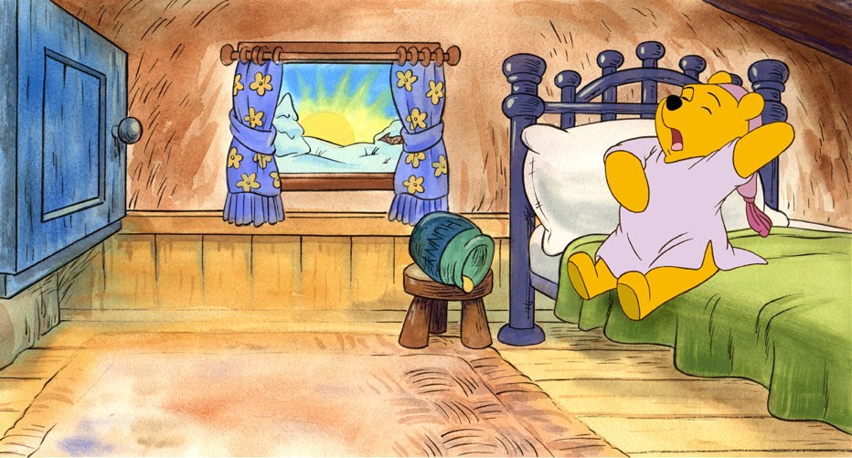
This was perhaps my favourite of the handful that I'd illustrated, as I really quite like drawing Rabbit. Perhaps I relate only too well to his curmudgeonly attitude! The fun for me was in keeping Pooh and Rabbit in character as best I could, as well as trying to paint the backgrounds as faithful as possible to the watercolour style in the films. I drew the characters as separate elements, scanning in the pencil art and colouring them in Photoshop, then placing them on top of the hand-painted backgrounds that were done with diluted gouache on illustration board. This process helps to keep the illustrations looking much like cel set-ups, resembling the look of the films as closely as I was able to achieve. Anyway, here are all of the interior pages from Happy New Year, Pooh! - some are single pages, others are double page spreads. The simple text is laid in afterward on top of the illustrations in the wide open areas. These books were available in a book-of-the-month-club format aimed at very young readers.


Tuesday, July 26, 2011

Caricatures For Ellie!

The other night I drew caricatures at a bridal shower for one of my former animation students, Ellie Ventura, who is getting married this coming September. I must confess, bridal showers are my favourite type of event to work, as I get to caricature lots of cute girls! Some people believe that it's harder to caricature females, but I think it's still possible to exaggerate and stylize the features while maintaining their attractiveness. Anyway, here is a sampling of the ones I drew that evening. Unfortunately, I didn't get to sketch Ellie herself, though at least she has the one I did from when she was in my class about 5 or 6 years ago. All the best to Ellie and her beau on their upcoming wedding day!