Wednesday, December 16, 2009
Thanks For Everything, Roy.
I'm so sad to hear that Roy E. Disney passed away earlier today. I wasn't aware that he'd been battling cancer, so it was quite a shock to me. There are a lot of memories that are flooding back from the last 25 years - starting in 1984, when there was that attempted takeover of Disney, which coincidentally reared its ugly head only several months after I'd first started my Disney career in the Canadian office.
I recall that Disney staff far and wide were all pretty nervous of how that would end, but once the attempt was thwarted and the dust had settled, Disney had a new management team in Michael Eisner and Frank Wells, with Roy having been instrumental in negotiating their installation at the helm. Admittedly, I wasn't that thrilled with the direction they soon started taking Disney in, but I was happy that Roy's part in the deal was that he would be the, albeit, figurehead in charge of Disney Feature Animation, as we saw him as the protector of that most important, yet under-appreciated division of the studio. It seemed that, were it not for Roy Disney, Disney Animation might have been dissolved soon after Eisner and Wells took charge. Fortunately, Roy convinced them of how important it was and that eventually led to such films as The Little Mermaid, Beauty and the Beast and The Lion King, putting Disney once again at the forefront of animated entertainment.
After Frank Wells was tragically killed in a helicopter crash in 1994, Michael Eisner started getting too big for his britches, making a lot of ill conceived decisions that were judged by many to be detrimental to Disney. Eventually Roy became so fed up with it all that he quit the board of directors (or was in danger of being squeezed out ) and started the "Save Disney" campaign to oust the tyrannical Eisner from his position as CEO. His efforts ultimately proved successful, leading to a humiliating revolt against Eisner at the 2004 shareholders' meeting, forcing his hand to leave the Company during the following year before his contract officially was up.
Back around 1981 or 1982, before all that mess with the Disney takeover attempt, I have one very fond, personal memory of Roy that I think says a lot about the man's character. Here in Canada on CBC (our public network) there's a long running current affairs show called The Fifth Estate, similar in format to CBS's 60 Minutes. Back at that time, they did a show where they investigated the mistreatment of animals that was purported to be rife within the TV and movie industry. It ran at least a couple times in repeats, so I remember it well. One of the guys they interviewed on the subject was Marlin Perkins, former host of TV's Wild Kingdom. When confronted with information from people who'd worked with him on some of his nature shows claiming there were contrived setups with animals that put them at risk of injury and death, Perkins denied it all, eventually losing his cool and demanding that they turn off the camera and stop the interview. Perkins came off as a bald-faced liar as a result.
Afterwards, there was a similar confrontational grilling of Roy Disney in what looked like his living room at home. The journalist confronted Roy with the accusation that there had been deaths of animals during the making of some of the True Life Adventures of the 1950s, in which Roy had been in charge of one of the camera units filming animals supposedly going about their business in the wild. I recall the journalist aggressively accusing the filmmakers of stampeding a horde of lemmings over a rocky cliff in White Wilderness. And while lemmings are believed to commit mass suicide in such a fashion, apparently these weren't the right sort of lemmings who are purported to do that! While the self-righteous journalist was accusing him of these misdeeds, Roy just sat there in his armchair very calmly smoking his cigarette before finally being given a chance to respond to the accusations. Instead of denying it all like Marlin Perkins had done, Roy just casually replied (and I paraphrase) "Yeah, that probably was what happened. We wouldn't do that type of thing today, but back then we did what had to be done to get some exciting footage in the wild". No vehement denials - just a somewhat sheepish grin, perhaps denoting some small pangs of latent guilt. Anyway, it took the wind out of the sails of that indignant interviewer and I admired Roy Disney for his refreshing frankness then and ever since, as every time I'd seen him on camera I was struck by how genuine and devoid of Hollywood b.s. this mild-mannered man was.
If you'd like to see Roy at his finest, I'd highly recommend checking out his lengthy interview with Leonard Maltin on the On the Front Lines DVD set, devoted to Disney's wartime cartoons. Roy fondly shares his firsthand memories of visiting his dad's and uncle's studio as a boy during World War II. His incredible knowledge of that period and nostalgic anecdotes are just a joy to watch. You can see just how much Roy loved and respected his uncle Walt's legacy, which explains why he felt so compelled in later life to defend Disney animated filmmaking at all costs. I'll always love ol' Roy for that, and I'll miss the man very much.
Saturday, December 12, 2009
Happy Birthday, Frank Sinatra!
Yes, it's that time of the year again, when The Cartoon Cave pays tribute to the greatest of them all, Frank Sinatra. I've written about Frank often on this blog, but he will always be celebrated here, as he typifies the entertainment from that glorious past that I love so much. In honour of his birthday, I sketched a new caricature of him, this time trying something a little different in the rendering technique. Instead of my usual brush and ink with Photoshop colour, I decided to draw him on toned paper with coloured pencils just to see how it would look. It may be a bit overdone in some areas, but I'm relatively happy with the result. I actually got the inspiration from having seen a similar approach by several of my very talented Sheridan animation students while reviewing their sketchbooks this past week.
The reference I used for this one was a scene from Tony Rome, in which Frank played the title character, a rough and tumble private detective operating in modern day Miami, Florida. The film also starred the delectable Jill St. John. Though I unfortunately can't embed the YouTube clip for this one, here is a link to the opening clip of Tony Rome, featuring the title song sung by Frank's little gal, Nancy Sinatra. Enjoy!
Monday, December 7, 2009
Me and Bob!
Yes, I know it's been a long time since my last blog post. I just haven't had much in the way of new stuff to put up lately. However, I did have a rather exciting thing happen last Friday evening that I want to post about at this time. I finally got to meet one of my top favourite TV stars of all time: Bob Newhart! I've written of Bob several times on my blog, including this tribute.
Bob was here in Toronto last Friday appearing at Roy Thomson Hall. I only found out about his scheduled appearance last Monday, so I was fortunate to be able to get good seats on such short notice. I'd actually seen him in concert about 20 years ago, also at Roy Thomson Hall, and I'd been kicking myself ever since for not trying to meet him back then. This time I was determined to do it right. I ended up sending off a quick note to him, care of the venue, including a small image of my caricature of him. Thankfully, the folks at RTH passed it along to him and the result was my name ended up on the list of those who would be granted a backstage visit with him after the show.
It was an admittedly short meet and greet affair, where there were several small groups waiting to say "Hi Bob!", so there wasn't any time to really chat with him. But, still, it was enough for me to just finally get to meet one of my TV heroes in person and present him with a framed print of my caricature. Bob got a big kick out it and was gracious enough to pose for a photo with me and autograph an additional print for my growing collection.
The performance itself was very good, though it seemed a bit short at just over an hour of Bob himself, after a short warmup act by a songstress singing Vegas style standards (I feel bad for not catching her name!). He included one of his famous telephone routines (on a cell phone yet!), the one involving Sir Walter Raleigh reporting back to his superiors in England after being introduced to the concept of smoking cigarettes by the Native Americans. A good review of his show on Friday can be found here. He's really quite amazing and I'm just happy to see this comedy legend still touring and performing having recently hit the age of 80. Here's to you, Bob!
Sunday, October 25, 2009
Recent Party Caricatures
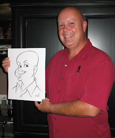
I still quite enjoy doing "Party Caricatures" at various events, whether they be corporate events or smaller private parties. Today I was hired to draw at the bridal shower of Carole Ratulowski and her husband-to-be, Ollie (who wasn't allowed to show up until the end, poor guy!). The happy couple are pictured in the first two photos, with several of the guests pictured after them. I wish I'd taken a lot more photos, but I'd forgotten I'd brought my camera until I was well into drawing them. Unfortunately, by that time I was also having problems with the bright sunshine streaming through the window playing havoc with the balance of the lighting. I've adjusted several of them to lighten the guests, while keeping the caricatures as untouched as possible. I'm afraid I'm no photographer!
This last young lady was so pretty - somewhat reminiscent of Audrey Hepburn with her big eyes and angular little jawline.
The following three pics are of Lesley and Peter Skingley and their son Connor. I'd sketched at Peter's birthday shindig about a month ago. I am certainly open to drawing at any events in the Toronto and Mississauga area, so for those in the GTA who might be interested in booking me for upcoming events, please email me for rates and availability. Remember, Christmas is coming up soon!
Wednesday, October 14, 2009
The Great Al Martino
This morning I awoke to the very sad news that singer Al Martino had passed away at the age of 82. Though I am grateful that he enjoyed a long and happy life and career, I am personally saddened because, of all the legendary Italian American crooners that I've long admired, Al Martino was the only one whom I'd actually had the pleasure to see several times in concert and meet in person.
Al Martino had been very successful starting from the 1950s, and particularly through the 60s and early 70s, with a string of song hits including Here In My Heart, Spanish Eyes and Volare. However, as many of my generation probably were, I was initially most aware of Al Martino from his film performance in The Godfather, where he played Johnny Fontane, a singer with movie aspirations clearly modeled on Frank Sinatra at the time Sinatra was fighting for the role in From Here To Eternity. Because the movie (and the original novel) depicted Fontane as having influential friends within the mafia, Frank Sinatra was none too happy with either the character or with Al Martino for playing the role. I gather that Frank held a grudge against Al ever since that time.
But in the years after The Godfather, I became a big fan of Al Martino, just as I loved all of those legendary Italian American singers like Sinatra, Dean Martin, and Bobby Darin. In fact, when my fellow highschoolers were all grooving to such 1970s newcomers as Elton John and Billy Joel, one of my favourite songs from the pop charts of that era was Al Martino's To The Door Of The Sun. Yeah, I was a weird kid, always with tastes that were more in keeping with my parents' generation. I remember the way Al Martino looked at that time, with the huge sideburns and mane of black hair, very similar to that of his contemporary and longtime friend, Engelbert Humperdinck. It was this look which I decided to capture in the above caricature.
About seven or eight years ago, Al Martino had been making regular stops here in Mississauga every couple of years on his concert tours, playing at Stage West in a dinner show format. My Mom and I were both big fans, so it was always nice to get together with her to go see Al in concert. I believe we saw him on four occasions, and it was on the third where I worked up the caricature and framed up the original to present to him. What was wonderful about Al was that he would always greet his fans out in the Stage West lobby after his show, and he was quite thrilled when I presented him with my framed art. He happily obliged to sign a print for me to add to my growing collection of showbiz memorabilia. Shortly thereafter, I was really excited to receive the following message on my website guestbook from Al's wife Judi:
Dear Pete,
What a wonderful surprise I got when my husband, Al Martino, came home from his recent tour of Canada. There was a fantastic caricature of him that you had done. You definitely captured him and I absolutely LOVE it. I have gotten so much pleasure out of seeing it.
Al has a studio here at our house and it now is very proudly displayed. We both thank you for your kindness. And what a talent. You have made our world a much happier place. God Bless You.
On the next visit, Judi accompanied him on tour, so I went up to say hi when I saw her in the lobby before the show chatting with the concert promoter. She was so sweet and insisted that I come back to see Al again after the show. When I saw them in the lobby later, Al happily greeted me and again expressed how grateful he was to me for doing his caricature. They were both such lovely people that I asked if I could take a photo of them together, which you can see pictured above. Al Martino was such a wonderful entertainer with that rich operatic baritone, and he was also a real gentleman. I will personally miss him so much, but am grateful for having had a chance to meet him several times. My sincere condolences go out to Al's wife Judi and their family.
Here are a couple clips to enjoy of Al Martino in performance. The first, singing his big hit, Spanish Eyes, and the second singing a song he recorded in the later years of his life, the poignant tale of an Italian immigrant first arriving in America, Come Share The Wine. As you can hear in that second clip, Al Martino's voice was still so rich and strong even into his later years.
Monday, October 5, 2009
Some More Mickey Mouse Magazine Pages.
Once in a while I got to do some illustrations of the characters from the Disney feature films, as some issues would tie in to one that was perhaps being released on VHS at the time. I enjoyed doing the spot paintings above of the Lady and the Tramp characters, although there was something that I took exception to and didn't hesitate to make my argument known. You'll note that in the second column it refers to "Scamp's brother and sisters", which, as every Disney fan knows, is just plain wrong! Scamp had three sisters but no brothers, so I insisted on depicting them exactly as they appeared in the film. While the editors allowed that, they resisted changing the text in the story to match, as I think they wanted to indulge in some political correctness to be more "inclusive" of their boy readers. By the way, the writer of the piece was noted Disney historian and author, Jim Fanning, and he wasn't to blame either. I talked with Jim about it afterward and he said he was just as uncomfortable writing it like that too!
The following set of four illustrations featuring the Pinocchio characters were a lot of fun to do, although the concept of the pages really frustrated me. The round holes were meant to be cut out so the kids could poke their fingers through and do finger puppets. While it may have worked okay on Pinoke's nose and Figaro's tail, I'm afraid that the Blue Fairy and Jiminy Cricket didn't fare so well. With or without the kid's fingers acting as arms and legs, these two characters were doomed to looking like war amputees! Still, the job was fun to paint, as I was trying to capture that watercolour look of the backgrounds from Pinocchio. I just wish I could have included all those missing appendages...
Sunday, October 4, 2009
Mickey Mouse Magazine
Despite growing up loving Disney animation since I was a young kid, these days I am not particularly enchanted with the company. In fact, I think that when they changed the name from Walt Disney Productions to the more corporate The Walt Disney Company, that signified the beginning of the end for me. Still, back in the 90s, I must admit I was getting some very good freelance jobs, some from within Disney itself, but mostly from their licensed vendors and publishers. Here are some samples I thought I'd post of various illustrations I had done for The Mickey Mouse Magazine, a very nicely produced publication put out by Welsh Publishing from about 1991 through 1996. They were also putting out Duck Tales Magazine at the same time, which of course was a tie-in with the popular TV cartoon. I was a regular freelancer on both publications for the duration of their run.
The art director I was dealing with on both magazines was a delightfully wacky lady with a sly sense of humour named Margaret Ottosen. Margaret was just wonderful to work with and she would always send her rough layouts to me in envelopes covered with various rubber stamped images cobbled together in amusing situations, just for a laugh.
I had a lot of fun on these illustrations, as I got to take each one from rough sketch, through clean-up pencil, to finished painting. All of these were painted in gouache on illustration board. Even if I were to do these today, at most I would only use Photoshop to perhaps paint the characters on a separate layer like an animation cel, but I would still paint the backgrounds traditionally with real paint. Trying to paint in a style as close to the look of the animated cartoon shorts was always my goal.
I also liked to include obscure secondary characters from the shorts whenever an animal was called for in a scene, rather than just make up some generic cartoon animal. The cat in the above Pluto illustration was from the cartoon, Plutopia. I guess I must like Spike the Bee, as the little rascal snuck into both of the illustrations above!
Margaret knew that I had a particular penchant for drawing the Disney ducks, so I would often get assignments featuring Donald, Daisy, and the nephews.
Alas, Disney no longer does much with their standard characters anymore. No longer in vogue in publishing or other merchandising, Mickey and friends have instead been relegated to babysitting the preschool set on the Mickey Mouse Clubhouse series. Additionally, they've been given a bland CG makeover too, as the Disney brass have made it quite clear that they really don't like cartoons.
Monday, September 28, 2009
The Limitations Of Contemporary TV Animation.
There's certainly an interesting discussion going on currently over at John K's blog regarding all of this contemporary trend in (mostly TV) animated characters where the designs are deliberately flat and graphic, with the limitations in movement and personality that are inherent in such design. Needless to say, I agree with John's stance on this and share his criticisms of this unfortunate trend. I believe that there is a real detriment to animation design when one is a slave to the computer software being used today. The examples that John cites from TV shows are all of the Flash cutout (or "symbol" as they call it) variety, where each character is created from an assortment of pre-drawn parts that exist in the computer, with no additional drawing being allowed by the animators working on the show. Instead of actually creating a pose or expression, today's TV animators must contrive it as best they can from the library of character parts they have to work with. Can you imagine - animators being discouraged from actually drawing something!
Additionally, the fact that these characters are all being drawn digitally on the computer to begin with, utilizing a vector-based program like Flash or other likeminded software, means that all of the designs consist of perfect geometric shapes: perfect straight edges and perfect curves. Likewise, the outlines are all vector lines, usually of an unvarying line weight, or occasionally with a contrived thick and thin. All of this unyielding control that the computer has been given is killing all of the potential for fluid animation and, ultimately, personality. It's like trying to draw a character using nothing but a ruler, circle/oval template, and maybe some French curves. Why would any artist want to be given such strict limitations? I'm not saying that the resulting images are totally lacking visual appeal, but they are certainly not designed for animation in the truest sense.
John talks of the functionality of a good character design, and that it must be explored through movement to arrive at a final design that's conducive to animation, rather than just be a series of graphic shapes that only work in static poses. I agree with this assessment, as I also prefer that a character design be "organic" - pliable and capable of fluid movement and full rotations when called for. Even the Hanna-Barbera designs of the early 1960s, though more simple shape based for the TV cartoons of that era than their theatrical predecessors, were still solid in form and designed for pliable movement. Just compare the animation of Yogi Bear or Fred Flintstone to anything of today and you'll hopefully understand what I mean.
One of the most compelling comments following this topic on John's site comes from a commenter by the name Tilcheff, who offers this bluntly honest and heartbreaking assessment of his recent experience in the animation studios:
"It's funny and sad at the same time that every single studio I have worked at makes the same mistakes in the name of efficiency. Business arrogance dominates this industry and people with no love for cartoons produce them. The self-censorship and political correctness strangle every fresh idea before it's even born. Young enthusiastic animators are very quickly disillusioned by a system, which treats them as computer operators and has no mechanism to get feedback, ideas or allow them even the slightest creativity to do visual gags, a system which shows no recognition for their work and appreciation of their skill or talent, a system that kicks them out in the street upon a successful completion of the job. Very quickly they become cynical, trapped in the world of stock actions and expressions, knocking frames day after day, quickly learning how to do things in order to avoid problems. They also very quickly learn to lie that they like the crap shows they work on, that they enjoy the terrible work atmosphere in the studios. There is usually a culture of hypocrisy and backstabbing, generated by the mediocrity, contemporary political correctness and 'post-modern' cool-ness which dominates these studios. The values behind contemporary cartoons have nothing to do with those during the Termite Terrace years. Everything seems to be extremely superficial, hollow and lacking internal logic, reasonable values and weight."
I think Tilcheff sums it up well, and his entire commentary is well worth reading, as this is only an excerpt.
Anyway, that's all I'm saying on this matter, as I've learned from recent experience that stating my opinion on anything animation related is akin to swimming in shark infested waters...
Wednesday, September 9, 2009
U.S. Health Care Reform
I watched President Obama's address to Congress this evening regarding proposed health care reform. For the record, I greatly admire Obama and believe that he's a man with great vision and a courageous drive to improve the lives of all Americans. I understand that not everybody may agree with all of his proposals for the Health Care Reform bill, but surely there was much in his speech tonight that made so much sense that I don't get why a certain segment of the American people are so determined to trip him up and see him fail. As President Obama maintains, to do nothing will only result in health care costs continuing to spiral out of control, demanding an ever expanding slice of the national budget, mostly due to wastage within the system and turning a blind eye to the greed of the insurance companies. (America currently spends about 13% of the budget on health care, compared to about 9% which is average for other developed countries, Canada included). Yet there are those on the far right who would rather live in denial than to confront the problem and work in a bipartisan manner to bring about new policy that will help to bring down wastage in the system and instead put that money directly towards universal health coverage.
I've written of my admiration for activist and filmmaker, Michael Moore in the past as well. In fact, years before he brought us the documentary, Sicko, which focused on the problems within the American health system, he had done this powerful segment condemning the health insurer, Humana, for ignoring the pleas of a man in desperate need of a kidney and pancreas transplant. Regardless of how you personally feel about Michael Moore, I would ask that you watch this entire clip I've linked to on Youtube. If this proof of bureaucracy and greed at one of America's big corporate private insurers doesn't make you angry enough to join in the fight for health care reform, I don't know what will:
Monday, August 31, 2009
Toronto Fan Expo '09
Welcome fellow nerds, to the 2009 Toronto Fan Expo, held every year downtown at the humongous Toronto Convention Centre. This was actually my first visit to this annual event, so I wasn't sure of what to expect. I was there on Saturday, likely the busiest day of the three, and found myself at the end of a huge, long lineup of fans that snaked around haphazardly all over the ground floor lobby. For about the first hour it wasn't even moving, and I was debating whether or not to stick around. Finally, they opened up the floodgates and after a total of about 90 minutes I was finally in the main room. I'm glad I didn't leave after all, as it turned out to be a lot of fun.
My main reason for going to Fan Expo was due to the scheduled appearance of a couple of the many guest celebrities who would be signing autographs (albeit for a fee.) I'd drawn up a couple caricatures beforehand, in order to get them signed.
Here's the guy I most wanted to meet: veteran actor, Beau Bridges. I've always liked both Beau and his brother, Jeff, but I think Beau has been largely underrated throughout most of his career. However, in recent years I think he's matured from the younger leading man into a very likable character actor, lately appearing in my favourite current TV series, My Name is Earl, as Earl's long-suffering dad, Carl Hickey. I'd inked up two original drawings and presented him with one framed and had him sign the other one for my personal collection of celebrity autographed caricatures.
Likewise, I had British 60s/70s horror film icon, Barbara Steele sign an additional copy of the caricature that I'd presented to her. Barbara had a very unusual sort of beauty with her huge eyes and prominent forehead, somewhat similar to today's Christina Ricci or Helena Bonham-Carter. She's mostly known for her films, Black Sunday and The Pit and the Pendulum, the latter co-starring with Vincent Price.
Illustrators were in great abundance at Fan Expo. Here's my friend, Paul Rivoche with his daughter Charlotte. Paul is a much sought after animation background designer, as well as a longtime comics artist.
This is local Toronto sculptor, Claudio Setti, whose specialty is creating figures based on sci-fi, fantasy and gaming characters. Be sure to visit Claudio's blog to see more of his wonderful work.
Veteran Playboy cartoonist, Doug Sneyd was there promoting a couple of books that show the process of developing his beautiful cartoons.
Looks like Doug has found some new inspiration for future cartoons!
It was a real pleasure to finally meet Jason Seiler, a fellow caricaturist whom I've crossed paths with online at the ISCA forums, and who also teaches through Bobby Chiu's very successful Schoolism online program.
Likewise, it was great to meet Stephen Silver, who has been a major character designer for animation, most notably for Kim Possible and Clerks, as well as also teaching through Schoolism.
Sheridan College Animation was well represented at the event. Here's my friend and teaching colleague, Dave Quesnelle, attending with his family.
Here's a group of my students from this past year, several hamming it up in costume.
Who ya' gonna call? Sheridan students, Nick Hendriks and Megan Kearney of course! (Be careful not to cross those streams, guys!)
X-Men's Wolverine (Derek Spencer) poses dramatically with Rogue (Vanessa Stefaniuk).
And then there are all of the folks who just love to dress up and pose for their adoring public. Here's a cute group of gals who were only too happy to keep those cameras clicking away.
A close-up on lovely Poison Ivy, who makes a very strong case for "Going Green".
This was one of the only photos that I didn't have to correct for "Red Eye"!
Needless to say, this painted lady had many a shutterbug gathered around her. The way I figure it, what she spent on body paint was more than offset by what she saved on spending for clothes.
Some cute Trekkie Chikkies...
...and still more Enterprising young ladies! Live long and prosper!
See you all again at Fan Expo 2010!
Wednesday, August 26, 2009
Remembering Ted Kennedy
I was very sorry to hear today that Ted Kennedy passed away. Although we all knew it was just a matter of time since he'd been diagnosed with the brain tumor, it's still tragic to see such a legendary political figure and statesman leave us. I was watching the coverage on CBC Newsworld earlier today and it was good to see that so many here in Canada admired him as much as his fellow Americans did. Former NDP Party leader, Ed Broadbent shared his tales of consulting with Ted years ago on possible ways that the U.S health care could be reformed, borrowing some aspects (not all) from our Canadian system. It's really too bad that President Obama will not be able to benefit from having such a champion of universal medical care as was Ted Kennedy. And of course, with his passing, so ends the era of those three legendary brothers from Massachusetts, and the closest thing to American royalty with that period we romantically dubbed "Camelot".
I'll add this caricature sketch I did recently of another prominent American figure, former President Lyndon B. Johnson, as tomorrow, Aug. 27th will mark his 101st birthday.