Sorry that's it's been awhile since my last blog entry. My excuse is a combination of being otherwise occupied with job-related stuff, along with lacking the inspiration of knowing what to post. Anyway, the latter problem was cured when I read this article on Jeremy Richey's blog, "Moon in the Gutter", about Kim Novak. As it turns out, Jeremy also lists Kim Novak among his alltime favourite actresses, as do I. So after reading his tribute the other day, I decided to watch the film "Bell, Book and Candle" again last night, so I could sketch a caricature of her. After I inked it up today and coloured it on Photoshop, I went back to Jeremy's blog again, only to find out that he's actually showcased this very film role as a follow-up to what he wrote the other day! Here is the link to his fine article on this film.
Jeremy Richey is a far more articulate film commentator than I, so there's not much point in my adding much to it. All I know is that Kim Novak is absolutely sultry and alluring in her role as Gillian, the gentle witch in the story. Since having first seen the film when I was a kid, I can appreciate it even more today for what I perceive as being a sly satire on America's fear and distrust of the communist movement, as typified by the "beatnik" characters who make up the coven of witches in late 1950's New York. Also, since we're at about the halfway point between Halloween and Christmas, this film seems to straddle that interim period quite nicely, being about witches during the Christmas season in Manhattan.
I've long admired Kim Novak's good looks, as, like her contemporary, Marilyn Monroe, she's quite representative of that more curvy, voluptuous type that was definitely in vogue back in the 50's. It's hard for me to pick an absolute favourite of her roles, but "Bell, Book and Candle" is probably it, though of course she is also renowned for her role in Hitchcock's "Vertigo". Also, being the huge Frank Sinatra fan that I am, I have a soft spot for Kim's role in "Pal Joey" too. This was their second film together, having costarred previously in "The Man With the Golden Arm". Here is an original autographed photo from my collection of Sinatra memorabilia, which is a treasured piece as you can imagine.
By the way, here's an interesting bit of trivia relating to "Bell, Book and Candle". Roy E. Disney, the nephew of Walt Disney who is still active in the Company today, is apparently also a big fan of both the movie and the play on which it was based. So much so, that he named his yacht, "Pyewacket", after the Siamese cat that appears alongside Kim Novak as the "familiar" to her witch. (Hey, if I were Pyewacket, I'd probably want to be as familiar with Kim Novak as I could get!)
So in closing, I would like to dedicate this post to Roy Disney, as well as to Jeremy Richey, whose "Moon in the Gutter" blog has become one of my regular daily reads!
Sunday, November 25, 2007
Sunday, November 11, 2007
The Cartoon Caveman At Work...
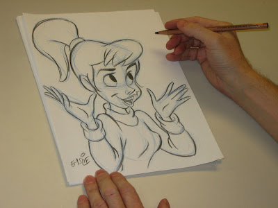
This past week at Sheridan College, two of my current 2nd Year students, Amir Avni and Mitch Kennedy, asked if I would do an on-camera demonstration of how I take a drawing from initial rough gesture through to the final sketch. It was all very spontaneous and we set up in the classroom right after I'd finished this week's lesson to their group. In a matter of minutes the camera was set up on the tripod looking down over my left shoulder and I started sketching away, keeping a stream of consciousness commentary going all the while I was working. Hopefully this will illustrate the ongoing thought process I experience as I am working out a drawing. By the way, I apologize for the initial stage where I am gesturing in quite lightly in blue pencil on the paper. What I didn't realize at the time was that it was just too light for the camera to pick up. However, once I start working out the basic forms on top of the scribbled gesture, you can make out more clearly what I am doing. As for the chosen subject matter, let's just say that there's nothing more appealing to me than doodling a cute gal!
Again, my sincere thanks to Amir and Mitch for coming up with this idea, as it really was quite fun to do and I am actually quite flattered that they asked me. Please be sure to also check out their blogs to see a sampling of what these clever students of mine can do themselves:
Amir Avni
Mitch Kennedy
The finished sketch. By the way, if this were an actual assignment, I would lay a fresh sheet of paper on top of this and refine the drawing much more before inking it.
Tuesday, November 6, 2007
What's My Line?
Again I am going to use John Kricfalusi's blog as a springboard to my topic today. John has been posting art notes that he'd written to hopefully ensure that the studios he was working with overseas would adhere to the correct design style of his show. You can read his post here. I believe what he is talking about in regard to linework relates to what I had also talked about in a Character Design class I gave just a couple of weeks ago to my Sheridan students. Since we rely on lines to a huge extent in cartoon art, the types of lines employed should actually mean something. To illustrate what I am getting at, here are the visual notes I drew for my class:
There really aren't many perfectly straight lines in nature - as they are mostly of human invention, found in machinery, architecture, etc. However, straight lines help to convey rigidity and firmness of form, whether something is absolutely solid or not. Straight lines also denote tension, such as the tautness of a rope pulled tightly, flesh stretched tight over the bone, or the creases in a freshly pressed suit and pants.
The 'C' curve travels in one direction and is mostly employed to show fullness of form. It can portray soft, pudgy flesh and the puffiness of fur. Anything that is inflated with air or bloated with liquid tends to round out into 'C' curves. The effect you can create when using them on humans or animals can also result in personality types that are friendly or comical. (Think of all of the rounded puffy forms on a circus clown, for example.)
The 'S' Curve is a curve that starts out in one direction then changes and curves in the other direction. This type of line is very prevalent in nature and is used to show rhythmic gracefulness of form. Animals that we consider very elegant in their structure, like cats and many types of birds, have flowing forms full of 'S' Curves. And of course an attractive female figure is loaded with them too! Many things in nature also move in 'S' Curve patterns, such as seaweed undulating with the current, a figure skater or ballet dancer, or a squirrel bounding up and down through the grass. A snake has to travel in 'S' Curves, its body pushing off from side to side through complex muscular contractions in order to propel itself forward.
From the examples above, I hope you can get a sense of what type of line will best suggest the desired form. Though I have deliberately used a preponderance of each individual type of line in the respective examples to exaggerate my point, a good drawing should ideally comprise a variety of linework stressing all three types of line. This not only helps to convey the correct form, but also creates visual variety, which is more pleasing to the viewer's eye, ultimately helping to engage their interest. This still of Shere Khan the tiger, from Disney's "The Jungle Book", has a nice variety of straight lines and curves that suggest exactly what the form is.
Here's an example from TV animation that still illustrates the principle of well-chosen lines to convey form. There are a few straight lines on Fred and Barney to show more of their ruggedness relative to their softer wives and round, chubby babies.
Unfortunately, many of today's cartoon shows fail to recognize the importance of line and tend to design everything with too many straight lines and sharp corners. Yes, I share John K's extreme distaste for this supposedly "stylistic" approach, as there really isn't anything clever or appealing about it in my view. Here's an example of what I mean:
This character has been created almost entirely from straight lines. Even his tongue! The result is that the character looks like he's been chiseled out of stone rather than made up of flesh, muscle and hair. The image ultimately has no sense of weight or volume and is merely a flat graphic design, and not a very good one either, considering the directionless arrangement of the lines in the hair for example. It certainly has not been designed for anything more than stiff, mechanical movement either, and this self limitation makes me long for the days when characters were designed specifically to work well in flowing, organic animation. Visually, it has all of the wit and appeal of a connect-the-dots puzzle in a kids' activity book! Sadly, we're seeing more and more witless design in today's TV animation. The tragedy is that it doesn't have to be this way, as there are countless individuals toiling away within the industry (and outside of it too) who are capable of far better design themselves. Why are they not being given a chance to shine? Why this rampant trend toward mediocrity?